Today’s issue of our FAQ Design Platform in Tubik Blog will concentrate on the difference of terms “human-centered” and “user-centered” which now have become a sort of basic ones for the sphere of web and app design. The answer is based on the thoughts we have provided for the question on Quora where we often share our ideas, knowledge, and experience.
So, the original Quora question we are answering today was the following:
What’s the difference between human-centered design and user-centered design?
That’s really true that the two terms mentioned in the question are widely used replacing each other in different contexts and perceived as equals. The difference between the meaning people put behind those words is really slight and blurred that it is easy not to notice it at all. However, with a content manager onboard holding a degree in linguistics and being a keen lover of the slightest semantic nuances, we decided to get deeper into the issue. As research and practice show, although these terms, in fact, have the same roots, the idea they present is viewed in a bit different perspective.
It can be supposed that human-centered design is the process of creating things deeply based on general natural characteristics and peculiarities of human psychology and perception. It doesn’t matter if you design furniture, cars, stationery, TVs, websites, or anything else – any object of design can be made human-centered on the ground of psychology, physiology, sociology, and other sciences analyzing human life and interaction with the environment. It means that human-centered products will be not only nice but also functional according to psychological traits and features typical for big groups of users.
A really good and simple definition is found in the article “Characteristics of Human-Centered Design”: “…human-centered design can be defined as the process that places the human needs and limitations in a higher priority compared with other targets during the design thinking and production differential stages. During this process, the designer is required not only to analyze and come up with the solution for existing problems but test and validate the designed products or service to achieve planned targets in the real world.”
For example, there are basic conditions of general physical human abilities, color perception, contrast perception, readability, interaction with a product in different environments that are typical for the vast majority of people. Let’s say, typically people are not able to see in the darkness, and the darker is the environment, the harder it is for most people to perceive something visually, doesn’t matter what age, education level, social layer, professional skills you represent. This is a common human physical characteristic. Neglecting it means creating a product which people will not be able to use properly, being limited in their abilities.
Creating objects people are going to interact with, designers have to be aware of those traits and take them into account in the process. That is the reason to study at least the basics of psychology, physical and emotional perception for designers who would like to create things convenient and friendly for people in general. We also believe that is a strong reason to involve psychologists, behaviorists, physiologists, and other experts in the process of design.
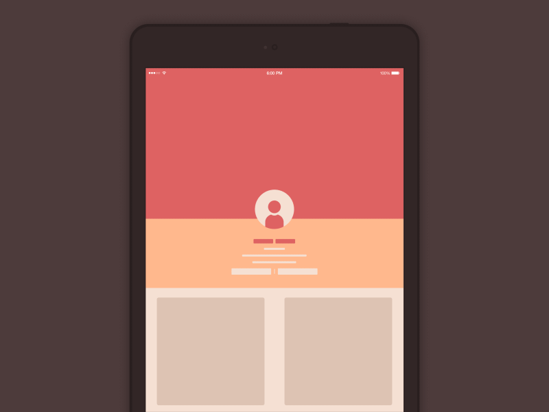
Portrait vs Landscape Interactions
Here you can see the interactive concept of transition from portrait to landscape mode. It is based on the general ability and necessity of any user of digital product used on iPad to get the feedback from the system that the action of transition from one mode to the other is done. If it is done smoothly and with a quite natural speed, that is one more element of positive user experience, sometimes even unnoticed as the microinteraction takes split seconds. The presented example actually imitates interaction with a physical object and therefore makes the user experience more clear and positive for users of different ages, gender, educational background, etc. This is actually the small piece of a human-centered design solution.
Continuing the theme, user-centered design is a more focused and concise version of human-centered design with a deeper analysis of the target audience. It is concentrated on not only human characteristics and perception in general but also specific traits and features of target users to make the problem-solving potential of the designed product as high as possible from the perspective of its users. This is the stage when details about the target user of the design object start playing their role: defining the target audience, the designer takes into account age, gender and social status, potential education level and professional background, influential social factors and typical environments of product usage, etc. On this basis, the designer makes deeper research on preferences and peculiarities, special aspects of interactions, specifying general human-centered ideas with important details of target audience’s preferenсes, emotional and physical perception traits as well as levels of technology awareness and tons of other factors. This is what we usually do on the stage of user research here in Tubik Studio and practice shows this stage is vital for creating problem-solving and user-friendly designs.
So, it can be said that human-centered design is the first obligatory step to making the product applicable, while the user-centered solution is the next step to make it concentrated on the pains and needs of the specific category of users.
Let’s look at one more example.
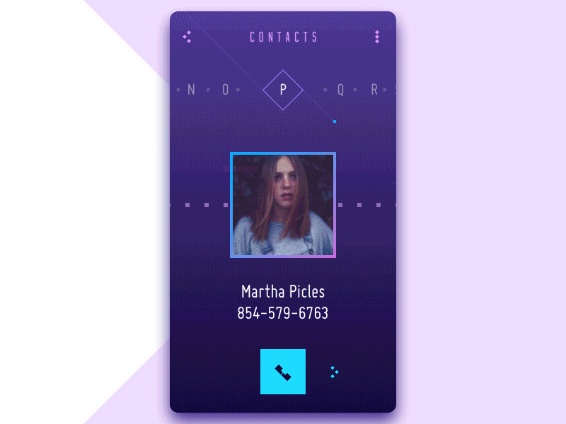
Contact List Concept Scrolls
This design concept for a contact list looks nice and voguish. It presents two different variants of scrolling the directory and refreshes the traditional interaction experience. It is grounded on basic aspects of readability, contrast, visual hierarchy, provides clear feedback to user’s actions and necessary functions. It follows the basics of color theory, logic, and visual harmony. Certainly, it is human-centered. No doubt, a big proportion of teenagers and millennials, people who use diverse interfaces every day and see them as an integral part of their life, will be engaged and would like to try it. However, for older people, this sort of interface can seem a bit scary and overloaded as well as somehow darkish comparing to simple traditional interfaces based on the light background. So, this user-centered interface responds to the wishes and preferences of the narrower target audience.
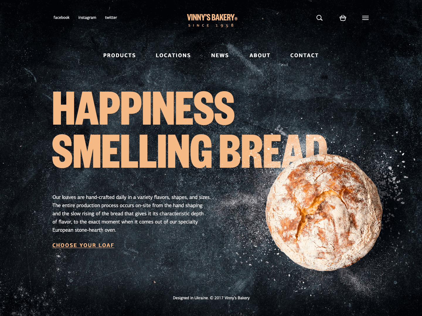
Here is one more case featuring a web design concept for Vinny’s Bakery. It represents interface design for a website presenting online bakery selling. On the basis of the design solutions, it is easy to assume that this is the service positioning itself as a producer of upmarket products which are exclusively hand-made and presumably because of that reason cost higher than average bread in the supermarket. Therefore, the website is designed aimed at the particular target audience. As we mentioned in one of our previous articles about the benefits of the dark background in user interfaces, dark color solutions can form popular associations in visual perception. Dark colors are usually associated with elegance and mystery. Moreover, black is often associated with elegance, formality, prestige, and power. This is the style provided by the presented design: dark background, branding element as a central element of a header, strong and clear headline establishing positive emotional message, visual elements enabling immediate perception of the theme and setting strong visual association with tasty pastry, short text block describing basic benefits of the product and clearly visible call to action. The designer worked out the solutions that will look attractive and informative for target users wishing to feel the exclusivity and high-quality of the product and able to pay more than average. Therefore, this example also shows the techniques of not only human-centered but deeper user-centered design.
However, it also has to be mentioned that in modern design, especially in the digital field like creating applications and websites, human-centered design and user-centered design are most often inter-replaced and used basically as full synonyms. Perhaps that happens because in this sphere most products are created and updated for a certain category of users rather than “for all and everybody”. Moreover, users of all the digital products are people, therefore all the solutions should get based on the positions of human-centered design. Certainly, it doesn’t mean that universal interfaces cannot be found: they do exist and we apply some of them on daily basis, so they are a good example of the general human-centered design that successfully applies knowledge about features typical for the great majority of users. However, they are closer to the exceptions which prove the rule.
So, in terms of web and app design, we can assume that description of design as “human-centered” or “user-centered” just shows different levels of detalization in the design process, different stages one of which considers human interaction features and the next gets deeper in details of certain categories of users, their needs, wishes, and problems.
A great example of the synonymic perception of the terms is the video powered by IDEO, great experts in human-centered design.
Again, it’s important to emphasize that the definitions given represent our personal vision of the terms based on linguistic nuances of given terms and practical experience of processes in the design studio with all respect to other points of view.
Useful Articles
How to Make User Interface Readable
Visual Hierarchy: Effective UI Content Organization
3C of Interface Design: Color, Contrast, Content
Gestalt Theory for UX Design: Principle of Proximity