The aspect of using dark colors and shades in backgrounds of user interfaces still belongs to highly debatable issues. No wonder it’s so actual: choosing appropriate background plays a vital role in all the product efficiency as it can become a key factor enhancing or, vice versa, killing other design solutions around the layout and functionality. Today our article will be devoted to the benefits and pitfalls of using the dark background in UI design, so let’s move on to the dark side.
In our earlier article, we have already analyzed the factors that can influence the choice of general color scheme and basic background color as well as mentioned some important points to consider in the process. This time we will concentrate on more detail on the strong and weak sides of the dark-colored design for websites and mobile applications. Experience of practical work on creating and testing diverse user interfaces here in Tubik Studio has proved that dark background can be powerful and appealing solution providing positive user experience. Let’s just take it for granted and discuss when and where we can make it work at maximum.
Visual perception of dark
One of the polls whose results were published quite a long time ago, in 2009, in ProBlogger already features some interesting points. The readers were asked what sort of background they prefer on blogs. Almost half of the readers answered that light background is preferable – and that is reasonable as blogs are traditionally text-driven, so the aspect of readability outweighs the others. However, 10% of respondents answered that they prefer dark backgrounds and more than one third mentioned that the choice should depend on the blog nature and content. Such a big proportion of users should not be neglected by designers in the process of looking for design solutions. Moreover, in the case of less text-driven content concentration in a digital product such as a website or application the proportion can become even bigger. This is a good example showing that user research and surveys should be an important part of the design process. Knowing what users want or at least what they are ready for can push the limits of traditional vision.
The scientific research provided around the issue by Richard H. Hall and Patrick Hanna highlights the important point about visual perception of the background color and its performance. Having analyzed practical experiments by different scientists done earlier in the sphere of web pages performance and readability, the authors sum up: “They found that combinations with positive polarity resulted in better performance (that is dark text on light background), and, as with studies mentioned previously, the greater the contrast between color combinations the better the performance.” Therefore, a dark-colored background can be as efficient as light-colored in the case when other aspects, in particular contrast and legibility of the layout elements, are designed and tested appropriately. The research contains a lot of interesting and useful information based on user testing in the perspective of different color combinations and their effectiveness, so it is highly recommended to designers.

The aspect of readability
One of the famous gurus of user experience design Jacob Nielsen mentioned: “Use colors with high contrast between the text and the background. Optimal legibility requires black text on white background (so-called positive text). White text on a black background (negative text) is almost as good. Although the contrast ratio is the same as for positive text, the inverted color scheme throws people off a little and slows their reading slightly. Legibility suffers much more in color schemes that make the text any lighter than pure black, especially if the background is made any darker than pure white.”
Indeed, readability is the vital aspect influencing the performance of the product and it deals not only with text. It goes beyond the limits of copy and means that all the meaningful symbols including letters, numbers, pictograms, and icons should be noticed and recognized easily in the interface. Thus, the designer choosing in favor of dark background should be prepared to especially thorough selection and testing fonts, icons, and images on different devices.
Best web and app design practices, for example, the collection of Best black websites on Awwwards, feature loads of successful design solutions which, using the dark background as a basis of color scheme, still don’t suffer from low readability. To avoid this problem, during the design process, it is important to remember:
- dark background absorbs some part of the light from the other elements, so there should be enough empty space or “air” between the elements;
- length of the line can make copy bulks more readable and digestible for users;
- the issues of interlinear space design, as well as the length of the text line, can have a great impact on readability, especially on the dark background, so paragraph size, kerning and leading should be thought over carefully;
- dark doesn’t always mean black, so in every particular case of design, it is reasonable to take some time testing different sorts of dark backgrounds and colors presenting the content, being open to experiments;
- shades, gradients and glows can influence readability;
- sans-serif fonts are usually more legible while serif fonts look more elegant; applying this factor in practice can enhance the readability of the content.
The aspect of contrast
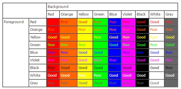
One more interesting thing to consider in the aspect of visual perception is the table presented by webdesign.about.com. The table demonstrating levels of contrast and performance of different color combinations features an interesting fact: the black part of the table is the only one that provides good contrast with practically all the colors. Tested carefully in every particular case of design interface, this factor can be the reason to try a dark background as a variant of a design solution.
In the aspect of readability, contrast is also one of the factors able to make the content more recognizable and legible.
One of earlier investigations of the aspects of contrast and readability states such a tip: “With a dark background, ensure you do not have overly-bright lettering: tone down white lettering to a pale gray, or dull the colour used to minimize extreme contrast and glare; this principle is used when doing slides, as well: at least 5% gray is used to cut the glare of bright white. Interestingly, this still “reads” as white. Also, make the text bold, so it has enough body not to be “eaten alive” by the darkness.” This test, as well as others, can provide new variants of toning in providing efficient and natural contest on a webpage or app screen.
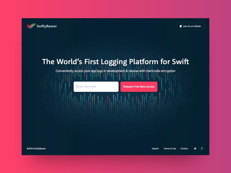
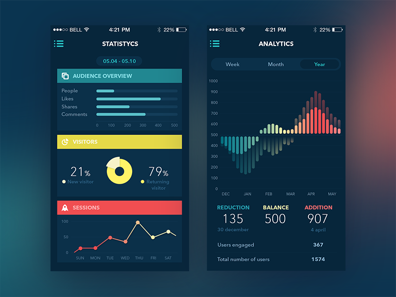
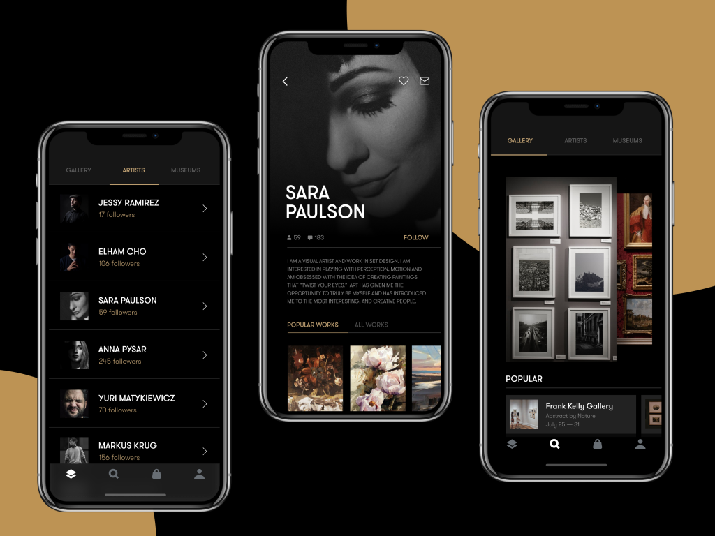
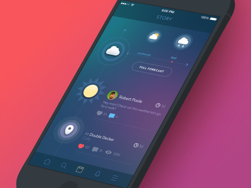
One more thing to mention is that dark background being somehow heavier and deeper usually provides great opportunities for presenting graphic content such as pictures, photos, illustrations, posters, and ads. Good composition and following the principles of the visual hierarchy can significantly enhance visual perception of this sort of layout elements. This factor makes dark background highly efficient and attractive in cases when the interface is based more on graphic material than on copy.
The aspect of emotional perception
Color psychology is another thing to consider choosing a background that will be not only the effective field of presentation but also the carrier of its own message. Dark colors are usually associated with elegance and mystery. Moreover, black is often associated with elegance, formality, prestige, and power. That is, perhaps, one of the reasons why many powerful brands build their visual presentation around a black-and-white scheme with dark dominating and light presenting and informing the recipient. Playing out this aspect in interface design can provide additional support to other design solutions and general presentation of the product.

Benefits of the dark background
According to all the points mentioned above, we can sum up that dark background applied in user interfaces can provide essential benefits, among which:
- style and elegance
- feel of mystery
- luxury and prestigious look
- the broad field of using contrast
- support of the visual hierarchy
- depth in the reflection of the presented content
- visual appeal
Points to consider
On the other hand, dark background requires thorough attention and analysis of the smallest details, which can get lost in the layout if they are not presented properly. Among them, we should consider:
- User research. Practical surveys, theoretic investigations, and experiments are important sources of data about the target audience, its wishes, and expectations that are the basis for choosing effective and attractive design schemes.
- Competition research. Market research of close competitors gives the understanding of which design solutions have already been applied by other players on the market, and this factor influences choosing original design solutions to make products noticeable.
- User testing. Dark background being more vulnerable in the aspects of readability and legibility should be rigorously tested on all sorts of devices and in diverse resolutions.
- Environment factor. Analysis of typical conditions in which the product will be used by the target audience can provide additional reasons for or against the option of the dark background.
- Amount of content. The number of elements and blocks which have to be featured on the screen or web page can influence the decision around the background: darker backgrounds leaving too little space between elements are extremely hard to perceive.
- Nature of content. Dark background can feature better performance for interfaces based on graphic elements rather than the big bulk of copy to read.
Recommended reading
Light and Darkness in UI Design. The Matter of Choice
Visual Perception: An Introduction
Light or Dark UI? Tips to Choose a Proper Color Scheme
Art and Visual Perception: A Psychology of the Creative Eye
Colour Choices on Web Pages: Contrast vs Readability
The Dos and Don’ts of Dark Web Design
How to Make User Interface Readable
Welcome to read or download our free ebook “Problem-Solving Web Design“