Every single day we’re surrounded by various colors from everywhere. If you take a closer look at the things around, they may surprise you with a number of colors and shades. People may not notice how colorful everyday things are but the colors have a significant impact on our behavior and emotions. Today our article is devoted to the science studying this issue called color psychology. Let’s define the meaning of the colors and review some tips on choosing suitable colors for the design.
What is color psychology?
It’s a branch of psychology studying the influence of colors on human mood and behavior. The thing is that our mind reacts to colors while we usually do not notice it. The moment our eyes perceive color, they connect with the brain which gives signals to the endocrine system releasing hormones responsible for the shifts in mood and emotions. These days a lot of research is conducted in order to study the peculiarities of these reactions and there are already many theories useful to learn. Color psychology is helpful in many industries including business, marketing, and design.
The success of the product depends largely upon the colors chosen for the design. The properly selected colors help put users in the frame of mind that compels them to take action. The research provided by Colorcom showed that it takes only 90 seconds for people to make a subconscious judgment about a product and between 62% and 90% of that assessment is based on color alone. So, the basic knowledge of color psychology can be useful on the way of improved conversion for your product. Moreover, accurately chosen colors can advance the usability of the product.
Meaning of colors
To convey the right tone, message and call users to make the expected action, designers need to understand what colors mean and what reaction they evoke. In one of our previous articles, we’ve demonstrated you the list of colors with brief descriptions of their meanings. Today we have prepared a bit more expanded list of color meanings in common use and in design.
Red
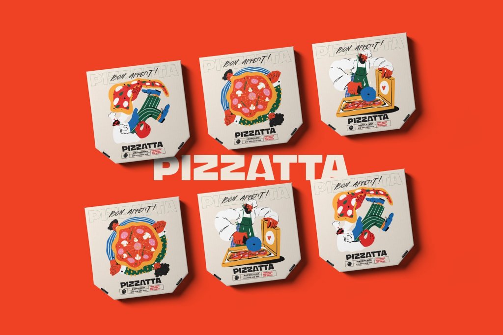
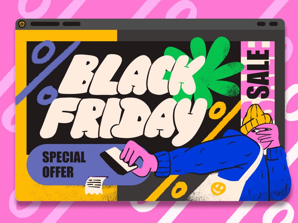
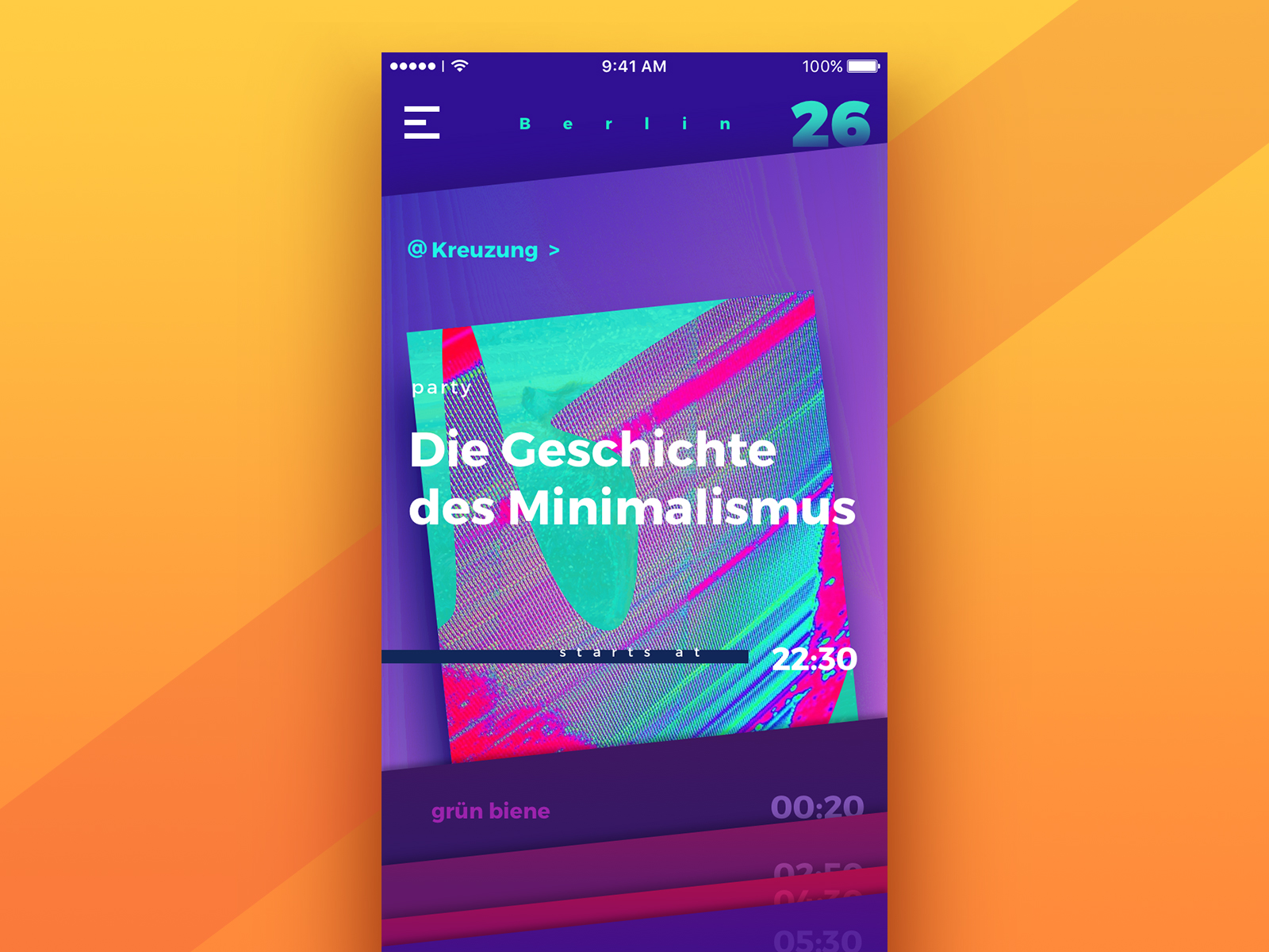
The color usually associates with passionate, strong, or aggressive feelings. It symbolizes both good and bad states of mind and soul including love, confidence, passion, and anger. In design, the use of red color is an effective way to draw users’ attention. Also, it’s recommended to use red sparingly to avoid negative reactions.
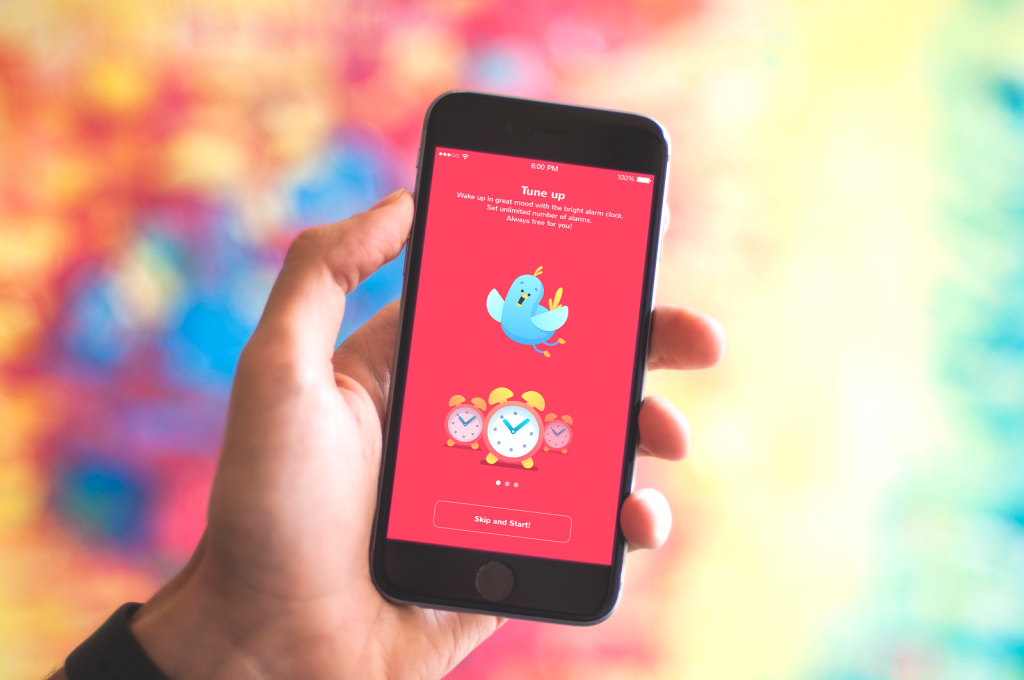
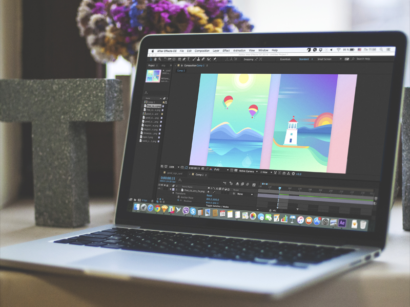
Toonie Alarm app tutorial
Orange
It is an energetic and warm color bringing the feelings of excitement. Orange combines red’s power and yellow’s friendliness, so it may bring feelings of motivation, enthusiasm, and love to life. Designers use the color if they need to give the spirit of creativity and adventure.
![]()
fOxygenic Logo
Yellow
This is the color of happiness which symbolizes the sunlight, joy, and warmth. Yellow is thought to be the easiest color to visibly see. What’s more, it has one of the most powerful psychological meanings. Users seeing yellow colors in the design can feel inspiration and confidence. Although, you need to remember that too much yellow may bring negative reactions such as the feeling of anxiety or fear.

StarDust website
Green
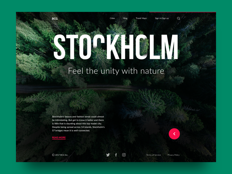
It’s often called the color of nature, balance, and harmony. Green brings calming and renewing feelings. Also, it is a sign of growth and inexperience. It has more positive energy than most other colors but sometimes it associates with materialism. Design in green colors perfectly suits the products connected with nature.
Blue
It often represents some corporate images since blue is the color of trust. It usually shows reliability, may give users calming feelings. However, as a cool color, it also associates with distance and sadness, so designers need to keep it in balance.
Purple
Long associated with royalty and wealth since many kings wore purple clothes, it’s useful for presenting some luxurious products. It’s also a color of mystery and magic. It mixes the energy of red and blue, so it has a balance of power and stability. A big concentration of the color may distract users’ mind.
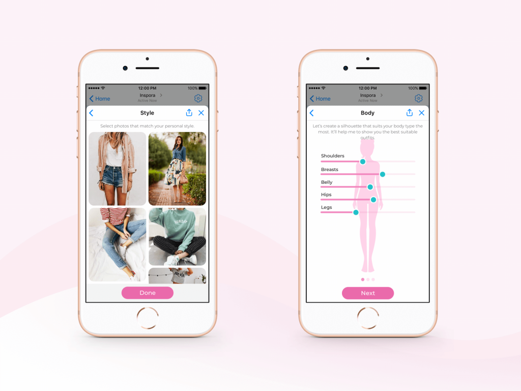
Pink
It is the color of hope, sensitivity, and romance. Pink is much softer than red, so it creates a sense of unconditional love. Pink is associated very strongly with youthful femininity, so it may be an effective color if the target audience is mostly girls and young women.
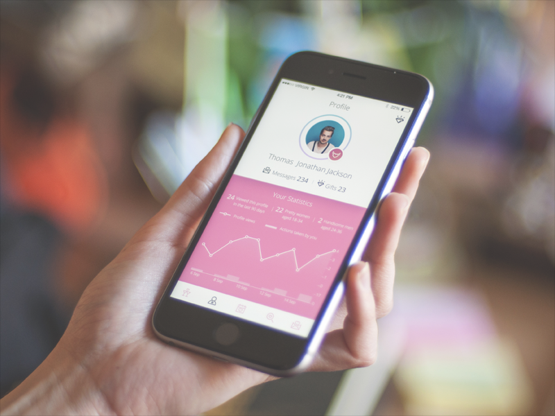
Dating App
Brown
The color of security and protection like the mother Earth. Designers commonly use brown as a background color in a variety of shades, from very light to deep. It brings the feeling of warmth and comfort to the designs. Also, it may be used to show experience and reassurance.
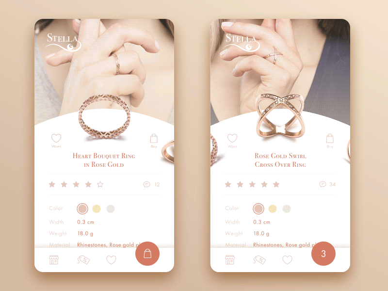
Jewelry E-Commerce App
Black
The color has a great number of meanings. It associates with tragic situations and death. It signifies a mystery. It can be traditional, modern, serious. Everything depends on how you employ it and which colors go with it. Black matches well with any other color, so it’s ideal for the background. Designers often use it to set contrasts.
White
The color means purity and innocence, as well as wholeness and clarity. White often associates with a blank sheet of paper motivating people to generate new ideas. However, too much white can cause feelings of isolation and emptiness. In design, white is commonly used as the background color especially for the resources for which readability is a vital part.
Bjorn studio website
Color meanings in branding
Colors are a vital factor for not only the visual appearance of products but also brand recognition. Nevertheless, in branding, colors tend to have more direct meanings than in common understanding. They can be briefly described within a few words, so here is the list for you:
- Red. Confidence, youth, and power.
- Orange. Friendly, warm, and energetic.
- Yellow. Happiness, optimism, and warmth.
- Green. Peace, growth, and health.
- Blue. Trust, security, and stability.
- Purple. Luxurious, creative, and wise.
- Black. Reliable, sophisticated, and experienced.
- White. Simple, calm, and clean.
![]()
Realli logo animation
Color Preferences
Visual perception is quite individual for everyone. Designers need to remember that the color effects may be different because of the factors such as age, culture, and gender. First of all, people’s preferences can shift during life whatever the object is, let’s say, food, clothes, music, colors and plenty of other aspects. It is caused by both mental and physical changes that happen to us across a lifetime. For example, children like yellow color pretty much, but as we become adults it usually seems less attractive. Faber Birren explains it in his work Color Psychology and Color Therapy: “With maturity comes a greater liking for hues of shorter wavelength (blue, green, purple) than for hues of longer wavelength (red, orange, and yellow)”. One more difference between children’s perception and adults is that kids can change their favorite colors fast, while adult color preference is usually non-malleable.
Also, designers need to consider that there are many cultural differences and color perception is not an exception. Sometimes cultures define colors diversely, for example, in Western countries, white color means happiness and purity, while in some Asian countries it symbolizes death. You can find many examples of how different may the meanings be in countries but it would take a whole article to tell about it, so if you’re interested in the topic, follow our updates on the blog since the post on this issue is coming soon.
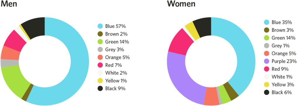
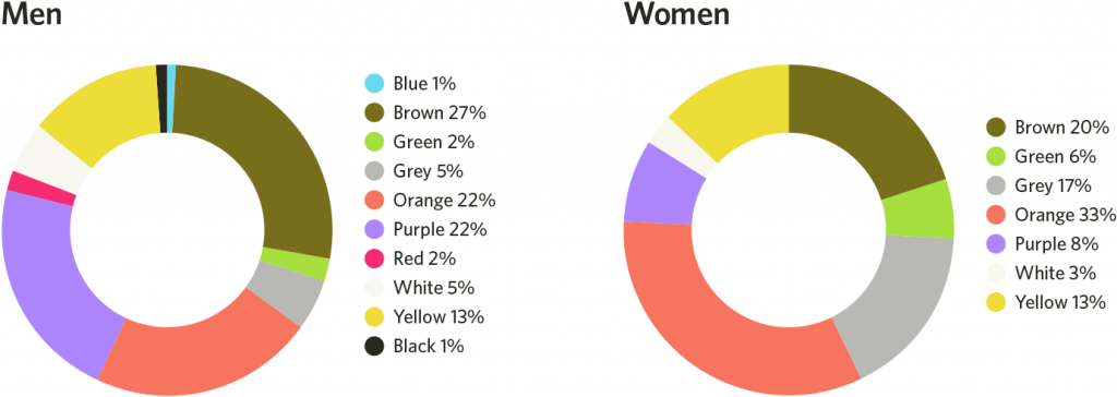
Another point on the color preferences is gender. Many color studies have been done over the years and a lot of them say that the color preferences of women and men significantly differ. The Color Assignment group has conducted deep research on this topic and many designers already use the results in the creative process. We’ve defined the most notable things from the research to share with you.
Blue is the top color. Both men and women of all ages think of blue as the favored color. The shades of blue such as cerulean, azure, beryl, cornflower blue, and sapphire are popular among women.
Brown and orange are in dislike. The first one considered less favorable among men, the second – among women.
Cool colors are preferred. Men and women favor blue, green and their tints in general.
Women like tints. When men prefer pure or shaded colors, ladies are good with tints.
Men prefer achromatic colors. White, black and gray are neutral colors and men are keen to choose them.
Favorite colors
Least favorite colors
It’s vital to consider the color preferences of the target audience while creating UI and UX design since it helps to avoid negative reactions and associations.
Points to consider
Color psychology is rather complex to understand and learn. However, it may become an efficient tool in designers’ hands helping to understand users and their demands. Summarizing the article, here is the list of useful things to consider:
- Choose colors wisely. They have a deep influence on the users.
- Make sure your design and its colors convey the right message and tune.
- Learn your target audience. The color preferences and meanings depend on many factors, including age, gender, and culture.
- Some colors may look different on the screens of different devices. Additional testing never hurts.
- It may be a good idea to test the UI colors with representatives of the target audience.
- Try to make the color combinations wisely, in the best way for the users’ perception.
Recommended reading
Here are some articles we could recommend for those who would like to get deeper into the topic:
Design Glossary: Color. Terms and Definitions
Color Theory: Brief Guide For Designers
Light or Dark UI? Tips to Choose a Proper Color Scheme
Color Matters. 6 Tips on Choosing UI Colors
3C of Interface Design: Color, Contrast, Content