Logo is definitely the basic element for efficient branding and marketing. Its design, taken seriously and based on user research, analysis, talent and design laws can become a solid basis for successful communication of the brand with its buyers, customers and users, that is why it needs careful professional approach.
Here in Tubik Studio we have felt the nuances of branding and logo design. You probably remember detailed cases of design process for Ribbet, Passfold, Tubik, Saily, SwiftyBeaver and Andre logos shared here in the blog. Today we would like to continue this set with a new detailed case study, showing logo design process for Referanza. This case was assigned for Tubik graphic designer Ildar Aleksandrov.
![]()
Task
Logo design for an innovative marketing startup Referanza.
Tools
Adobe Illustrator
Process
The clients represented a startup based on the idea of enhanced marketing and business growth: Referanza helps businesses improve customer satisfaction and turn happy customers into referrals. The task set for a designer was to create a logo which feels modern and friendly and signals on customer happiness and growth. The primary target audience was defined as young marketing professionals and online entrepreneurs. General task on branding design solutions was to get a fun and fresh look for a brand.
After user research and marketing research, the designer worked over several stylistic directions. As for the color palette, the search didn’t take long because the clients primarily set their preferences on light and airy design within white and blue shades. So, the main search was focused on shapes and imagery. At this stage, the clients were provided with four stylistic versions, three of which presented various approaches to lettermark while the fourth featured a mascot character. All the versions were based on circular geometric approach. The logo versions were made monochrome applying flat style of graphic design.
The first option showed the stylized version of the initial letter “R” combined with the image of a target card as a symbol of success.
![]()
The second variant moved away from the letter concept and featured a friendly positive mascot as a part of branding.
![]()
The next option offered the lettermark accomplished with a more classic stylistic approach and inscribed in the colored circle.
![]()
The fourth variant featured another lettermark which looked a bit bolder and more massive and had a star inscribed in the top part as an image usually associated with high achievements and success.
![]()
In addition, all the versions were supported with stylistic variants of lettering for the brand name.
![]()
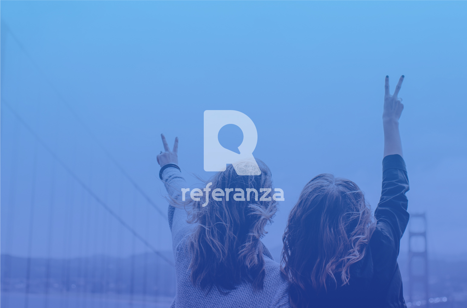
Having discussed all the set, the clients agreed upon the direction of lettermark rather than the slogan. The version with bold and massive “R” was chosen as a basis and the stage of the creative search was continued around this concept. The clients wanted to see more prominent and clear sign of communication setting the link with the startup activity and philosophy. So, the designer offered another option for combining the letter with a bubble speech easily associated with communication.
![]()
Lettering for the full name of the brand was accomplished originally for the brand without capital letters to feel balanced when used together with the logo image. Rounded corners, enhancing readability, also added some original look and consistency to design of both parts of the logo combination.
![]()
Once the final version was approved, it was carefully tested in different resolutions, on multiple devices and surfaces to ensure that logo works effectively for various environments. The logo keeps harmony and consistency in both horizontal and vertical placement of its elements.
![]()
The final version of the logo was also tested on smoothly colored surfaces to provide the brand sign with marketing flexibility.
To read more about theory and practice in the logo design process, welcome to look through the articles about types of logos and creative stages of logo making. Don’t miss new design cases and articles coming soon.
Useful Case Studies
For those, who are interested to see more practical case studies with creative flows for the logo and identity design, here is the set of them.
AppShack. Logo Design for a Digital Agency
LunnScape. Identity Design for a Landscape Company
Binned. Brand Identity Design for Cleaning Service
Reborn. Identity Design for a Restaurant
Andre. Logo Redesign for Landscape Firm
Andre. Corporate Identity Design for Landscape Firm
SwiftyBeaver. Logo for Mac Application
Saily. Logo for Local C2C E-commerce Application