Branding is not the absolute synonym of design: it should present an insightful strategy to lay the foundation for success for a product or company. To work well, all the elements of the brand image have to support each other consistently and give users or buyers an instant message about the benefits. And design presents the fruitful soil for this goal, giving a company, service, or product its face and dressing it elegantly.
We have already shared case studies with the stories of creating identity concepts for Ribbet, Passfold, Tubik, Saily, SwiftyBeaver, and Andre. This time we have prepared a new story about creating the identity for an innovative self-service Chinese restaurant. This project was brought into life by Tubik designer Denys Boldyriev.
Project
Create branding identity for an automated, self-service Chinese restaurant Reborn.
Process
For this project, we got a set of tasks according to the client’s marketing strategy:
- logo
- app icon
- corporate business cards
- stickers
- corporate letterhead and envelope for printed correspondence
- style guide.
Logo design
One of the key elements in marketing is a logo: it usually presents the basis of all the further visual identity solutions. In this particular case of branding design for a restaurant, as the concepts were explored around healthy eating, futurism as a part of the brand image and marketing strategy, and the unique approach to food service, the image of a red ribbon emerged at the stage of the creative search. The implementation of the ribbon as the initial letter of the restaurant name expresses all of these ideas and ties them together with a traditional Chinese color palette.
The first ideas were visualized in the quick pencil sketches to catch the possible silhouette of the future logo. In a graphic design flow, pencil sketching is a significant stage that satisfies several needs. It allows visualizing the early ideation process in a quick and easy way. Moreover, it becomes really helpful for communication with a client to discuss if the general directions of the creative search correspond to the client’s expectations: this way is especially effective if the requirements are quite blurred and the customer doesn’t have a clear vision of a future symbol. Here you can see the set of early sketches for the logo.
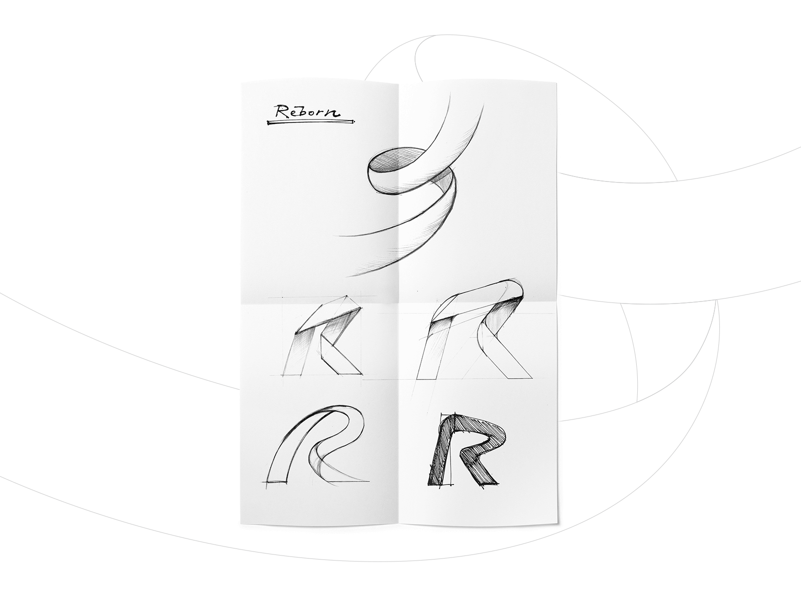
In fact, right from the beginning, the basic issue was agreed upon: the main part of the visual harmonic for this case was a lettermark presented in a special symbolic form. At the next step, the client was provided with a set of options showing the extended version – the combination of a logo sign with the lettering for a full brand name.
![]()
Through the iterations, the final variant of the lettermark for the restaurant branding design was constructed and polished to get a sophisticated and elegant silhouette.
![]()
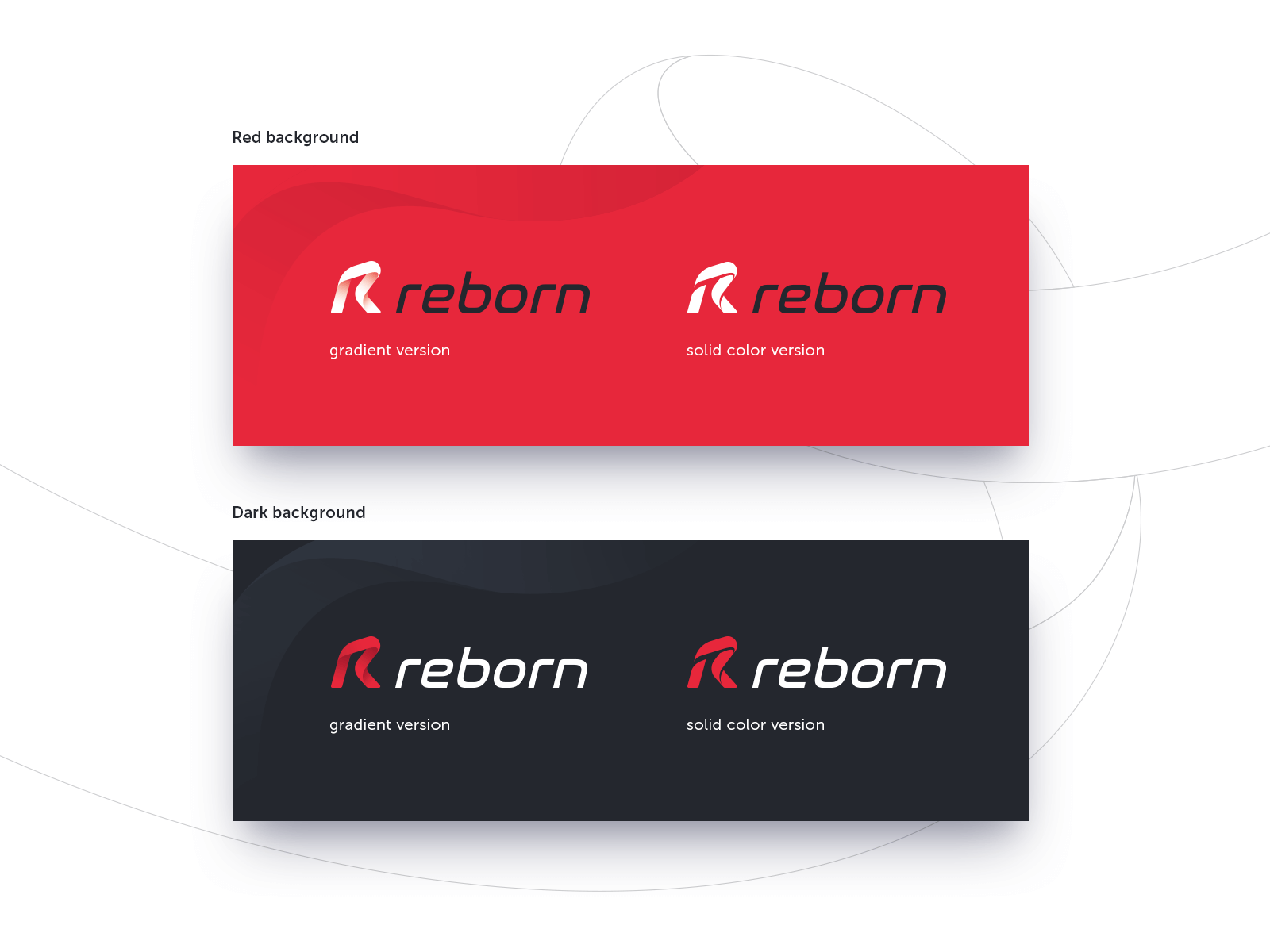
So, the final Reborn logo is a combination mark that consists of the lettermark and custom lettering for the brand name. The core symbol presents the first letter of the company name for better brand awareness. The overall look of the symbol reflects the form an inseparable silk ribbon featuring the slight movement which portrays the principal service philosophy – bringing in the modern way of automated ordering food in the restaurant industry and setting the link between traditions of healthy food and innovations. The chosen style gives the visual idea of an elegant and simple form reflecting the core benefits of the product. The letter is easily associated with both the brand name and the word “restaurant” showing the kind of service.
The solution for a lettering part was focused on readability on different surfaces and sizes. It keeps visual harmony and consistency with the logo. Both parts can be efficiently used together as well as separately which gives flexibility for various marketing needs.
![]()
Another task in the creative flow of restaurant identity design was an app icon. It functions as an interactive symbol and presents the restaurant app on various digital platforms supporting the original identity. In most cases, app icons feature the logo of the app, although sometimes it can apply other visuals like a mascot or an abstract combination of corporate colors. The effective choice must be based on thorough market and competition research so that an app icon could strengthen the general brand strategy.
For Reborn, the option of the lettermark was defined as the strongest. Below, you can see what solution was chosen as the app icon. The simple and effective contrast of red as a corporate color and white as a background worked well for sign recognizability on a variety of devices and in different sizes.
![]()
Color, style, and background variants of the logo allow for flexible use, including on print materials. The client was offered several effective color combinations based on bold colors (red, black, white) and tested on the high level of readability in any case.
Branded items
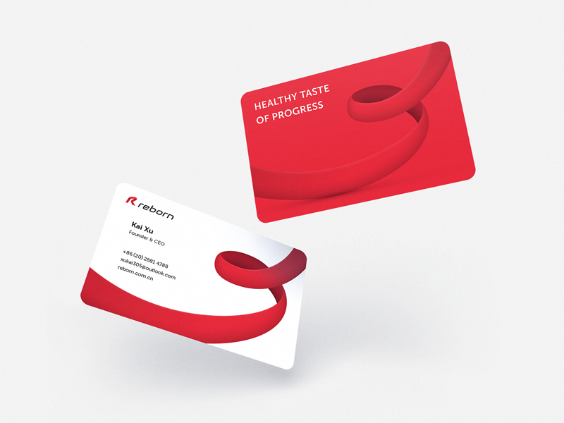
After approving and testing the logo, the next task was a set of basic branded items that would support the visual identity concept. Among them, the designer worked on business cards. The dynamic ribbon element here communicates the focus on a healthy lifestyle and movement to progress in providing services.
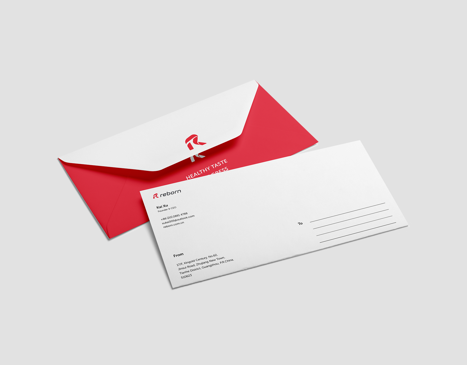
Simplified and stylized, the logo creates a minimalist aesthetic suitable for envelopes and other mailing materials. Consistent with the overall design concept, the unique layout of the letterhead reinforces the futuristic sensibility of the service. The client also asked for slide templates that would allow easy creating company presentations that adhere to brand guidelines.
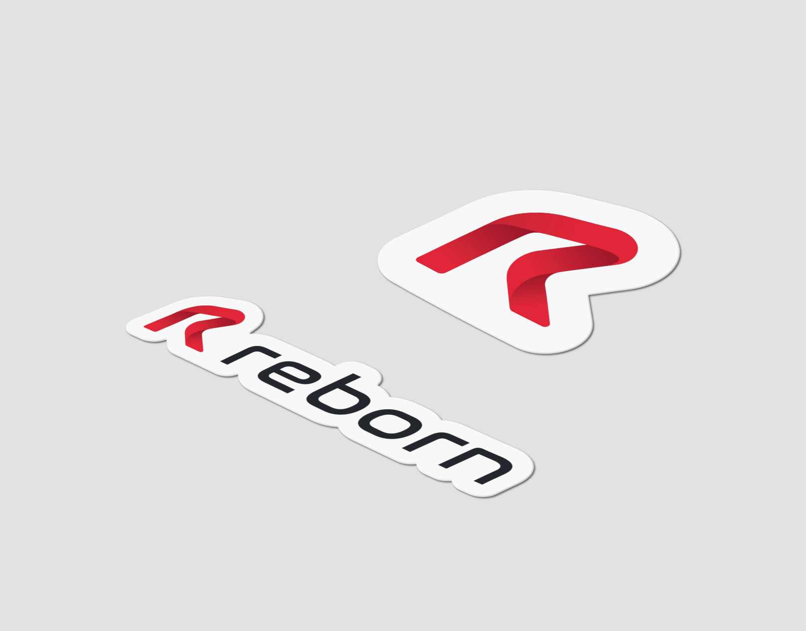
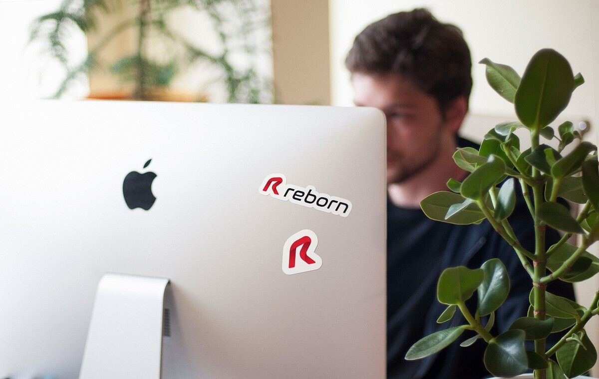
Another object of design effort was a brand sticker. Now stylish and catchy stickers have become a popular and quick way of spreading a word about the restaurant and strengthening brand awareness. Two sticker options were created for this purpose: one featured only the lettermark while the other showed the full version of the logo.
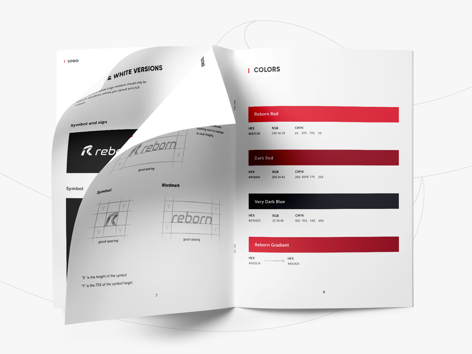
The client was also provided with a full set of guidelines for logo and identity use, including color palettes, fonts, and placement. Practice shows that style guides play a strategic role in the brand development: all the further contributors will get the clear instructions about correct and wrong ways to use the graphics created for this project. The document included several sections and informed about the idea which became the basis of a logo, its structure and specifications, color and monochrome versions which could be used for a wide range of purposes. Also, it showed examples of incorrect usage in order to avoid poor visual performance. In addition, all the branded items were included in the guidelines and described in detail.
![]()
This case of restaurant identity design has shown how to combine the traditions of a particular culture with modern trends and specific business goals. If you want to know more about the stages of the creative process for logos, welcome to read our free e-book «Logo Design». Don’t miss the updates here; new case studies on graphic, web and mobile design are coming soon!
More Branding Design Case Studies
Quisine. Branding Design for Food Delivery Service
Shpin’s Wine. Identity Design for Family-Run Winery
Logo Design: Collection of Creative Logos for a Variety of Brands
Dicey. Logo and Mascot Design for Party Game
MYWONY. Storytelling with Brand Intro Design
Inspora. Brand and UI Design for Virtual Stylist
AppShack. Logo Design for a Digital Agency
LunnScape. Identity Design for a Landscape Company
Binned. Brand Identity Design for Cleaning Service
Welcome to check the Reborn presentation in Tubik Portfolio