You could already read our previous case study, in which we told about UX/UI design for the Echo project. This time we are going to show the other case of design: issues and peculiarities of the design process of logo creation.
Being a symbolic sign, the logo is one of the most important parts of a company or project identity. It should combine lots of magic ingredients of success: pure and distinctive shapes and colors as well as the overall image being both original and meaningful. A designer assigned to create the logo gets a very responsible job and has to get through lots of ideas and updates before the creation of the final version satisfying the customer.
The designer for Tubik Studio Arthur Avakyan is already experienced in such things so he always considers lots of those issues and he did the same working on a logo for the Ribbet project.
Tools
Pencil sketching, markers, Adobe Illustrator
Task
Designing the logo for the online photo editor with a wide set of tools.
Process
The designer started working out the idea of lettering compositions that could be used for logo style.
![]()
First sketch variants of new lettering
![]()
Lettering processed in Adobe Illustrator
However, the customer wanted to use the visual elements that would be associated with the mascot of the company. The word used as the name of the company — Ribbet — is one of the variants to express the sound made by a frog or a toad, so the image of a frog has been originally the mascot of the company. They wanted to preserve it in the logo in order to support consistency with other visual elements of branding as well as the name of the company. Having analyzed the experience of the other competitors on the market, they came to the conclusion that it would work efficiently and would create better web-presence. Being widely functional, the service lacked in the style which would distinguish it from the competitors. So, it was agreed to create the variants combining lettering with the visual elements reflecting the mascot.
It should be said that the logo was created in a tight and deep connection with the whole concept of the Ribbet website design. Tubik has been working with this customer on the general design of the site and that was the reason why the company decided on creating the logo which would correspond with the general conception. By the way, that was a very efficient decision as the designer creating the logo was able to work together with designers developing the overall redesign of the site at all the stages of the project. Very soon the users will see an absolutely new version of the Ribbet site style.
Originally the company didn’t have a visualized logo using any image — they used only a lettering composition reflecting the name of the site. So, the task was to create a unique logo which the company could use in all its products and social network profiles.
Therefore, as the online graphic editor already had the general style of the site developed and it included mostly dark colors and shades with some blue color accents and was quite strict, elegant and serious, the concept of the logo had to correspond to it. The website was totally redesigned and the lettering used for the logo needed a fully new concept too.
Trying to get away from the previous idea, the author offered a neat geometric originally made lettering composition.
![]()
![]()
Trying new versions of lettering in the redesigned style of the site
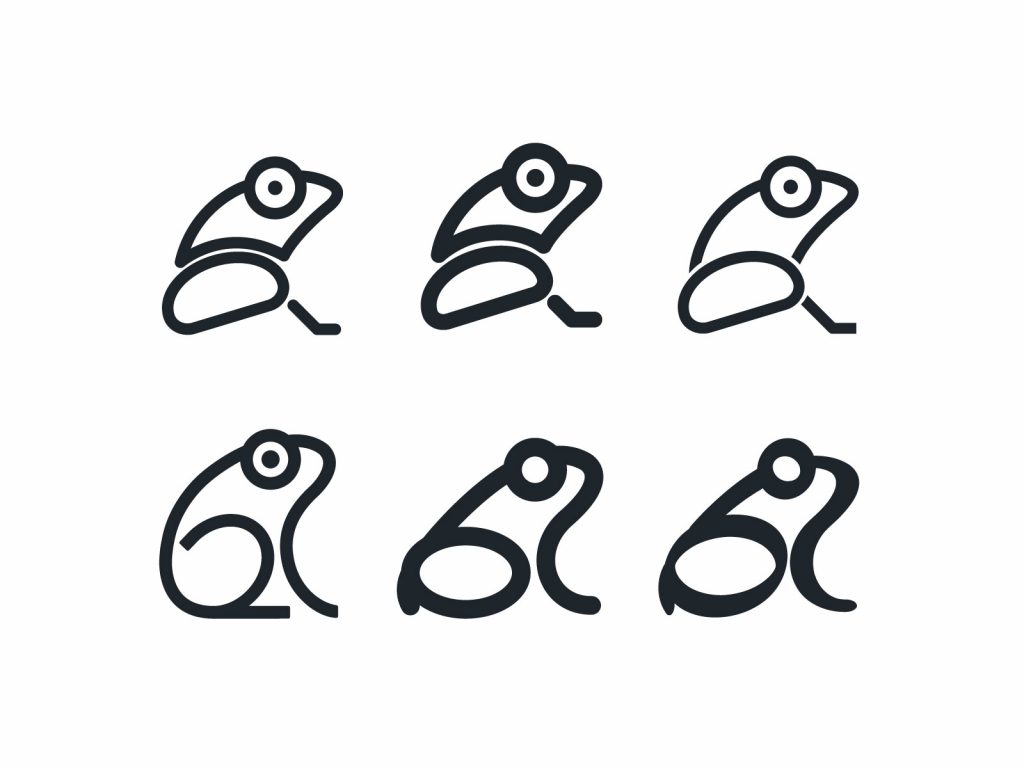
When the customer asked to develop the idea of the visual element showing the mascot, the first variants of visualizing the frog were based on the image of a frog’s pad, but they didn’t seem really clear to make necessary associations with a frog in different sizes, so the designer decided to try other variants.
![]()
The variant of visualizing the mascot with the image of a frog’s pad
All first versions were created by means of traditional pencil sketching aiming to keep elegant and serious stylistic features. At the same time, the designer worked on the other version of lettering, more gentle and rounded than the previous.
![]()
First sketches visualizing the company mascot for the logo
![]()
![]()
The combination of new visual elements with a new style of lettering
The collaboration with the customer was kept first of all through revision of the sketches and afterward if those sketches had been approved, they were processed in Adobe Illustrator.
The first version of the frog seemed to be a bit complicated for the customer so they asked to simplify it by eliminating some details and making the image clearly perceived. There was created the variant with the half-head of a frog, which was not clearly associated with the frog so it wasn’t accepted.
![]()
The simplified version of a half-head frog image
![]()
Combinations and versions of lettering and images of a frog with different details and shaping
The customer asked to add a little fun and joy to the image so that they could see if the character will work. Taking this into account and meeting the customer’s wish, the author added some details, trying to play out a smiling mouth.
![]()
The emotionally marked character of the mascot in combination with various lettering styles
The version was rather stylish; however, it didn’t match with the whole stylistics of the site, so this variant was put aside on the agreement of both the customer and the designer. The task became more distinct: to create a more natural image of the frog adding some details, as the practice showed that the oversimplified version could confuse a user and prevent the customers from achieving their aims.
The customer has selected and shown the samples of real logos which they liked and thought appropriate at the perspective of brand identification. Those samples showed that the main accent should be still put on lettering. After creating and reviewing numerous variants of lettering the customer and the designer agreed on one as the best version.
![]()
![]()
Working out sophisticated lettering versions
Then there was a long and thorough process of specifying the details to the approved version, such as lengthening/shortening or moving some strokes and elements. There were tons of tiny but really numerous corrections and alterations in order to get the most harmonic version. It is natural as the logo was based at purely original and uniquely created lettering. At last, the final version was agreed upon.
![]()
![]()
![]()
Thorough work on details in the final version of the lettering
Nevertheless, the designer didn’t forget about the customer’s desire to visualize the frog as the mascot of the site. So, the designers of Tubik Studio got together at a brainstorming session and developed the idea of using previous images of a frog and animating them in a functional feature of the preloader.
Brainstorming session in Tubik Studio
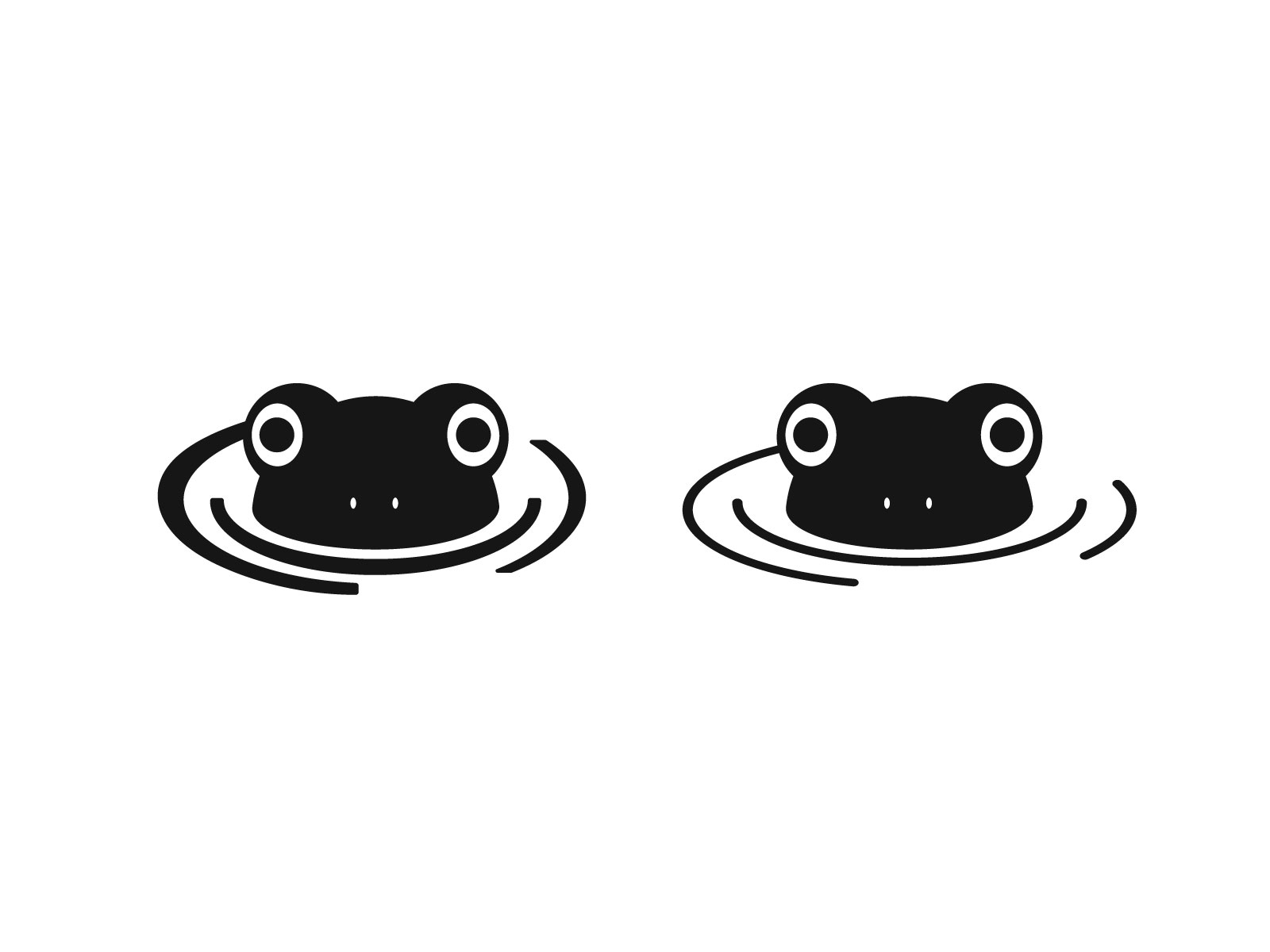
The final image of a frog animated for a preloader on the site
In addition, there was created a simple and rounded variant of a frog image that could be used together with the lettering or independently.
![]()
New versions of visualizing the mascot for logo
![]()
Various combinations of lettering with the image of the mascot
So, it can be seen, that the designer has made great efforts to meet all the needs and wishes of the customer, that is why his work was highly appreciated by the customer. In a while, all the work on the site redesign by Tubik Studio together with the new logo will be presented to the users of the Ribbet service.
![]()
The final version of the Ribbet logo
This case has become one more example showing how many attempts should typically be made in the process of logo creation. The designer has to do his best and be always ready to listen carefully to the customer. In addition, it is vital to be ready for research and deep analysis of existing products in the sphere in order to create original and highly competitive product satisfying customers, increasing brand identity, and attracting users.
Useful Case Studies
For those, who are interested to see more practical case studies with creative flows for the logo and identity design, here is the set of them.
AppShack. Logo Design for a Digital Agency
LunnScape. Identity Design for a Landscape Company
Binned. Brand Identity Design for Cleaning Service
Reborn. Identity Design for a Restaurant
Andre. Logo Redesign for Landscape Firm
Andre. Corporate Identity Design for Landscape Firm