The first step on the way to success for the company or brand is creating an offer – be it a product, service, community, event or anything else – which somehow satisfies the needs of a target audience. And the next step is to inform the buyers or users about its benefits, and the problems it solves. There’s no way to jump over this step: without recognizable identity, even the excellent products or services risk getting lost in the ocean of their competitors. This is the issue when design can literally blaze a trail to profits with thoughtful and efficient branding.
We have already shared case studies with the stories of creating logos and brand identity concepts for Ribbet, Passfold, Saily, SwiftyBeaver, Andre and Reborn. The new story is about brand identity designed for Binned, the US-based cleaning service, supporting a cleaner and healthier environment for the local community by washing and deodorizing the trash bins outdoors. This time the task was designed to Tubik designer Arthur Avakyan.
Project
Create a brand identity for a trash bin cleaning service based in the US.
Process
Binned provides a service that cleans and deodorizes outdoor trash cans to promote a healthier environment in local communities. Based on that, a detailed description of the service and the brand image which the client wanted to set for the target audience, the designer was assigned to create the logo and a set of branded items that would grow brand awareness.
Logo
At the stage of the creative search, several directions were tested, including a minimalistic lettemark and also lettermarks showing the initial letter combined with bubbles setting the association with washing and cleaning. Another set of options included elephant mascot to evoke bathing, water, and environmental awareness.
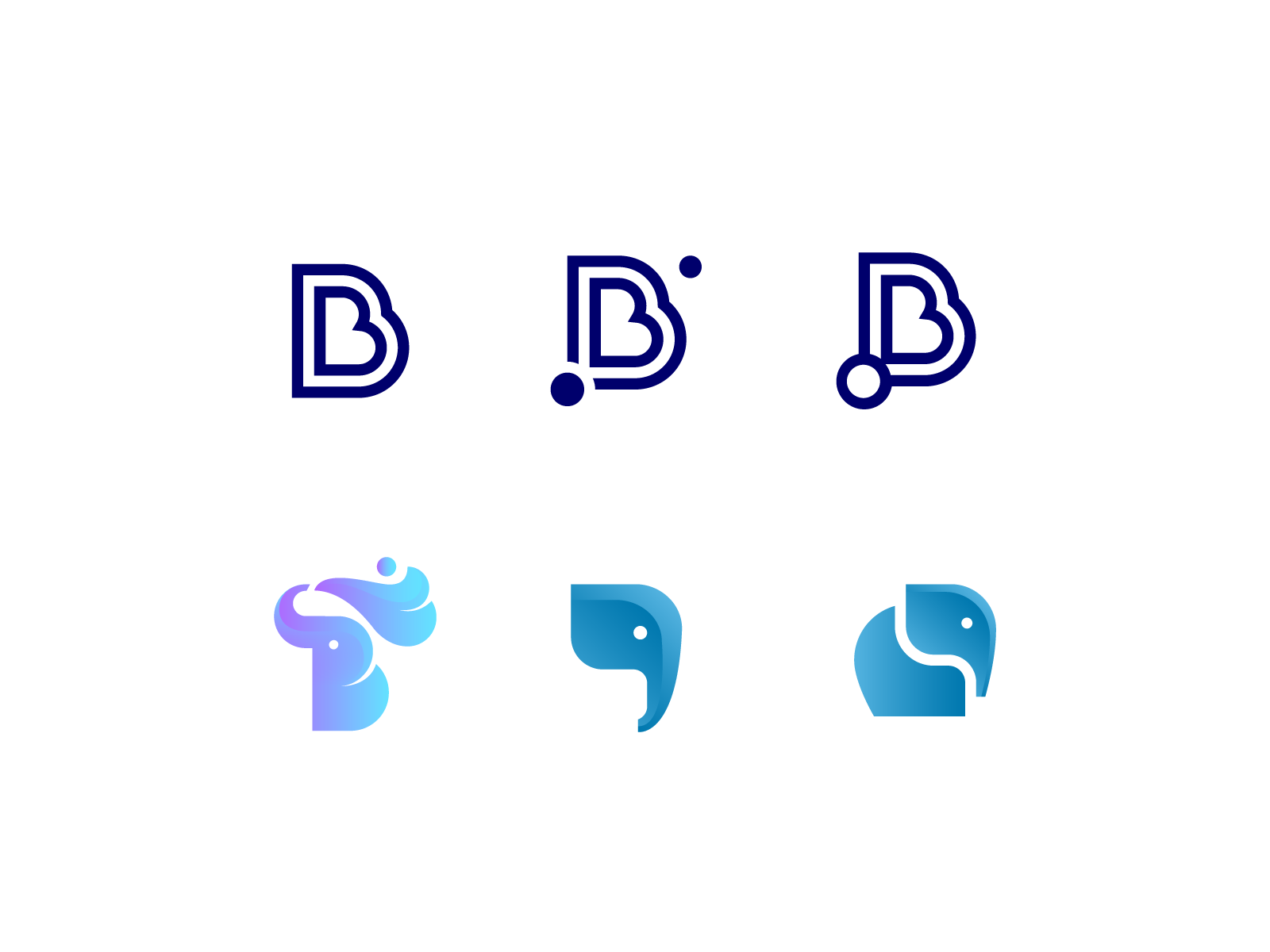
Having reviewed the versions, the client tended to choose the logo presented as a lettermark but wanted it performed with original and friendly mood. So, the next stage developed this direction and the designer presented the set of colorful lettermarks applying the shapes of the wave to echo the idea of water splashes and cleaning and various gradients to make the image noticeable and catchy. Various color options for lettermark logos were also tested for visual impact.
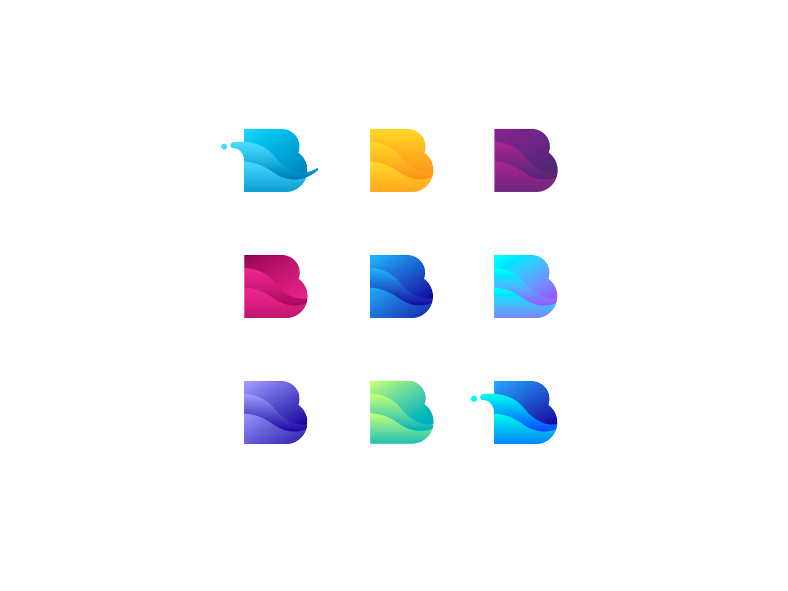
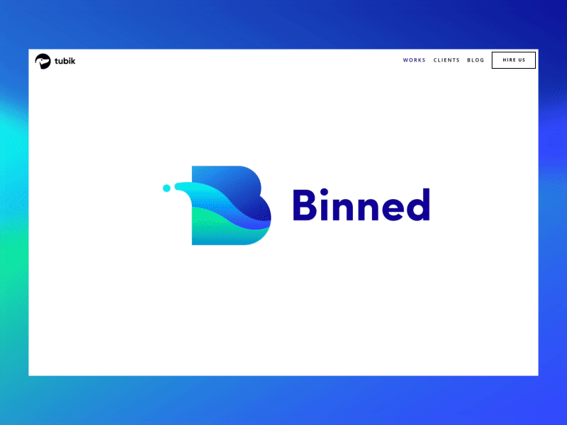
The lettermark design most closely matched the business brand: the final version of “B” was developed as a visually appealing “splash” in watery blues. Also, the client was provided with the combination mark combining lettermark with the entire brand name in a simple yet bold font. These brand identifiers strongly evoke a sense of water, cleanliness, and fun.
The client was finally presented with vertical and horizontal variations in color, as well as a monochrome version, for the lettermark design. This approach provided higher flexibility for further marketing needs.
![]()
Horizontal version
![]()
Vertical version
The monochrome version of the logo is easily recognized and stands out on a variety of backgrounds and surfaces.
![]()
Also, the animated variant of the logo was designed by Arthur Avakyan and Andrey Drobovich to be applied on the website and in social marketing: the motion smoothly imitated the natural movement of water waves and splashes looking attractive and catchy.
![]()
After the logo was approved, the next stage of the design process was aimed at creating branded items supporting general identity.
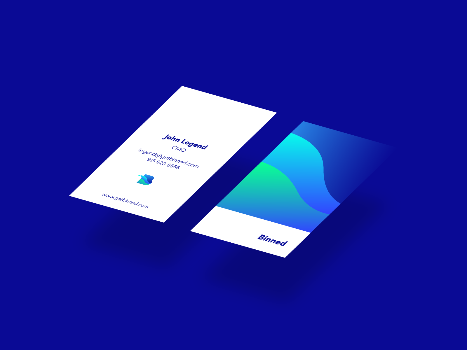
Business cards
Business cards and other stationery items designed for the service reflect the minimalist color palette and typography of the brand identity.
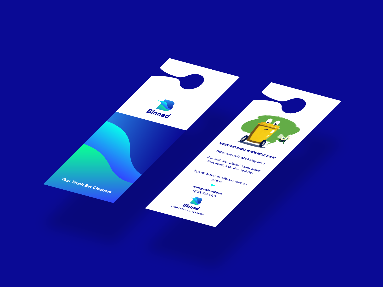
Hangers
The set of hangers were also designed in the same visual concept: their purpose is informing users that it’s time for the bin to be cleaned with the key reasons why. The hangers also featured the funny and cute mascot – yellow bin: it was later used in the promo video for Binned which we will show you in our next case study.
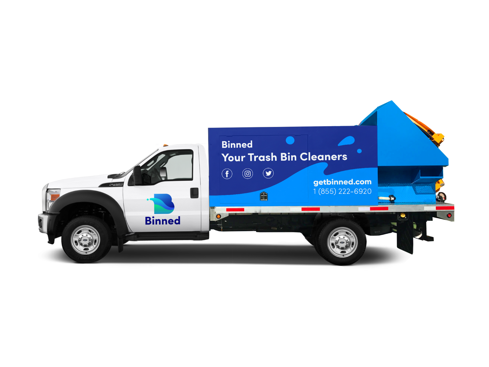
Vehicle
The branding was carried through to the design of other company assets, including the truck livery, which features a bold and easily recognizable brand identity.
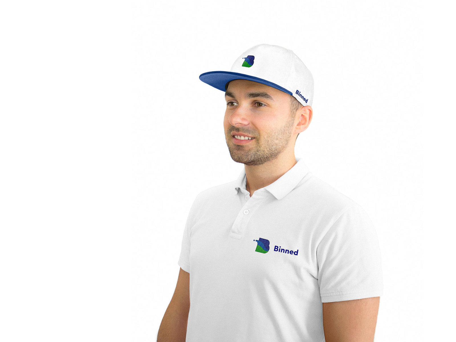
T-shirt
The logo stood up well to use on items such as apparel, where the monochrome background of items such as T-shirts allows the brand identity to pop.
Brand guidelines
The client was provided with a full set of guidelines for logo and identity use, including color palettes, fonts, and placement. Practice shows that the guidelines play the strategic role for brand development: all the further contributors to this process will get clear instructions about correct and wrong ways to use the graphics created for this brand. The document included several sections and informed about the idea which became the basis of a logo, its structure and specifications, color and monochrome versions which could be used for different purposes. Also, it showed examples of incorrect usage in order to avoid poor visual performance. In addition, all the branded items created for this project were included in the guidelines and described in detail.
![]()
To share the details about this project with our readers and clients, we added a new interactive case study in our portfolio. Also, welcome to see the case study on promo video design for Binned.
If you want to know more about the creative stages of the design process for logos, welcome to read our free e-book «Logo Design». Don’t miss the updates here, new case studies on branding, web and mobile design are coming soon!
More Branding Design Case Studies
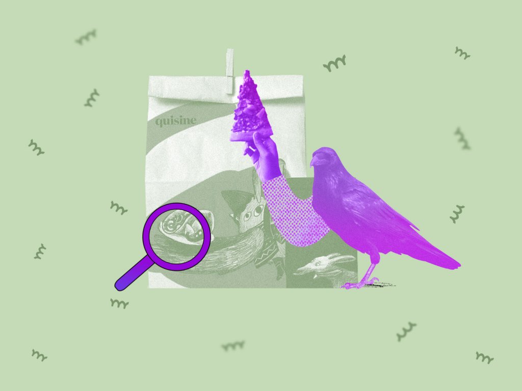
Quisine. Branding Design for Food Delivery Service
Logo Design: Collection of Creative Logos for a Variety of Brands
Dicey. Logo and Mascot Design for Party Game
MYWONY. Storytelling with Brand Intro Design
Inspora. Brand and UI Design for Virtual Stylist
AppShack. Logo Design for a Digital Agency
LunnScape. Identity Design for a Landscape Company
Binned. Brand Identity Design for Cleaning Service