For brands and companies, the logo often becomes the sign of destiny, the instant visual connector of buyers or customers with offered products or services. The importance of a logo as the center of branding strategy is obvious and proved by practice.
The efficient logo is the result of thorough analysis and creative search, designer’s ability to not only produce the attractive visual sign but also keep in mind all the variety of factors influencing design solutions making the logo work properly and support general branding strategy. Earlier we have published here the article presenting all the creative stages of logo design process in detail, and today we want to continue the theme presenting the collection of logos created by Tubik Studio designers. Here you will see the logos made for the wide variety of design tasks and target audience, some of them are already implemented in real branding strategies while others feature logo design concepts showing various styles and approaches. So, let’s get started!
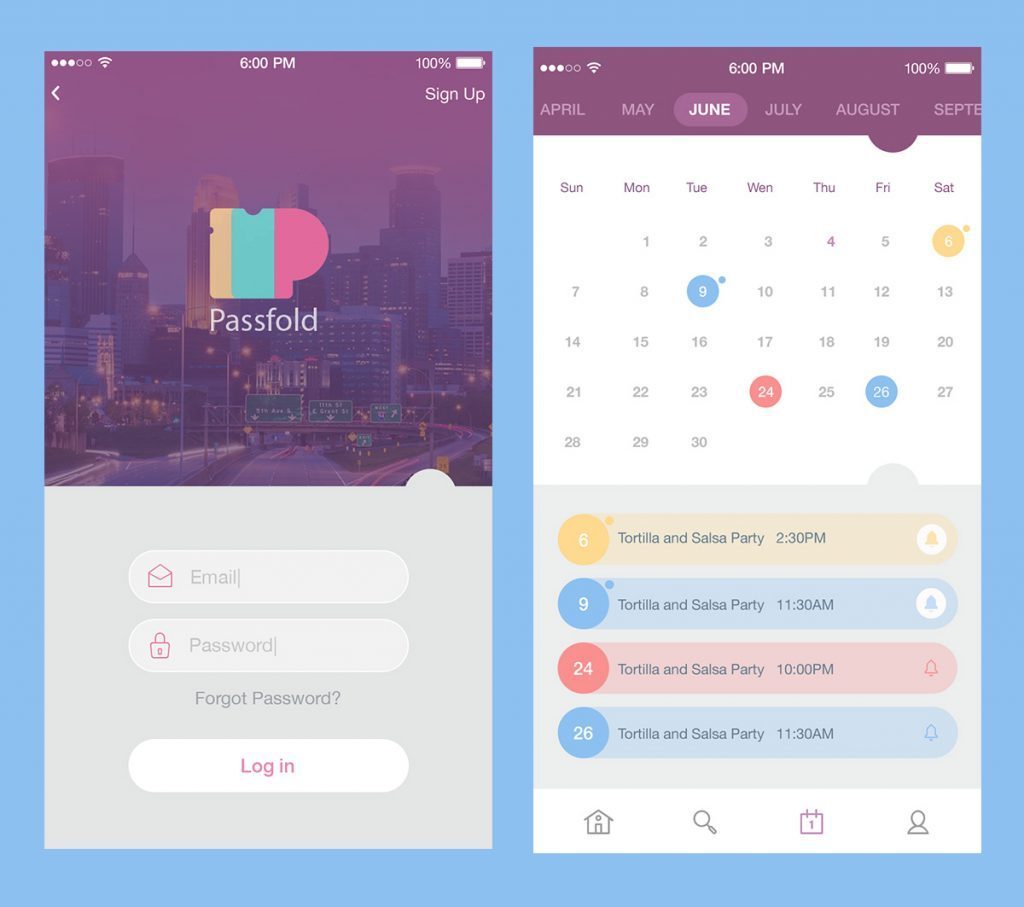
Logo for the app managing tickets and passes
![]()
PassFold logo presents the combination mark: the sign and the lettering for the full brand name, which can present the brand separately or in combination. The sign is actually the image of letter-and-ticket combination featuring the legible and clear capital letter “P” as an initial letter of the brand name but at the same time, it distinctly echoes with the ticket form. It works successfully in different color combinations as well as in the clean stroke version.
![]()
![]()
This design case showed the importance of the tight connection between a logo and the other elements of the user interface as well as a general concept of the product. High attention to all the details provides the result which makes pleasant-looking and efficient design.
Read the full case on logo design here
Logo for a game application
![]()
The logo was accomplished for the game app called Snake Battle. The image is based on the concept of the initial letter S woven as a long slick snake. It seems to be quite natural as the snake is the main active element of the game and also the part of the brand name. The presented combination features the logo icon with the emblem and the variant of lettering for a full game title. The color palette chosen by the designer for the game logo also looks natural: snakes are often associated with different shades of green, while a little gradient and “neon” effect added to the basic color makes it trendy and catchy.
![]()
Logo for a Mac app for developers
![]()
SwiftyBeaver is a native Mac application presenting the integrated logging platform for Apple’s Swift programming language. The target audience, as well as the nature of the product, is quite specific so among different stylistic approaches more abstract version of the logo could show more flexibility in its expressive potential. The variant with stripes was chosen because it made a logo meaningful as logs the app is based on like the logs of trees are stripes so it presented a strong visual metaphor. Moreover, this version got closer to the general visual design of the user interface for the application. Different versions of curves and length of the lines were tried and discussed in search of the most harmonic variant.
![]()
The original version of the logo was colorful, but the monochrome version was also accomplished and tested to provide branding solutions with a high level of flexibility.
![]()
Read the full case on logo design here
Logo for B2B online service
![]()
The logo is designed for a startup based on the idea of enhanced marketing and business growth: Referanza helps businesses improve customer satisfaction and turn happy customers into referrals. The version with bold and massive «R» was chosen as a basis. The clients wanted to see a prominent and clear sign of communication setting the link with the startup activity and philosophy, so the designer offered an option combining the letter with a bubble speech easily associated with a communication.
Read the full case on logo design here
Logo for a C2C e-commerce app
![]()
Saily is a local community app allowing neighbors to buy and sell their used stuff. Therefore, it is a kind of e-commerce app but with a solid communication feature. The first part of the design process included creating lettering which would be highly readable and legible as well as flexible for developing further design solutions.
![]()
The second element was a mascot, a friendly ghost helping users to interact with the app. There were many iterations which ended up with a flat and rounded image of mascot that looked nice and stylish both inscribed inside the icon form and as the separate element of any environment. This solution was accepted as the most universal and flexible for different aims.
![]()
Read the full case on logo design here
Logo for a horse care service
![]()
This case is the logo for Horsy, the company delivering the highest class of horse riding activities. The main brand idea is providing luxury service with love and care of horses. The logo design expresses brand nobility with smooth shapes and a soft color scheme. Added logo animation makes it more lively but still elegant when it’s used in digital products. Logo style guide presents the details about applying the logo to different surfaces and colors with branding aims.
![]()
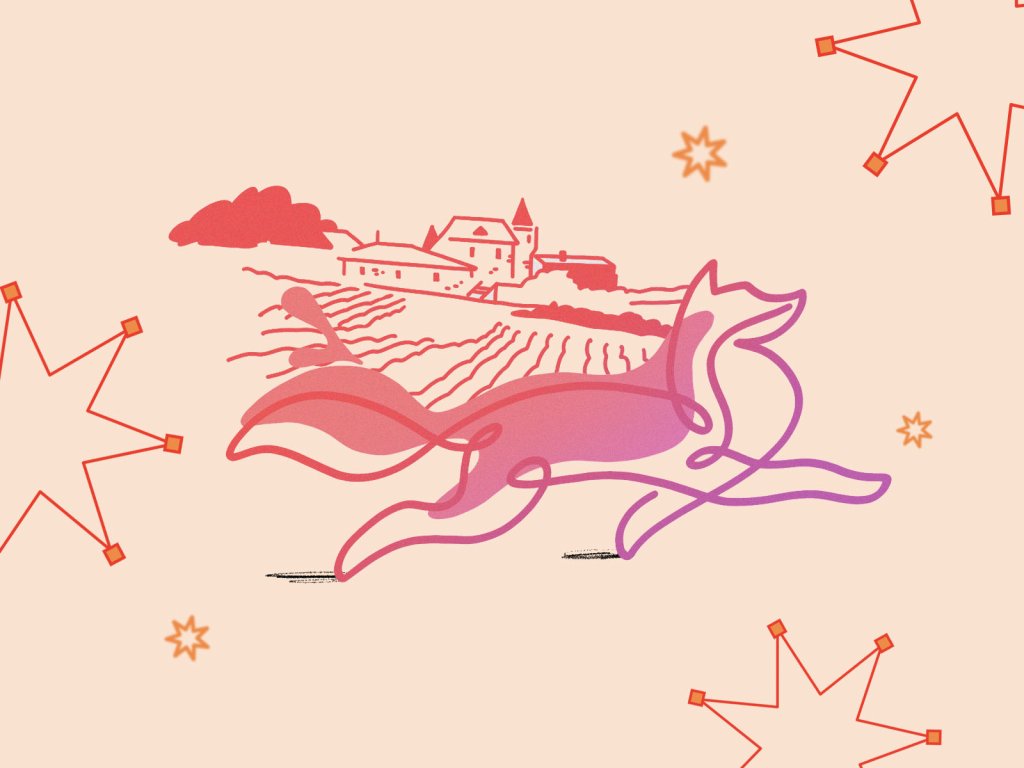
Logo for a social network
![]()
Here is a logo for fOxygenic, a mobile application that represents a social network for people loving active life, open-air sports, and events. As you see, the mascot is combined with the shape of “O” letter. Bright warm color shades reflect not only the traditional vision of a fox coloring but also the idea of dynamic life, joy, and great mood. Moreover, the color has high visibility potential which strengthens the icon’s recognizability.
Logo for a browser
![]()
This one is a logo designed for Lion, the accountability browser applications. The logo is focused on the stylistic version of a mascot echoing with the name of the product and applies a pleasant calm business-like color palette based on shades of blue.
Logo for a landscape company
![]()
The design task was set as a redesign of a logo for a commercial and holistic landscape firm Andre operating in landscape maintenance, tree care, and design. The customers wanted a new logo to be quite classic, memorable, enduring and setting a strong association with land care. So, it was important to provide the visual sign that will instantly inform observers about the nature of the business and create positive vibes via the harmonic combination of shapes and colors. The new logo also featured a mascot so a new shape grown through the set of creative iterations gave the visual concept of a bird and a leaf in one image. This logo became a basis for a broad branding strategy and was applied to many different branded items, you can see some of them in the detailed brand presentation.
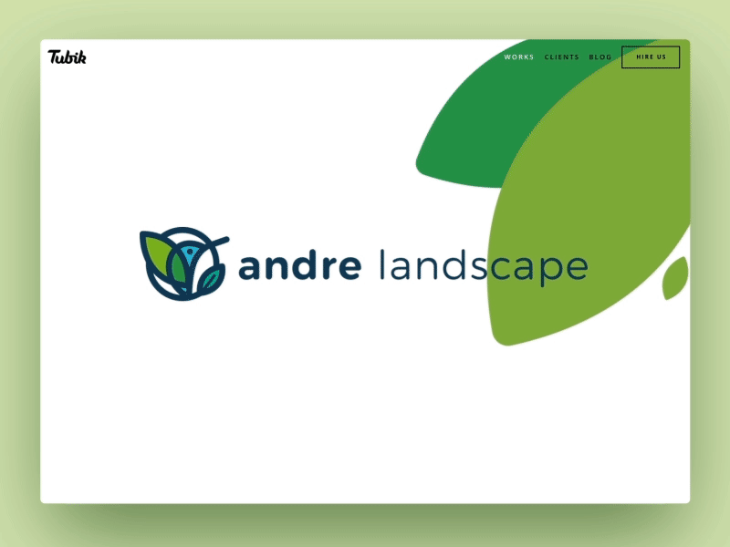
Read the full case on logo design here
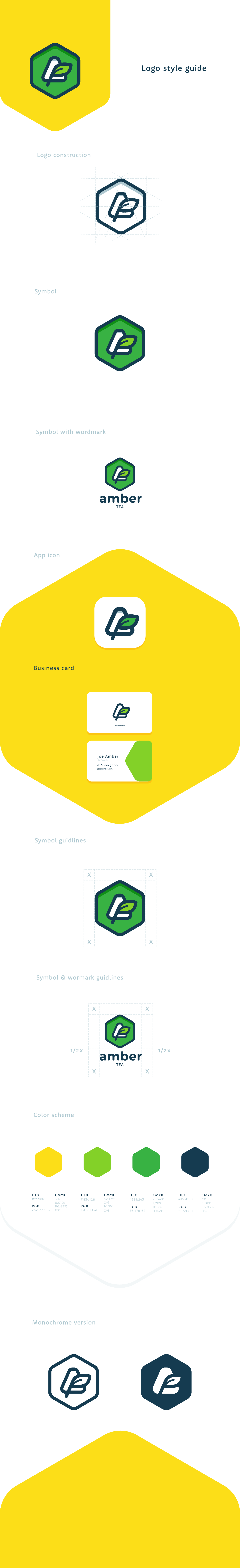
Logo for the tea brand
![]()
This is a logo design concept, which presents one of the iterations of the previous creative search for Andre. It wasn’t chosen by the client, still, it looks nice and the creative team didn’t want to leave it to die in the drawer and decided to keep it for a portfolio. The idea was to transform it into a logo concept for a tea brand called Amber. This creative direction is supported both with color palette, the image of the leaf, and the shape of the letter “A” inscribed into the figure.
Logo for a mobile alarm app
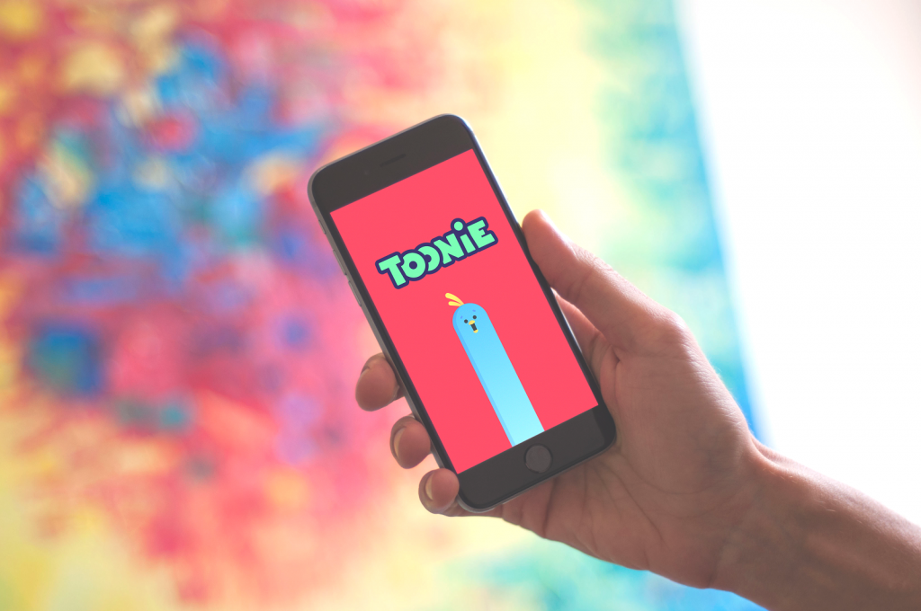
Toonie Alarm is a simple and bright alarm app rewarding users with cute stickers for waking up. The basic brand image was set as fun, cute, bright, and cheerful. Logo design keeps the style of lettering associated with fun and entertainment and creating the harmonic link to the fonts typical for cute cartoons.
![]()
Read the full case on app design here
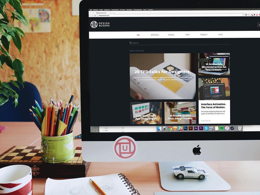
Logo for a design blog
Design4Users is a blog devoted to diverse design issues solving users’ problems. Its mission is establishing a solid highly informative platform for designers, customers, managers, product creators and marketers focused on the aspects of user-friendly design trends, process, organization, collaboration, resources, and tips.
![]()
The logo emblem transfers the basic message: the design resource is simple and easy-to-use. It is done via a sophisticated combination of the basic geometric shapes – circle and square – with the letter “U” in the center reflecting users as a center of design solutions.
Read the full description here
Logo for an online music platform
![]()
Here is the logo concept for OrBeat, the online platform for sharing digitized sound material like music, speech, and specific sound sets on the Internet. In addition, the service has the functionality of a social network: users can create their unique playlists, leave comments, listen to the tracks online and share their sound collection with friends from other social networks. The logo is accomplished on the basis of rounded shapes and features the variety of shades associated with diverse content on the platform.
Logo for events arrangement app
![]()
This is the logo concept for an application called Elephun which is used for arrangement and holding kids events like birthday celebrations, baby showers, and other parties around children. The logo echoes the basic idea behind the name and combines visual elements representing the image of an elephant and some details symbolizing fun, joy, parties, and bright moments of life.
Logo for an app for making choices
![]()
This is a logo designed for Pickitout, an application that allows users to involve their friends in the process of making decisions and choosing the best options. The image of a logo reflects the tick sign symbolizing successful making the choice while the variety of colors features the nature of the app as dynamic, cool, fun, and trendy.
Logo for a music app
![]()
It’s a branding sign concept for a music app SwitchUp with broad functionality for generating and sharing playlists. The keywords behind its branding are “bright”, “dynamic”, “fun” and “positive”. So, the logo is accomplished in the stylistic direction aimed at creating this sort of image instantly. It features the form of a play button to set the link with the nature of the application while the animated version enables breathing life and rhythm into the visual sign.
All the cases prove that the logo is the object of thorough creative search and analysis of various factors, both objective and subjective. Logo obviously presents the key element in establishing the foundation for efficient branding and marketing. Its design, taken seriously and based on user research, analysis, talent, and design laws can become a solid basis for successful communication of the brand with its buyers, customers, and users, that is why it needs a careful professional approach.
Today’s list is over but studio practice is full of many other interesting examples of design concepts for different purposes and needs of modern users. Don’t miss new presentations in our future posts.
Useful Articles
Remember Me. Basic Types of Efficient Logos
Shape and Color in Logo Design. Practical Cases
Design Me Live: The Power of Mascots in UI and Branding