It is not a secret that people are mostly visual creatures. They are often driven by what they see faster than by any other way of perception. That is why an efficient visual sign is so important to make a company, brand or service recognized quickly and remembered for a long time. Investigations of the way to prosperity and fame of the most successful businesses will inevitably prove how vital it is to choose the good representative sign which is well-known as a logo and which is always the basis of the whole branding strategy.
Here in Tubik Blog, we have already published several case studies showing the process of logo creation in detail and also provided deeper considerations on correlations of branding and user interface design. Today using the background of diverse practical experience, let’s get deeper into types of effective logos illustrated with Tubik team designs.
What is a logo?
According to the Merriam-Webster dictionary, a logo is “a symbol that is used to identify a company and that appears on its products”. Even this quite broad definition contains the obvious message: logo somehow becomes the first visual association that is brought out when people think over or hear the name of the brand. Like any other visual element, the logo itself can contain and transfer the message about the nature of goods or services presented by the brand, the tone and voice of the company’s communication with the customers, the general brand image.
Logo design usually becomes the basis for the whole brand strategy which is often fixed in a special set of rules and guides about the brand strategy called a brand book. An efficiently designed logo can definitely increase the recognizability of the brand or company which enables the business to achieve its goals, be it selling more goods, involving more customers, getting more subscribers or obtaining wider recognizability. In addition, a logo is a sign that makes the product or service different from its competitors which is also an important pre-condition of the company’s fast and successful development.
Most logos look like a simple sign and that makes people think the process of its creation is fast and simple, not needing too much effort or special skills. And that is quite a mistake. Efficient logo design is a complex strategy that includes all the stages of the design process and marketing process such as:
- user research,
- marketing research,
- creative search,
- choice of style direction,
- choice of color palette,
- testing in different sizes and environments,
- creating a style guide setting right and wrong cases of logo use, etc.
That is why a lot of companies including startups, which only start their way in the sphere of business, prefer to trust this essential task to professional designers. Practice shows that the logo thought-out to the slightest details is the worthy investment.
Types of logos
Historically companies tried different variations of visual elements to strengthen their branding: some of them preferred images or mascots as the central element drawing attention while others favored the idea of nice lettering immediately showing the name of the brand. Through the decades, designers outlined five basic types of logos.
Icon/ Symbol: logo represented with a visual element of high symbolic potential. The image can represent the name of the company, perhaps its mascot or the sign that symbolically shows the nature of the product or service.
![]()
Lion browser icon
![]()
fOxygenic logo
![]()
Logotype/ Wordmark. This is a widely used type of corporate identity mark represented by artistic lettering featuring the full name of the brand. It is a well-known fact that different sorts of types and fonts can immediately transfer the messages and whole stories to their readers and this trick is frequently applied by logo designers and marketers.
![]()
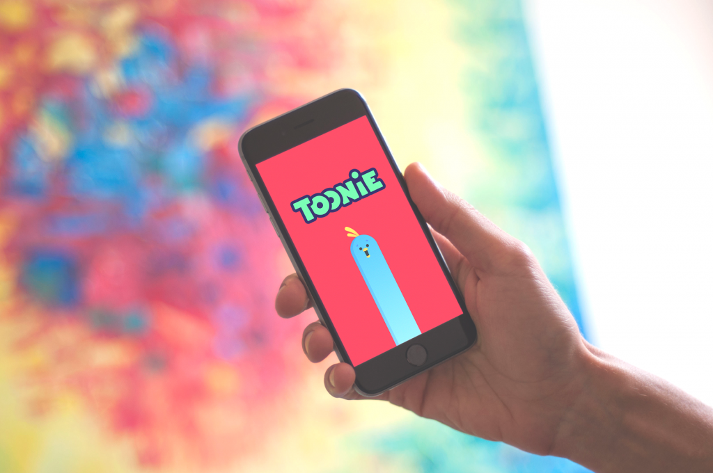
Toonie Alarm wordmark
Lettermark. This type of logo uses the technology close to the previous type but features only the first letter of the brand name presented in an artistic manner. This sort of logos is often effective in small sizes, for example, app icons, when reading the full word is difficult. However, they need special attention in the aspect of originality and recognizability as it can be a complex task to make this one letter different from the other same letters representing other brands.
![]()
Combination mark. Combination mark is usually the logo applying two techniques simultaneously: symbol or lettermark and wordmark. In this case, observers obtain two different sources of information, being able to see the image and read the word representing the brand identity.
![]()
Genius bar logo
![]()
![]()
Andre logo: different variants of lettering placement
![]()
![]()
Emblem. This is also a sort of visual elements combination. The difference of this logo kind is that it inscribes the wordmark or lettermark presenting the name of the brand into the symbolic image instead of placing it over, under or beside the symbol as it is done in the previous case. The logos of this sort when created thoughtfully feature the integral and compact identity sign.
![]()
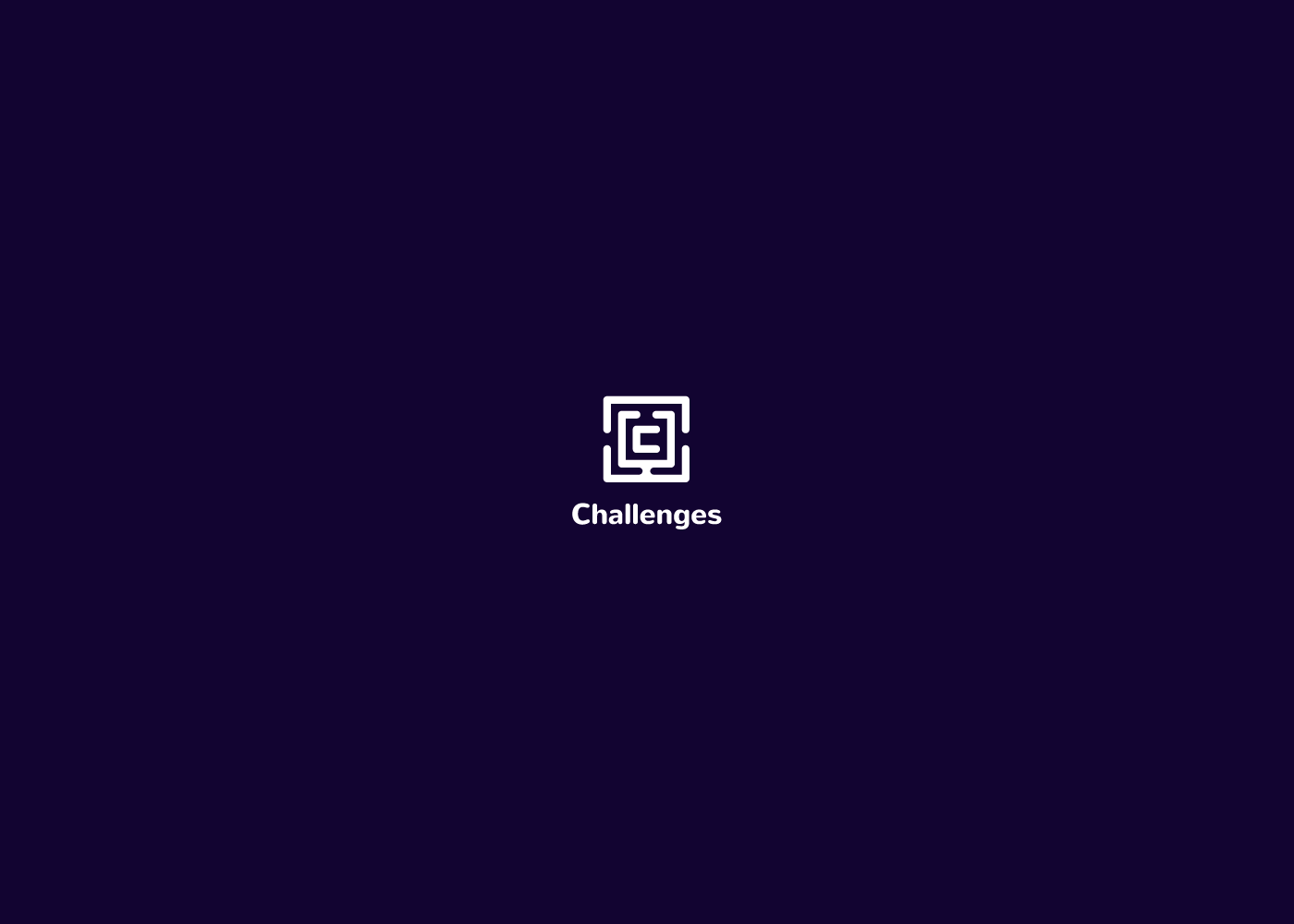
Challenges logo design
Features of an effective logo
Whatever is the choice of the creative direction in the logo design for a particular brand, any logo should include the basic number of efficiency features:
- simplicity
- originality
- versatility
- recognizability
- consistency of use
- appeal to the target audience
- informativeness
- memorability
- longevity.
![]()
The provided set of logo design features doesn’t really look simple to be combined in one sign. That is why this job is advised to be done by professional designers. Even tiny disharmony, inappropriate color combinations, lettering illegible in small sizes, and tons of other invisible mistakes can considerably reduce the profits and customer trust to the brand. Logo is a sign able to connect or disconnect customers and sellers in split seconds, so its creation definitely is food for thought and an object of thorough attention.
Useful Reading
Shape and Color in Logo Design. Practical Cases
Design Me Live: The Power of Mascots in UI and Branding
Don’t Stay Still. Why Brand Needs an Animated Logo
6 Creative Stages of Branding Design: Step-by-Step Guide
Logo Design: Collection of Creative Logos for a Variety of Brands