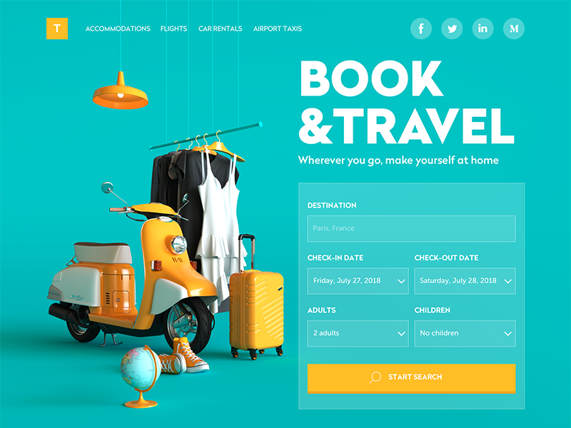
One of the basic features of product usability is thoughtfully created navigation. It doesn’t matter if the visual performance is creative, stylish, original, catchy and so on and so forth, in case the users don’t know where they are and how they could reach their goals with the website or app. Whatever is the reason that brings users to your digital product, the high level of respecting them means letting them know what is going on and where they are going at every step of interaction with it. Earlier we have already published the Glossary posts with key terms for the topics of usability and web design as well as business terms and abbreviations. This time the perspective will get focused on navigation aspect: let’s check out what parts and elements of the interface are responsible for this vital issue.
Navigation
In its basic meaning, the word navigation names the sphere of the human activity responsible for enabling a vehicle to get from one place to the other, controlling and supporting this process. According to etymology dictionary, the term has deep roots and comes from the Latin word navigare “to sail, sail over, go by sea, steer a ship,” which in its turn is based on two words: navis “ship” and agere “to set in motion, drive, drive forward”. So, to navigate is to make possible for someone or something to cover the planned route. This is the foundation from which the numerous meanings of this word took the start and adjusted in many other spheres.
In terms of user experience design, the concept of navigation is one of the basic notions setting usability. Navigation, in this case, could be generally defined as the set of actions and techniques guiding users throughout the app or website, enabling them to fulfill their goals and successfully interact with the product. The aspect of efficient navigation has a great impact on setting a positive user experience: users start using apps or websites with particular aims and expectations, and that’s designers’ task to set the best and easiest route to solving users’ problems.
The aspect of helpful and seamless navigation in UI should be thought out from the early stages of creating the user interface. Users are navigated via an interface with a number of interactive elements such as buttons, switches, links, tabs, bars, menus, fields and the like, some of which will be described more in detail below.
Here in Tubik, we support the workflow in which all the basic navigation issues, such as layout, transitions, elements placement and functionality, are set in the early phase of UX wireframing and then checked with a simple prototype to make sure all the important operations and options are clear for users. Neglecting this essential aspect sets high risks that all the other effort on design can be just wasted, so it’s much more user- and client-friendly to start with the basics.
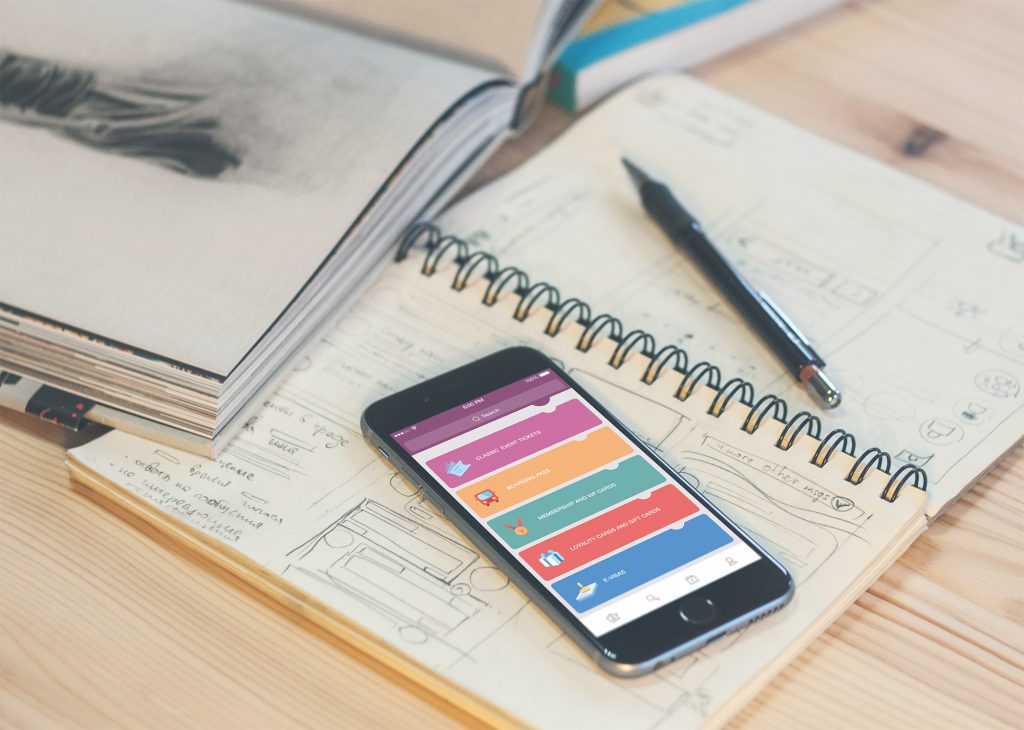
Menu
Menu is one of the core navigation elements. It is a graphical control that presents the options of interactions with the interface. Basically, it can be the list of commands – in this case, options will be presented with verbs marking possible actions like, for example, “save”, “delete”, “buy”, “send” etc. Menu can also present the categories along which the content is organized in the given interface, and this can be the high time for using nouns marking them.
Menus can have different locations in the interface (side menus, header menus, footer menus, etc.) and different ways of appearance and interaction (drop-down menus, drop-up menus, sliding menus, etc.) Any solution, which a designer makes about menu functionality, appearance, and placement in general layout, should be based on thoughtful user research, analyzing not only the potential wishes and expectations of the target audience but also their tech literacy and possible environments in which the digital product could be used. A well-designed menu can significantly speed up the process of achieving goals and satisfying needs that lay a solid foundation for a positive user experience.
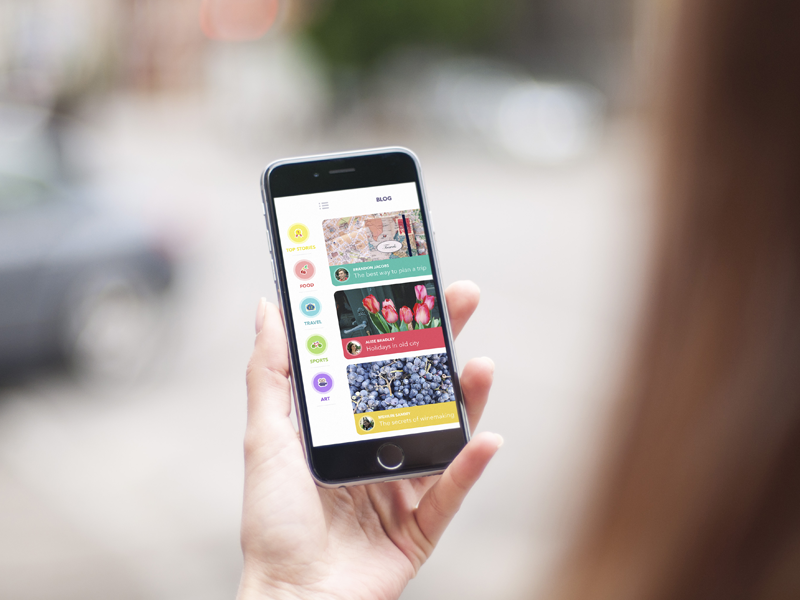
Here is the example of mobile blogging app interface which features a left-side menu presenting the categories of content. The copy describing positions in the menu is supported with icons presenting recognizable visual mark for the category.
The presented app UI concept shows the type menu applying the effective technique of color marking: when users move to a particular category, the specific background color is used for all the content in it, which forms strong associations and quick perception of the nature and theme of data the user sees.
CTA
Behind the widely used abbreviation CTA, designers and content creators mean a call to action. This is actually the word of phrase which stimulates users to interact with a product in a way and for the aim it is designed for. CTA elements are the interactive controls that enable users to do the action they are called to. Typical types of such interactive elements in the layout are buttons, tabs, or links.
In the interfaces of all kinds, CTA elements are the core factor of effective interaction with the product, which plays a crucial role in usability and navigability. When all the path of interaction and transitions is built clearly for users but CTA element is not thought-out, placed or designed well, users can get confused and will need to take additional effort trying to achieve their goals. That sets the high risk for poor conversion rates and general user experience. That’s why this navigation element should draw particularly deep designer’s attention. In any interface, it should be one of the most prominent and quickly noticeable parts to inform users how the product can be helpful or useful for them.
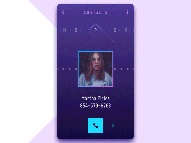
As we mentioned in the article with tips on copy content in UI, some call-to-action elements may be represented with icons that don’t require copy using widely and instantly recognized images such as a telephone receiver for making a phone call or the envelope for opening received mail. The app interface presented above shows this case: the button with a receiver is the most prominent interactive element on the screen navigating the user to achieving their goals with the app quickly, and it doesn’t need the copy to let users understand what action can be done with it.
However, when the image of an icon is not so obvious or can be misleading, it is more effective to use the double scheme, when the icon, button, or link is supported with the copy.
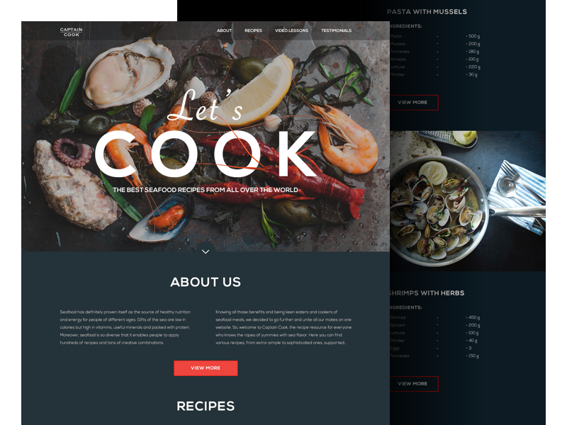
The example above features the landing page for a web platform devoted to cooking seafood. The headline of the page presents a call to action and immediately sets the theme by both verbal and visual means. Still, this call to action is not interactive. The active CTA elements are clickable buttons informing users that after clicking they can see more information on the particular topic or recipe. The bright color enhances the visual hierarchy on the page and draws users’ attention to the key interactive zone.
Bar
Bar is a section of the user interface with clickable elements enabling a user to quickly take some core steps of interaction with the product or it can also inform the user on the current stage of the process. Among the basic types of bars, we could mention:
Tab bar – in mobile applications, it appears at the bottom of an app screen and provides the ability to quickly switch between different sections of an app.
Loading bar – the control informing the user on the current stage of action when the process is in the active stage and the user can see the flow via timing or percentage shown in progress.
Progress bar – provides feedback on a result of the current process so far, for example, showing how much of the planned activity has been done.
Button
Button is, perhaps, one of the most popular elements of any interface. Button is the element that enables a user to get the appropriate interactive feedback from the system within a particular command. Generally speaking, a button is a control with which the user directly communicates to the digital product and sends the necessary commands to achieve a particular goal, like, let’s say, send the email, buy a product, download the data, turn on the player and tons of other possible actions. One of the reasons why buttons are so popular and user-friendly is that they efficiently imitate interaction with the objects in the physical world.
Modern UI buttons demonstrate high diversity and can serve plenty of purposes. Typical and frequently used buttons which present an interactive zone, usually clearly marked out for visibility and having a particular geometric shape and often supported with the copy explaining what action will be fulfilled via this button. Designers usually apply considerable time and effort for creating effective and noticeable buttons that are harmonically added into the general stylistic concepts but are contrast enough to stand out in the layout.
Besides, we could also mention several types of buttons with additional functionality, widely used in mobile and web interfaces.
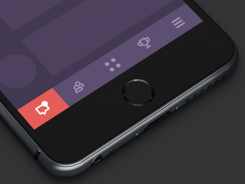
Hamburger button – the button hiding the menu: clicking or tapping it, a user sees the menu expanding. It is called so as its form consisting of three horizontal lines looks like a typical bread-meat-bread hamburger. Nowadays it is a typical element of interaction, still highly debatable due to the number of pros and cons.
Most users who visit and use websites on a regular basis know that this button hides the core categories of data so this trick does not need additional explanations and prompts. Hamburger menus free the space making the interface more minimalist and full of air as well as allow a massive saving place for other important layout elements. This design technique also provides additional benefits for responsive and adaptive design hiding navigation elements and making the interface look harmonic on different devices. Although hamburger menus still belong to highly debatable issues of modern web and app design, they are widely used. The arguments against the hamburger menu are based on the fact that this design element can be confusing for people who do not use websites regularly and can get misled with the sign which features a high level of abstraction. So, the decision about applying the hamburger button should be made after user research and definition of the target audience’s abilities and needs.
The presented website concept uses a hamburger button to hide the menu and support the general minimalist approach to the visual performance of the layout.
Plus button – the button that being clicked or tapped presents the ability to add new content, be it a new contact, post, note, position in the list – anything user could do like the basic action with the digital product. Sometimes, tapping this button, users are directly transferred to the modal window of creating content, in other cases, there is also a medium stage when they are given additional options to choose from and make adding the particular piece of data more focused.
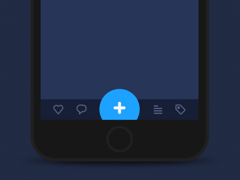
Here is the concept showing that the plus button first enables a user to choose the category of the added content (image, video, text) and only then directs him or her to the particular screen where it can be done. This practice takes seconds still makes the experience more user-friendly as designers can present users with modified options of adding content for every particular case.
Share button – the button enabling a user to share the content or achievement directly to social networking accounts. In the vast majority of cases, it is presented with icons that present a brand sign of particular social networks and are easily recognizable.
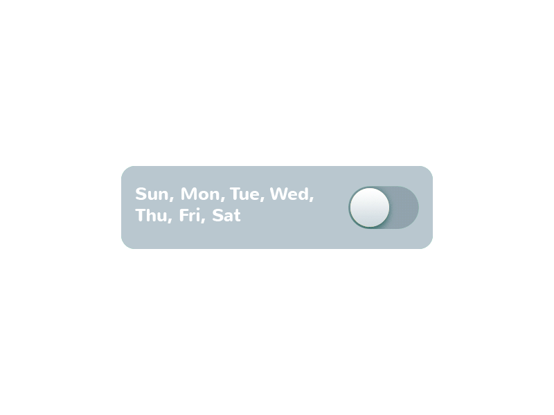
Switch
Switch is a control that enables users to switch the option on or off. Again, it is applied with a high level of efficiency and popularity in the modern interfaces because it presents the direct imitation of switches people are accustomed to in real life. The important point of consideration here is that states of the switch should be visibly clear and distinctive so that users could avoid applying effort to understand if the option is active or not. Various sorts of contrast and slight animation can solve the problem by making the experience simple and user-friendly.
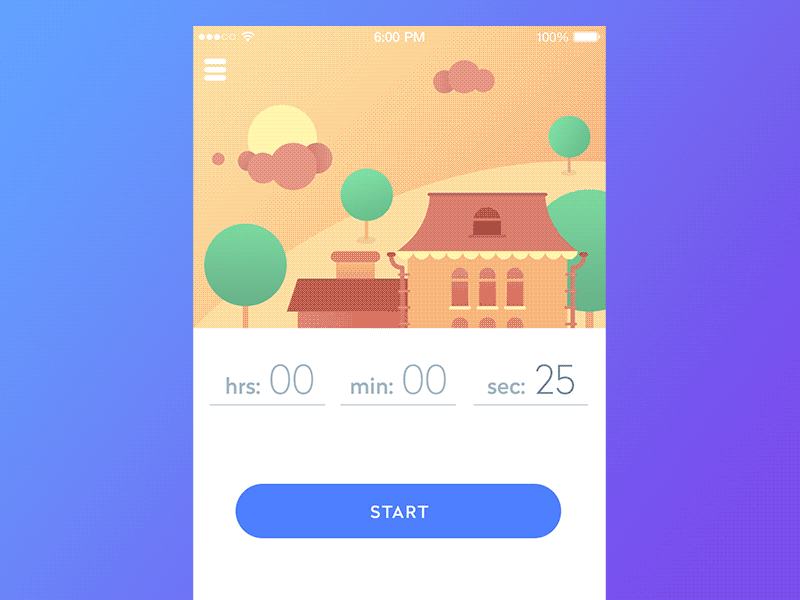
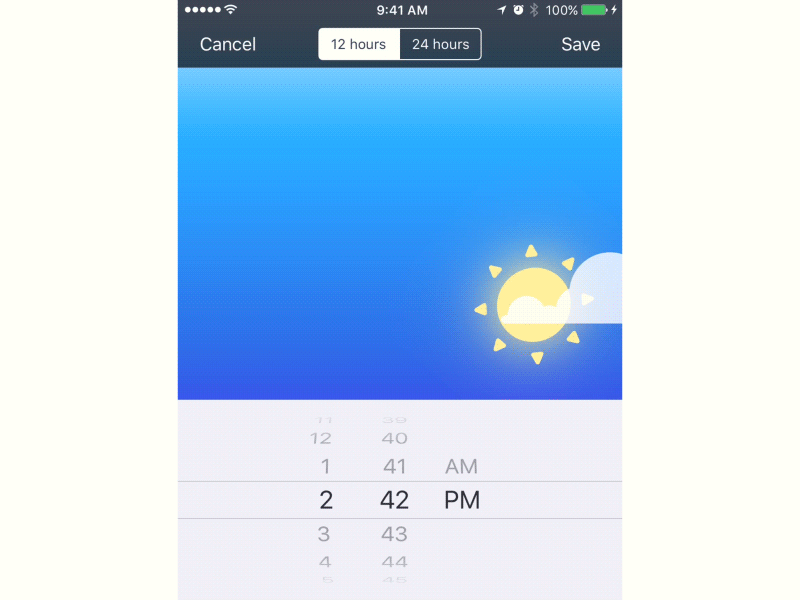
Here is the switch turning on and off the alarm in the Toonie Alarm app. Animation makes the interaction smooth and natural while changing the color of the tab and the toggle transforming into a spinning sun lets users instantly understand whether the alarm is active. If you want to see the full case study on how this animated element was designed and developed, welcome to check the details here.
Picker
As it becomes clear from its name, the picker allows users to pick the point from the row of options. It usually includes one or several scrollable lists of distinct values, for example, hours, minutes, dates, measurements, currencies, etc. Scrolling the list, users choose and set the needed value. This type of interactive element is widely used in the interfaces which have the functionality of setting time and dates.
Checkbox
A checkbox is a graphical UI element that is used to mark a particular piece of content, usually setting the choice for the binary options. It is another element setting the bridge with the real world as it looks really similar to the process of filling in tests, questionnaires and other stuff of this kind when you put a tick or color the box to mark the option. Checkboxes and switches can be found in any type of user interface, especially in the sections of the user, screen or page settings. Also, checkboxes present a common part of navigation in apps and websites with the functionality of task managers, to-do lists, time trackers and the like.
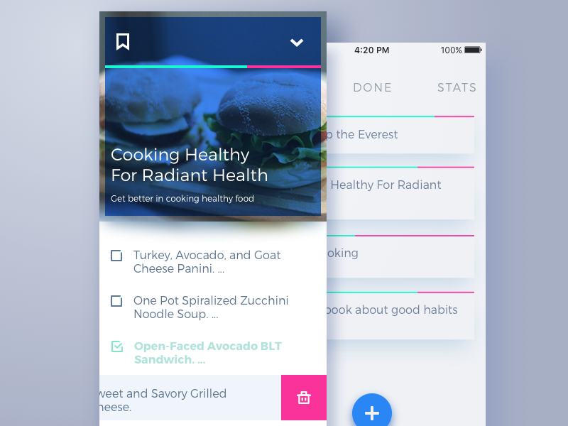
Here’s an example of the design concept for the mobile to-do app for complex tasks. Tapping the checkbox, users mark the task as done and it automatically gets faded, the copy is colored differently and the font gets bolder to support the contrast of this task with the ones which are still in progress.
Today’s set of our glossary is ready for those who need it and we are going to continue this practice before long. Don’t miss the new sets – the next one will continue the issues of navigation with deeper insights into types of menus and buttons, tags, breadcrumbs, and icons. New definitions are coming soon!
Recommended reading
Here is the set of recommended materials for further reading for those who would like to get deeper into this topic and learn more about the theme.
UX Design Glossary: Interface Navigation Elements. Set 2
iOS Human Interface Guidelines
Small Elements, Big Impact: Types and Functions of UI Icons
Visual Dividers in User Interfaces: Types and Design Tips
Directional Cues in User Interfaces
Basic Types of Buttons in User Interfaces