The new year is always a good chance to remember, analyze, observe, and make plans. Starting a new design year, we are going to review some of the popular design trends and traditionally invite you to join. Following the review of illustration and graphic design trends, let’s see what trends established or strengthened their positions in user interface design for websites and mobile applications. As usual, it’s packed with UI design examples.
Brutalism
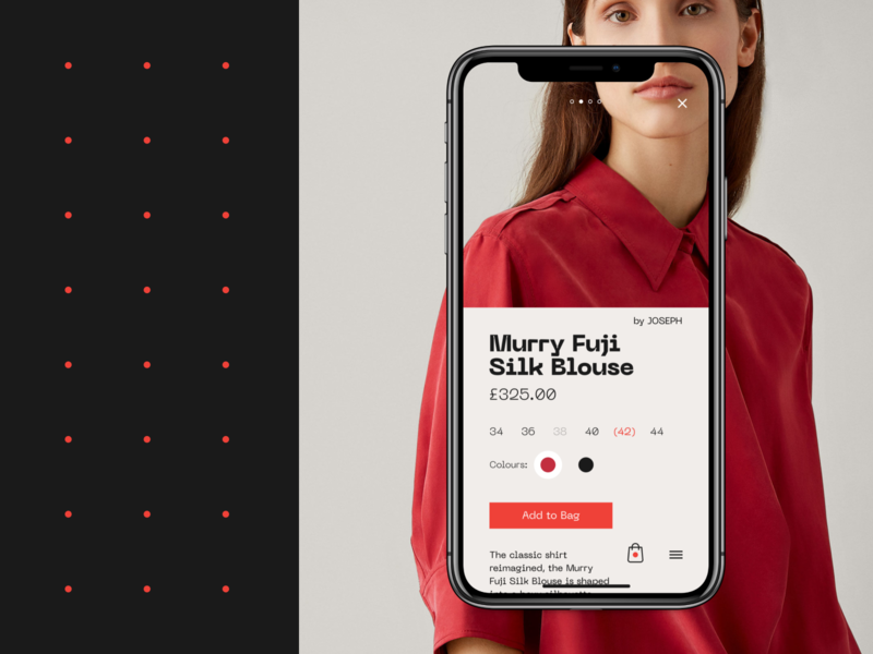
The trend of brutalism in UI design has been rocketing this year, getting more and more diverse expressions for websites and apps. It is often described as a style that aims at breaking standards and predictable design techniques. The websites and apps created in this manner are a sort of rebellion to sophisticated designs with thought-out symmetry and harmony, complex layouts and accents of aesthetic visual performance. In contrast, brutalism is based on simple and raw appearance, in most cases not loaded with many visual details and sometimes even close to a plain HTML page. Used thoughtfully for the appropriate goals and audience, it features a high level of originality, stimulates interest, and gives the unique look to the interface. You may like it or not, but you’ll never leave it unnoticed.
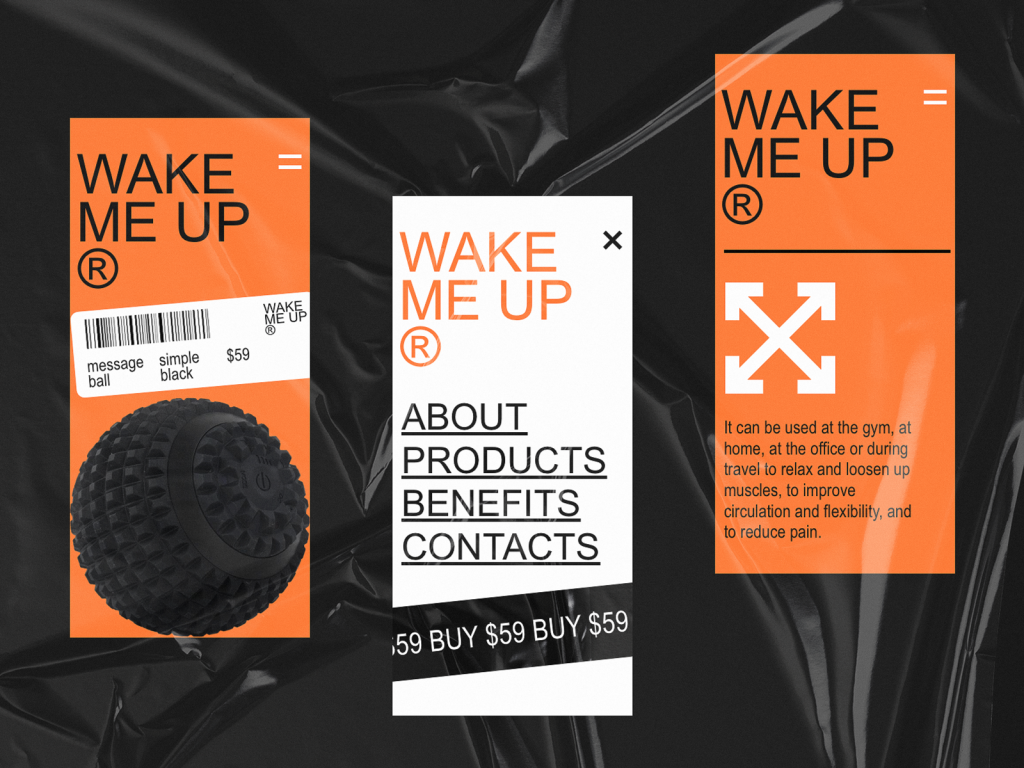
Mono-ecommerce website and its mobile version designed in a brutalist design manner
The website for a metal plant with atmospheric and trendy visual content instantly sets the visual association. The general approach is based on brutal design. The layout applies the strict grid and small margins, as well as light background for the parts with text content to ensure high readability.
Dark Theme
The recent year brought a new rise of popularity for dark color schemes. As we mentioned in the design article devoted to this issue, a dark background applied in user interfaces can provide essential benefits such as:
- style and elegance
- feel of mystery
- luxury and prestigious look
- the broad field of using contrast
- support of the visual hierarchy
- depth in the reflection of the presented content
- visual appeal
Dark backgrounds are especially effective for the interfaces focused on a variety of images, such as photos, illustrations, 3D arts, even videos.
Gallery app based on visual content and dark background giving it deep elegant looks
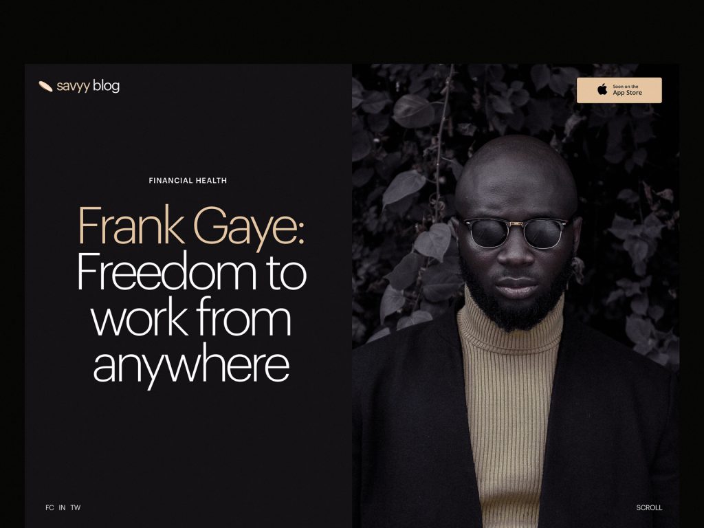
Blog design for a financial service using the dark background
Dashboard for Designer AI, the tool on artificial intelligence helping fashion designers, also applies the dark background as it basically operates with visual content
Minimalism
One more trend to mention is another great bunch of apps and websites designed by the principles of minimalism. They support a positive user experience by providing clear and simple interfaces, full of space and air, focused on content, and only core navigation with a high level of intuitiveness. Minimalist interfaces demonstrate thorough attention to visual elements, not numerous but always transferring a particular message. Also, they show sophisticated work with typography and visual hierarchy supporting instant scanning and skimming the content of the page or screen. However, the pitfall of working with minimalist interfaces is double thinking over the information hierarchy and navigation so that not to hide from users something crucial and not to lower the level of usability.
Minimalist lookbook for the website of MYWONY, the studio producing exclusive wedding dresses
Minimalist product page for the website devoted to zero-waste living
Typography-Based UI
Catchy but scannable typography as a crucial part of any design concept continues to keep its high presence in web and mobile layouts. It’s even hard to call it a trend as it should be seen as the default and crucial part of the UI design process. Designers pay much attention to keeping it not only beautiful but also readable with typographic hierarchy and choice of proper fonts. Yet, there is a noticeable trend of more and more interfaces designed around typography as the core of the user experience design and attractiveness, with no images at all. The visual and emotional appeal, in this case, is reached with not only the search for interesting and original fonts but also with animation, color contrast, filled and outline letters in one piece of text, and other tricks. What’s more, design approaches now demonstrate deeper care about text content itself and its integration into the layout. For example, informative and catchy taglines have shown a growing presence as a part of web interfaces, especially on landing pages.
Typography-based interactive website for a digital marketing agency
Transparent Navigation
Many examples in this post feature another trend: the transparent background for navigation elements. Now designers find a good level of contrast to make the navigation visible and legible instead of marking out special zones with another background. Such an approach supports the feeling of the integrity of all the layout. The most popular zone to apply such a trick is website headers that are often sticky in the process of scrolling the page but non-distractive for users due to such a neat presentation.
Elegant website for the hairdresser brand uses a sticky transparent header
Diverse Text Directions
The recent months have shown the growing interest in the experiments with different directions for text lines and blocks: not only traditional horizontal lines are used but also vertical or even shaped into circles, squares, or other figures. This way some elements of the screen become both decorative and informative, catching users’ attention with unusual looks. In addition, vertical placement sometimes can help to save some space on the screen. Still, the important point is not to over-experiment, leaving this kind of originality for short text elements that won’t hurt the readability and scannability of the webpage.
Website for a niche cake bar uses prominent visual elements and experiments with text elements direction in the side menu as well as circled copy in logo and tagline
Book festival website uses the vertical placement of menu items
Interface Illustrations and Custom Graphics
The trend of integrating custom graphics of all kinds into user interfaces is getting even stronger and more diverse. From small graphic elements that both attract users’ attention to some zones, functions, or information to memorable mascots, prominent hero illustrations and product images, 3D graphics and animated stories – it seems, designers now are super armed for any goals. Made in various styles, custom graphics effectively support the quick perception of the information on the page or screen. They also set the solid foundation of visual originality and adds aesthetics and beauty to landing pages, blogs, and websites.
Webpages for the blog articles devoted to zero-waste living feature custom title illustrations as well as slight and attractive graphics for a loading animation
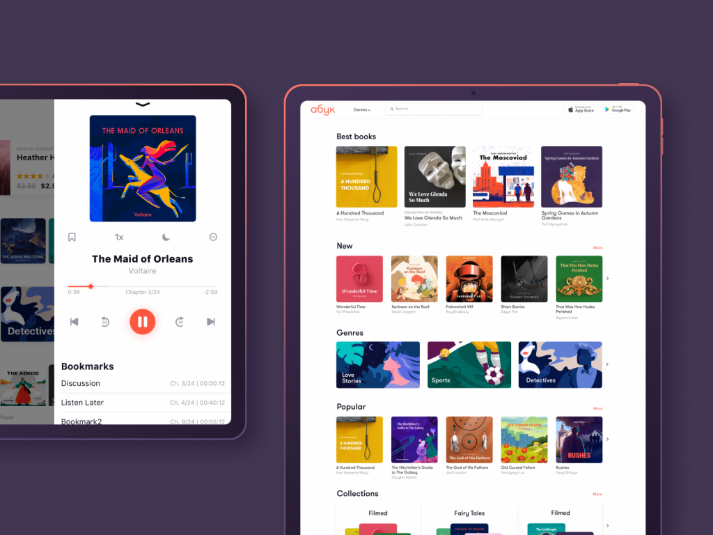
The examples of custom book covers and theme illustrations we designed for the audiobook store ABUK
Funny characters designed for onboarding screens of the bee and honey service app
The event app uses the original illustration as a funny and engaging loading animation
Website for GNO blankets features a variety of custom graphics: hero illustration, icons, and multilayered product visualization
Experimental Interactions
Under conditions of tight competition growing day by day as well as new challenges for digital products, user experience designers are always in search of new ways to give users more, to solve their problems faster, and to present information in a digestible and eye-pleasing way. So, the experiments with interactions, controls, and navigation step up to a new level.
The event app features a set of interactions for creating a new event and changing the date with the use of quite unusual pickers control
Nuance Animation
No doubt, now motion is already an integral part of UI design. Yet, now animation integrated into web pages and mobile screens also demonstrates the growth of diversity. Designers show more interest in motion for nuances and slight details, this way engaging users, beautifying the interfaces, strengthening the associations to the physical interactions, and amplifying aesthetic satisfaction.
The book review website uses nuance animation marking the special titles for books or reviewers, this way adding dynamics to the page and attracting users’ attention to those items
The About page for the cleaning company website with engaging scroll animation
Glitch animation used for the tagline in special offer page for Designmodo catches the user’s attention and give the page a more trendy look
Interactivity Adding Fun
Another trend getting higher and higher presence is the growing interactivity aimed at adding fun and wow-effect to interactions as well as engaging users to stay on the page longer. The progress of web development tricks and technologies stimulates that process so more and more interfaces of that kind appear on stage.
Interactive product page for zero-waste living ecommerce uses engaging animation of checking the color options
The website for exclusive watches collection uses interactivity for product images
Interactive webpage for Tubik Academy intensive course lets users interact with a model of hamburger button
Decorative Fonts
The recent year has shown a new wave of interest to the experiments with fonts. It sets a kind of contrast to the earlier trend of super simple, san-serif fonts that were chosen for the sake of readability but with time made many websites and apps look like identical twins. So, now web and app designers often turn to catchy decorative fonts that add their two cents to originality and stylish looks. The objects covered in these fonts – such as headings, subtitles, taglines, and the like – usually have the size that’s big enough so the readability aspect doesn’t suffer.
Niche cake bar website uses prominent photo content and decorative fonts to create an attractive offer
Evening wear ecommerce website uses decorative fonts, full-screen theme image, and unusual grid together creating a minimalist but informative page
Video Integration
As technical improvements in the sphere of web development don’t stop, video backgrounds and any other kind of video content integration for web pages aren’t seen as a great challenge anymore. So, web designers often turn to full-screen videos as a way to capture people’s attention, create the needed atmosphere and give an instant view on the product or service that is offered.
Forest camping website uses a video as a hero image in the above the fold area this way instantly creating a visual trigger of the offered service and evoking the correspondent emotions
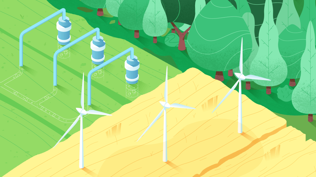
The home page for the website of agricultural holding uses an atmospheric full-screen video capturing attention from the first second
Hairdresser’s website integrating video demonstration on the page
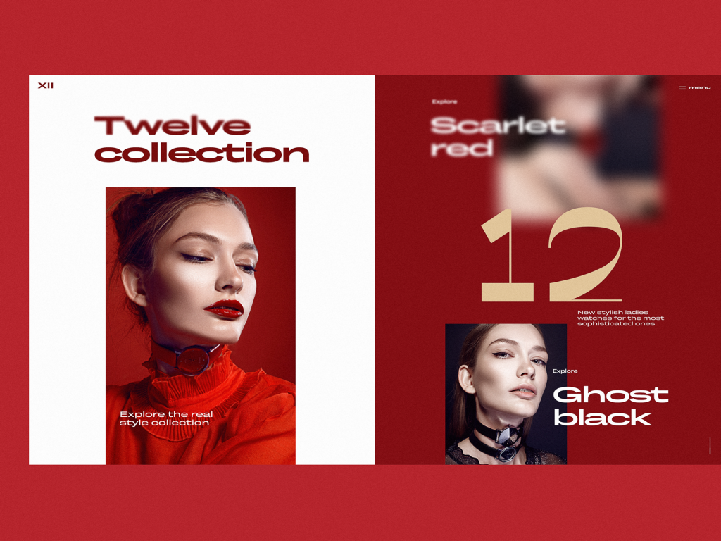
Full-Screen Background Visuals
The previous example also features another trend solidly established in user interfaces now: full-screen visuals of all kinds that are used instead of a neutral background. These can be photos, illustrations, abstract compositions, specially rendered visualizations, or even video, as you could see above. The approach makes the screens visually and emotionally appealing as well as informative, as the image instantly captures users’ attention much faster this way. Also, it supports the feeling of the integrity of all the layout elements. However, it requires much skill and effort to find the right contrast and hierarchy of elements and integrate the navigation and text content properly so that the page wouldn’t turn into an illegible mess.
Website of the MYWONY wedding brand features the full-screen process video as a background for tagline and navigation in above the fold area of the home page
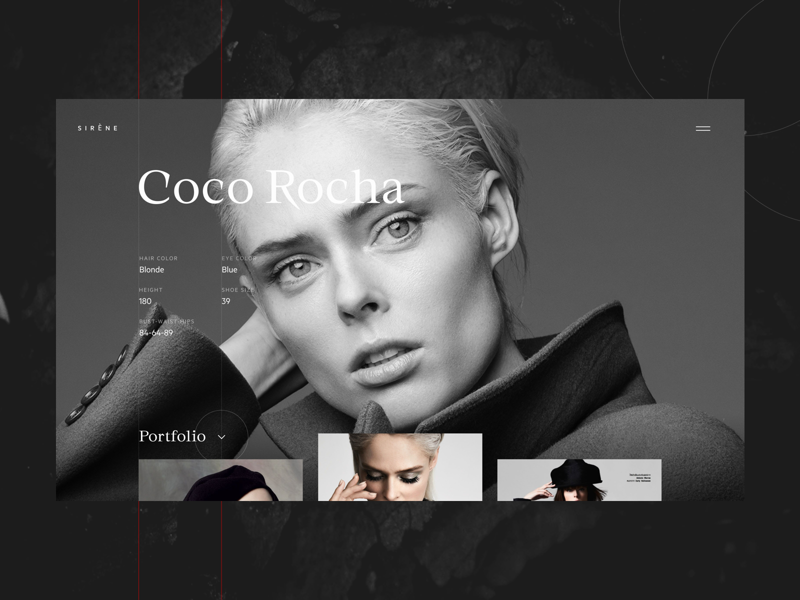
Fashion model portfolio webpage uses the photo as a background
The trendy website for the online magazine uses the photo background and asymmetric grid for copy blocks
3D Graphics and Animation
The integration of various 3D graphics into mobile and web interfaces continues its steady growth in the diversity of styles. And designers are now more flexible to move from static images to 3D animation to make webpages or app screens even more dynamic and engaging. Creating this kind of graphics requires specific skills and an artistic eye; it may be quite challenging and time-consuming. Yet, it’s worth the effort: 3D graphics are always eye-catching and present a kind of flexible visual content. Depending on what you need, they may look photorealistic which is a big advantage for user interface design as the graphics of this kind may save the game when proper photo content is impossible to get or too costly. As well, designers have room for creative experiments and may create non-realistic images increasing the originality of UI.
The landing page for a crypto report uses original 3D graphics and animation
Custom 3D graphics and animation designed for Status app onboarding
Split Layout
It seems that websites and mobile screens tend to keep another trend of the recent year – split screens and pages. This design practice is nothing new – it goes away and comes back in various spheres of design, but now it’s well alive. The approach is effective from the perspective of responsive design: it enables to play with content variations not missing the consistency. In addition, it opens the limitless area for color combinations and experiments. Split screens are also helpful when it’s important to show the duality of options of equal importance.
Mobile ecommerce app using the split screen to make the interactive zone clear
Calorie calculator app using the split layout to separate the interactive zone for inputting the personal data from the animated illustration quickly evoking emotional and aesthetic appeal
Split layout for the ecommerce website offering an exclusive collection of watches
Original and Limited Color Palletes
With color being one of the crucial factors of visual perception, psychological influence, and beautiful looks, designers pay much attention to color choice and tend to try new uncommon combinations. Another trend from this perspective is using very limited or even monochrome palettes, not distracting users with a variety of colors. For the recent year, it burst with plenty of elegant and super stylish designs.
The website designed for the cleaning company uses the color palette uncommon for this sphere of services and adds even more wow-effect with quite a futuristic animation
Book festival website uses an elegant limited palette of bold colors
Color Contrast Separating Content
Making colors more and more functional, another trend designers tend to apply broadly now is applying color contrast to distinguish screens or content within one app or website. This way designers not only add a pinch of diversity into the product but also provide effective visual separation for different kinds of content or various purposes.
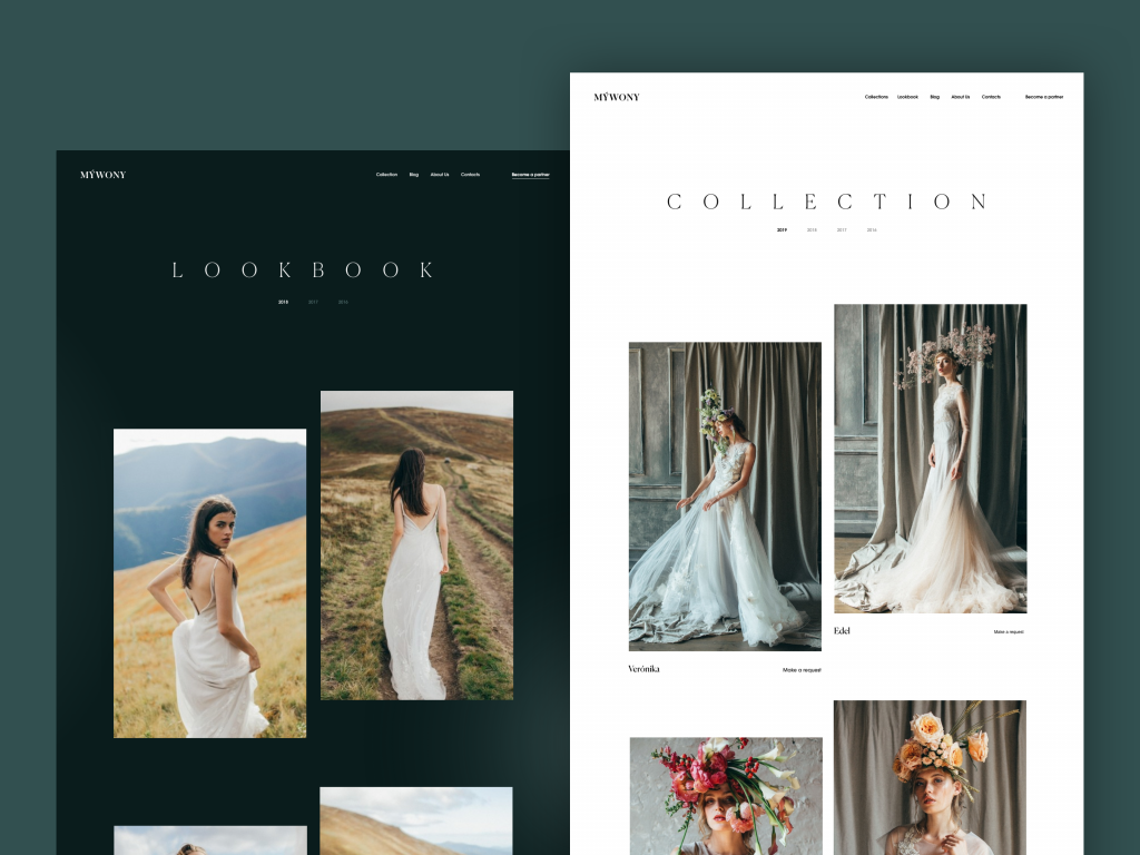
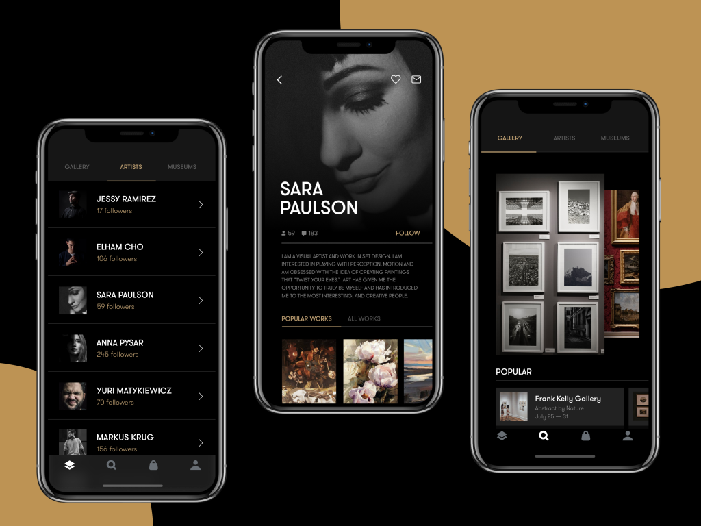
MYWONY website separates content with contrast backgrounds: a dark background is used for Lookbook screens while Collection screens feature the light background
Choice of Color Scheme
Another thing color helps to provide is personalization. UI designers and developers strive to provide more functionality with which users may customize the features according to their personal needs, and among the most popular options, you’ll find the choice of the color scheme users get for a particular web or mobile interface. Sure, it takes more time and effort invested in the design and development process. Yet, it definitely contributes much to positive user experience. This year the trend gets even more actual, with many designers seeing the color theme choice as a default part of interaction design.
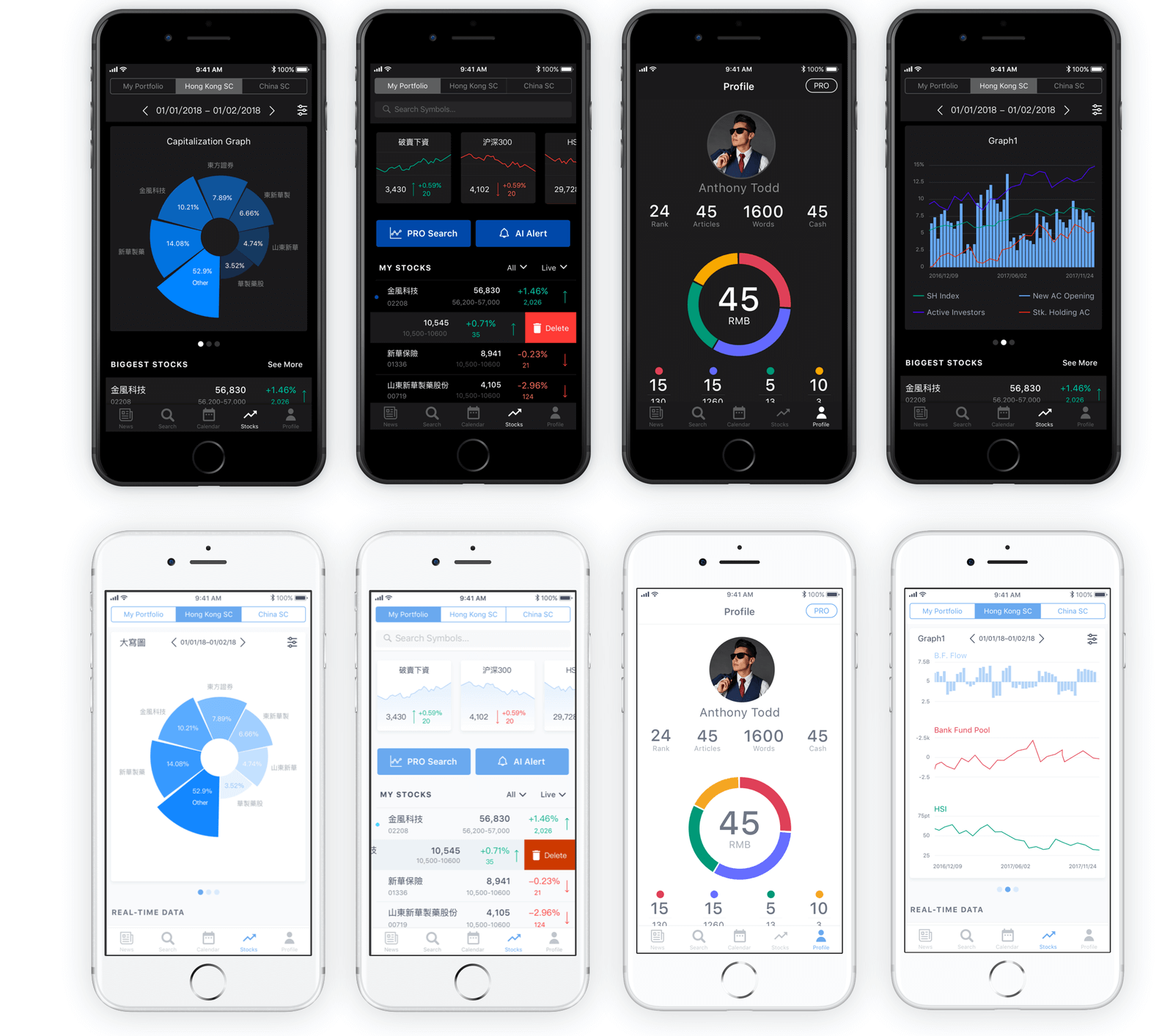
Dark and light theme for Bitex stock analysis app
Experiments with Grid
Creative experiments with grids seem to be never stopped for a recent couple of years and is getting new and new faces now. The custom grid effectively helps to save the feeling of harmonic layout and placement of the elements with a high level of flexibility and originality. In many cases, it’s also the way to rethink the visual hierarchy and draw the visitors’ attention to the needed zones or elements of the layout. Or it helps to consume a big amount of homogeneous content easier. Asymmetry, broken grids and other experiments at that perspective are considered helpful in achieving that goal. However, the creative approach of this kind requires attentive research and testing. So, the effective result is often reached via several iterations tested and analyzed on usability and visual perception.
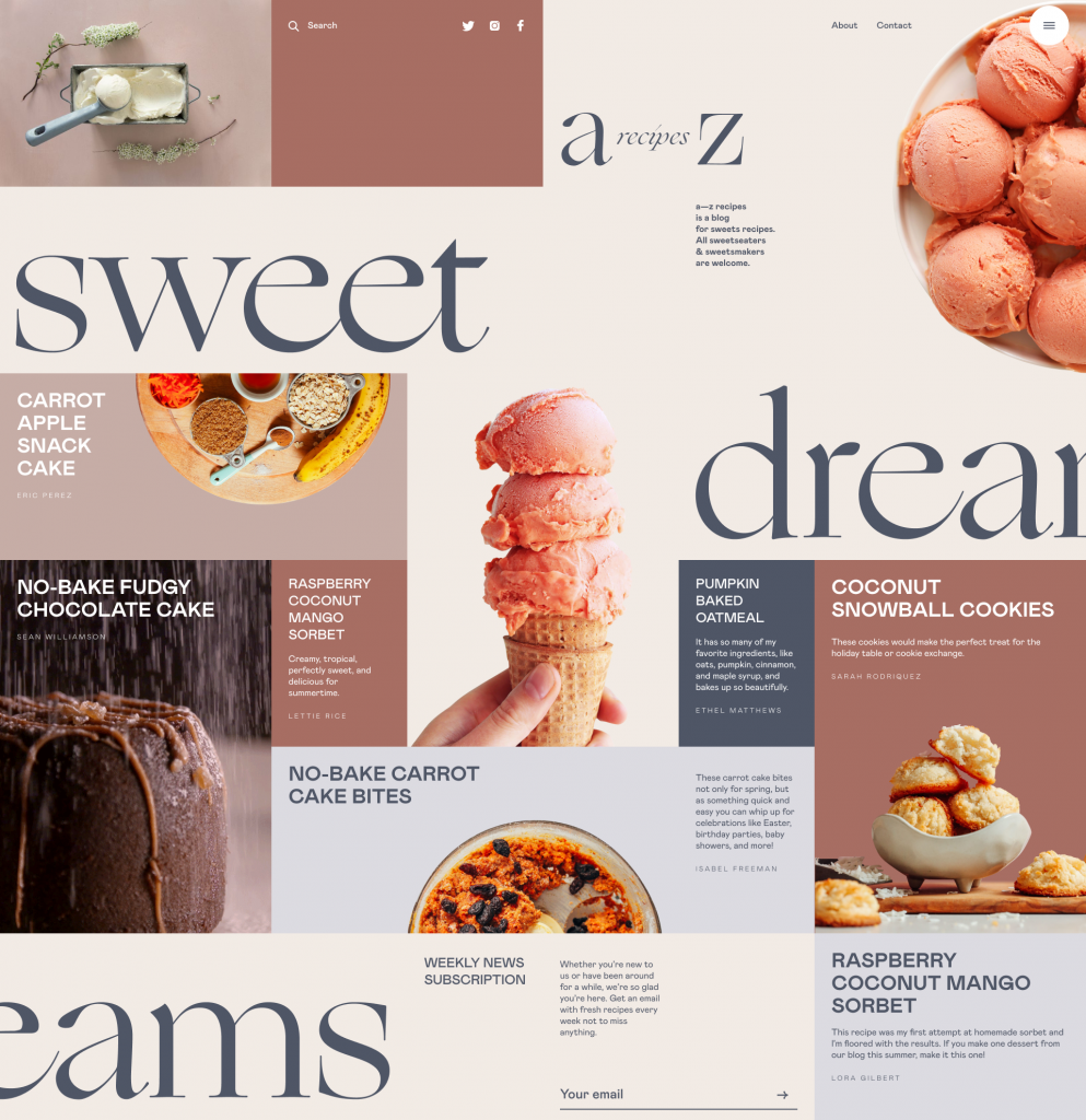
Sophisticated and micro-balanced grid for the web design of the dessert recipe blog
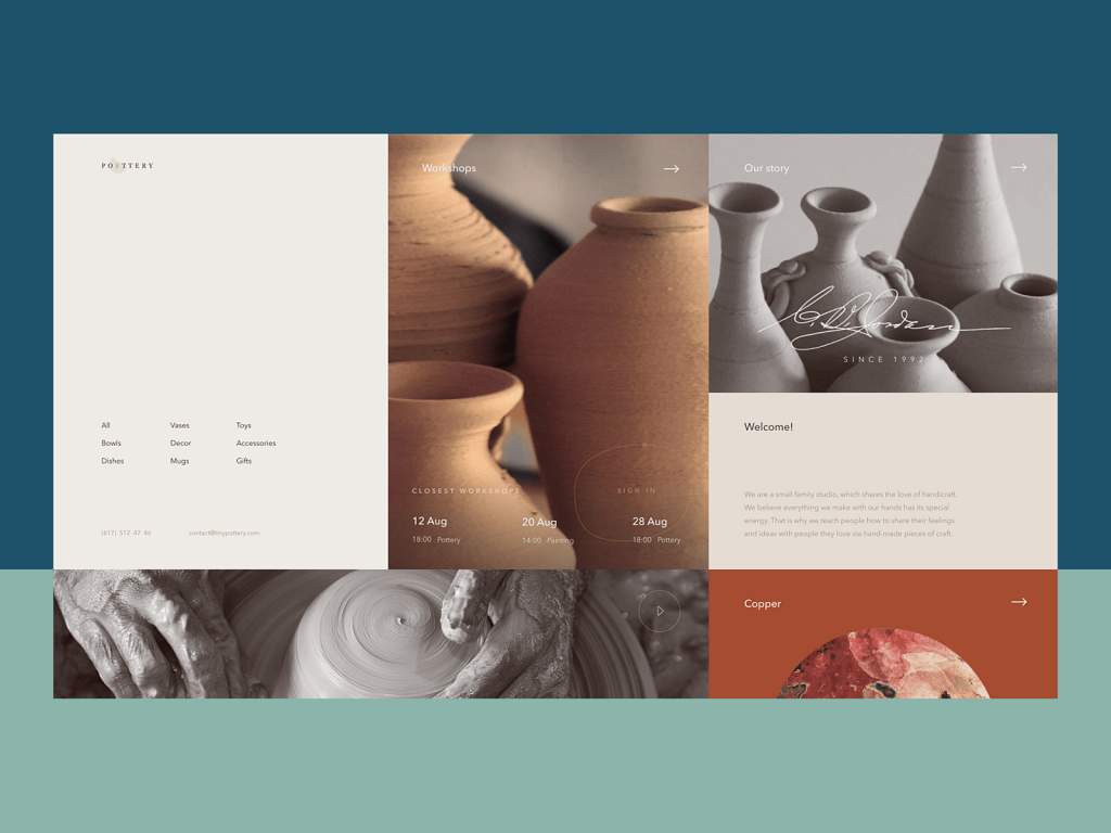
Elegant grid performance for pottery website design
Prominent Photo Content
For a couple of recent years, we could see that custom graphics like illustrations or 3D images tended to overpoise more traditional and conservative photo content. This way designers got more flexibility to create something out-of-the-box as there was a wave of negative feedback on the lack of originality in stock photos while producing custom photo content could be even more expensive and difficult to organize than getting custom graphics done. Now it looks like photo content gets back on the scene. With more and more sophisticated compositions and attention to detail, sometimes even stock photos look super cool, let alone the fact that the production of custom photo content also diversified and got more affordable for many cases. So, now we are observing more and more designs with photos put in the center of attention: hero images that immediately set the mood and atmosphere, informative and catchy product images shown in a much bigger size than we used to see them before, and so on.
Product page for the ecommerce website selling glasses uses big product images and the original way of browsing through the options right on the page
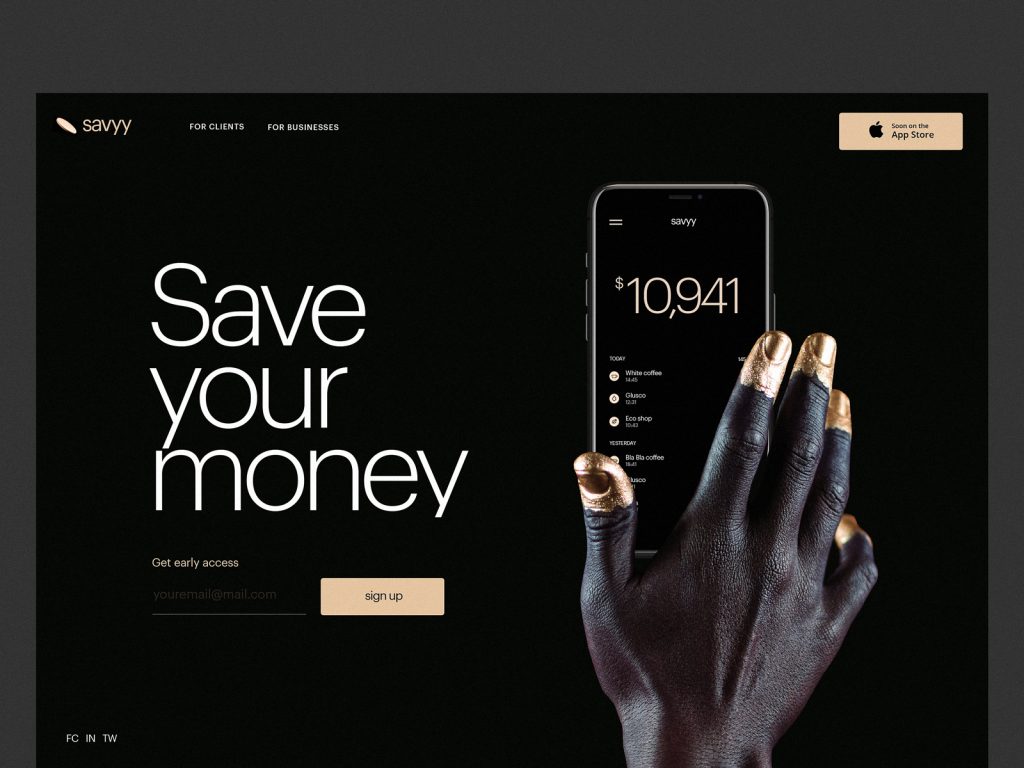
Landing page designed for the financial service uses the original visual approach to photo content to draw users’ attention
Interactive Onboarding
Design for onboarding is for sure not an invention of today. However, one of the rocketing trends getting more and more diverse is the advent of interactive intro projects giving a deeper understanding of the brand, company or product and supporting their promotion with emotional and catchy storytelling. These can be tutorials, cartoons, animated stories, integrated gamification elements and mini-games, interactive magazines and the like.
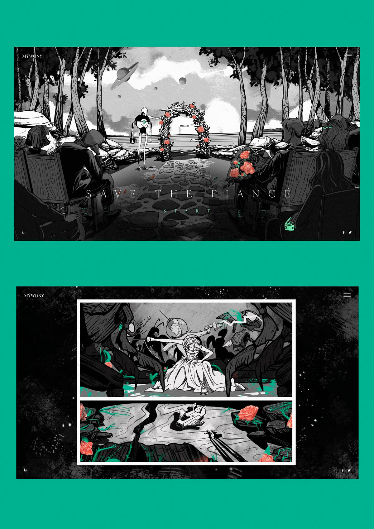
A glance at the interactive brand intro for the wedding brand MYWONY features a cartoon telling a romantic story in the style of sci-fi comics.
Infographic-Style Numbers
As we mentioned in the article about web scannability, readers subconsciously associate numbers with facts, stats, sizes and distance — data that is potentially useful. So numbers included in copy catch reader’s attention while words representing numerals can be missed in the bulk of copy. What’s more, numbers are more compact than the textual numeral, so it makes the content more concise and time-saving for scanning. One of the trending design features goes even further: it makes the numbers prominent and more noticeable than text as it’s often done in infographics.
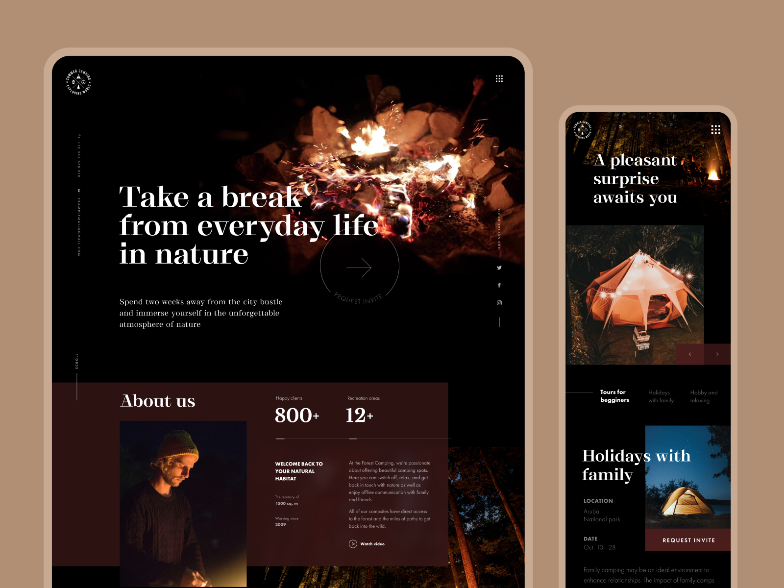
Forest camping website uses infographic-style numbers on the home page catching user’s attention
Website for an AI-based marketing service focuses attention on a prominent and catchy number for price
So, we’d like to believe that the design year 2020 is going to bring us even more diversity, beauty, elegance, and efficiency in user interfaces. As well as creative experiments with interactions and visual content that have to evolve non-stop together with users.
Useful Articles
Here’s a bunch of articles to dive deeper into the theme of usability and user experience design.
UX Design: Types of Interactive Content Amplifying Engagement
Aesthetic Usability: Beauty on Duty for User Experience
5 Basic Types of Images for Web Content
Motion in UX Design: 6 Effective Types of Web Animation
Types of Contrast in User Interface Design
5 Pillars of Effective Landing Page Design
How to Make Web Interface Scannable
The Anatomy of a Web Page: Basic Elements
How to Design Effective Search