Home is usually associated with the place where you feel comfortable, convenient and safe. That is why, perhaps, the saying “Home is where your heart is” has gained its popularity. For many of us, the web network has become an integral part of everyday life, both professional and personal, so no wonder the word “home” describing the main page of a website stays much more common and frequently used than all the other versions.
Talking about web design, home page, in fact, is the place that should make the interaction with a website of any complexity convenient and positive. Any designer wants to create it as a place where users can find everything they need easily and quickly. So, this object of the design effort is strategically significant as most users dealing with a final web product in the vast majority of cases have a chance to interact with a home page, even if it’s not a place from which they start a journey around the website.
Earlier, we have already provided our readers with a general explanation of the home page and its typical features in the issue of UI/UX glossary devoted to web design issues. This time let’s extend the basics with some ideas and strategies important to consider designing the home page.
What is the home page?
Home page is the most popular name for the main page of the website. It is called home as it usually provides a starting point with many further directions for the user, containing direct links to the most important areas of interaction with a website. In other words, it can be also named the initial page or index page. Home page is mostly the start of users’ journeys if they are directed to the site by search engines which means that it is the page visited by the biggest number of website users.
In addition to essential links to different website parts, the home page often contains a search field, basic onboarding functionality for personalized sites, and different areas of navigation showing users diverse categories of data. It might also contain engaging welcome messages and copy blocks featuring slogans and taglines and/or explaining the benefits of the website or objects it presents.
More than a decade ago, a famous expert in usability Jakob Nielsen wrote Top 10 Guidelines for Homepage Usability in which he said: “Homepages are the most valuable real estate in the world. Each year, companies and individuals funnel millions of dollars through a space that’s not even a square foot in size. For good reason. A homepage’s impact on a company’s bottom line is far greater than simple measures of e-commerce revenues: The homepage is your company’s face to the world. Increasingly, potential customers will look at your company’s online presence before doing business with you — regardless of whether they plan to close the actual sale online.” A long time has passed since then, but a clear and user-friendly home page is still an issue of vital importance for an efficient website.
Home page is actually the basis of good navigation, which is usually the core of a positive user experience. A messy interface and badly designed layout can become the reason for user confusion and annoyance.
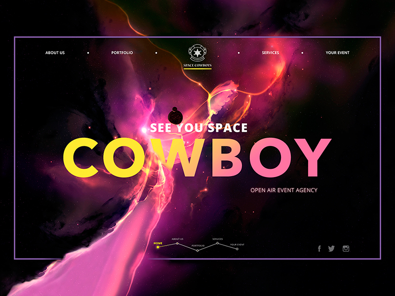
Event Agency Webpage
What does a home page usually include?
The aspects of interaction with a website home page should advisably provide the following data:
– the nature/theme of the website: the users need to understand immediately if they deal with a company website, a professional blog, e-commerce website, social network, personal blog, educational platform, etc.;
– branding elements or other stuff supporting the web product identity: home page should be easily recognizable, memorable and identified by users among tons of others. Thoughtfully accomplished branding can be used to serve these goals, at least presented with a logo and corporate color palette. It plays the vital role for commercial and corporate websites which should feature strong connection with a particular brand or company; however, for non-profit or personal websites elements of identity also have a great impact on boosting usability and memorability;
– goals and utility of the website: it’s important to let users know what is the purpose of the website and what users’ needs it can satisfy. When users are provided with this sort of data during the first interaction with a website, they are ready to devote their most precious resource – time – to know more;
– ability to search around the website content: the search field or button should be easily seen and recognizable as well as located in the area of high visual intensity according to eye-tracking trends;
– navigation elements providing the ability to move to different sections and pages starting from the home page: the home page becomes the starting point of the route from which the user should get the ability to move to any essential and meaningful part of the website and also get back home any moment and from any point of a journey;
– contact information and preferably data about creators or people in charge: the home page is the place where users expect to get provided with the basic information about who creates, maintains and curates the website and how to contact people in charge if there is such a need;
– links to social networks: support of social networks is not only an effective tool for social marketing but also a good way to communicate to users. Social networks are now used by thousands of users on a regular basis, so there will be always the ones who are interested to see how the website is positioned in the environment which is common and clear for them as well as contact via usual social network tools instead of looking for the means of communication on the website. Considering and applying this trend can be one more step to positive user experience;
– testimonials or information supporting trust to the website: mentioning famous clients or partners, as well as the signs of social popularity, can be a catchy factor to learn more and further investigate the website content.
Defined target audience and rigorous user research, made on the earliest stage of interaction and visual design, enable designers to sort out layout elements of the highest priority according to target audience’s needs, expectations and peculiarities of psychological perception. Preferably, the components of the highest priority should be placed in the pre-scroll area of the home page to make their perception fast.
As the home page is actually the front door to the website, definitely it should provide all the strategically vital information about the website which a user should be able to absorb in split seconds. It’s important to remember that not many users tend to spend much time investigating a new website: in most cases, there are a couple of minutes to attract their attention and inform about the website while they are scanning the page. If this short time is used wisely to communicate with the observers about the theme and benefits they can get, they will be ready to spend more time to learn further and browse the site.
For this reason, it is highly advisable for web designers to learn more about psychological and physiological aspects of user interaction with web products, in particular, color psychology and studies about eye scanning trends, for example, the investigations by Luke Wroblewski and Nielsen Norman Group. They are deeply helpful for designers seeking to create home pages with a high level of usability which directly influences general conversion and bounce rates of websites. Knowing how users tend to scan web pages, the designer can apply the most important elements in the zones of the highest visibility and in this way, make the page quickly informative and catch the attention of target users or readers.
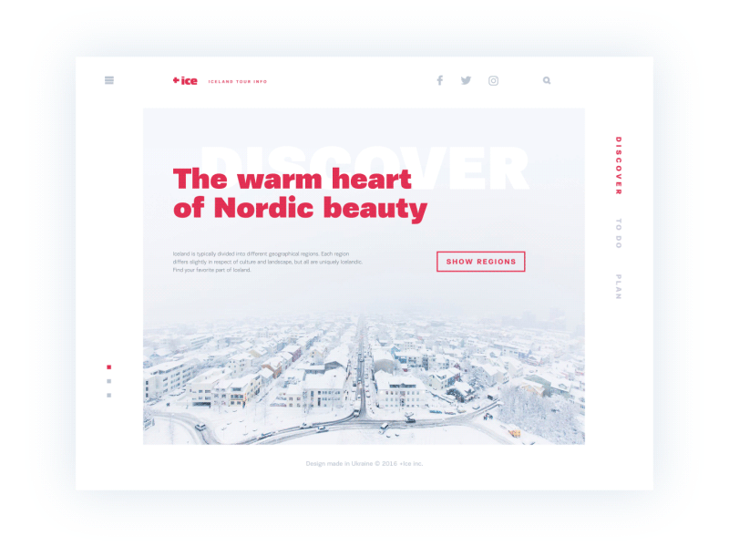
Ice Website
Should all the traffic be directed to the home page?
The answer considerably depends on the nature and complexity of the website. The biggest deal to think over is the user’s attention and its concentration on definite areas of the websites in terms of solving a particular problem or satisfying particular needs.
For simple one-page websites, this question is not actual: indeed, they represent only a home page that satisfies one or multiple functions and there is no other place where the traffic could be directed from the outer sources. The same happens if the website is not complex, the home page in not overloaded with diverse links and navigation elements, so conversion can be reached right from the home page while other pages play secondary roles. In this case directing all the traffic to the most informative part of the site, which also enables a user to accomplish the necessary action and get what they need, is a good idea.
However, for complex websites and platforms, especially if they satisfy the multiple needs of a broad target audience, this approach can be the step in killing profitability and reducing conversion rates. The user can get scared, distracted or even annoyed with the tons of information they have to get through to find what they need, especially if the needs or wishes are focused on a particular narrow goal. Using landing pages in the case when you need to concentrate the user’s attention on something important, to make it noticeable and easily available can be an efficient way of solving this problem. Landing page is a tool to emphasize one item, to make it quickly found and reduce delays in cases when the target user seeks for specific operations, services or items. This is the issue of especially high importance in the case of e-commerce websites when unwise design solutions bring to poor user experience and financial losses. If you want to know more about the effective use of landing pages, welcome to read about the topic in detail in our previous article. Anyway, the approach in every case should be based on user research and then thorough user testing.
What are the important aspects of an efficient home page?
Among the numerous aspects essential for such an essential zone of high functionality as home page, we would define the following aspects as the ones definitely deserving attention:
- clear intuitive navigation and balanced visual hierarchy
- application of different menu types enabling avoiding overloaded page design
- the utility of the applied layout elements
- readable copy, easy to scan
- length of copy blocks that correspond to target users’ needs and expectations
- usage of language (vocabulary, syntax, modality, keywords, etc.) which is understandable and appealing to the target audience
- the intensity of graphic visual content
- the short loading time of the webpage
- thought-out and efficient search
- responsiveness of the webpage when it’s opened on different devices and screens with various resolutions
- effective application of keywords
- good balance of tradition and innovation
- accessibility of the home page from any point of the website
- easy and clear recognizability of the home page in comparison with the other pages of the website
- consistency of visual design solutions
- visible and informative call-to-actions
- defining the most important content to get it supported and strengthened with visual design solutions.
Here are some more design concepts for home pages accomplished by Tubik Studio designers.
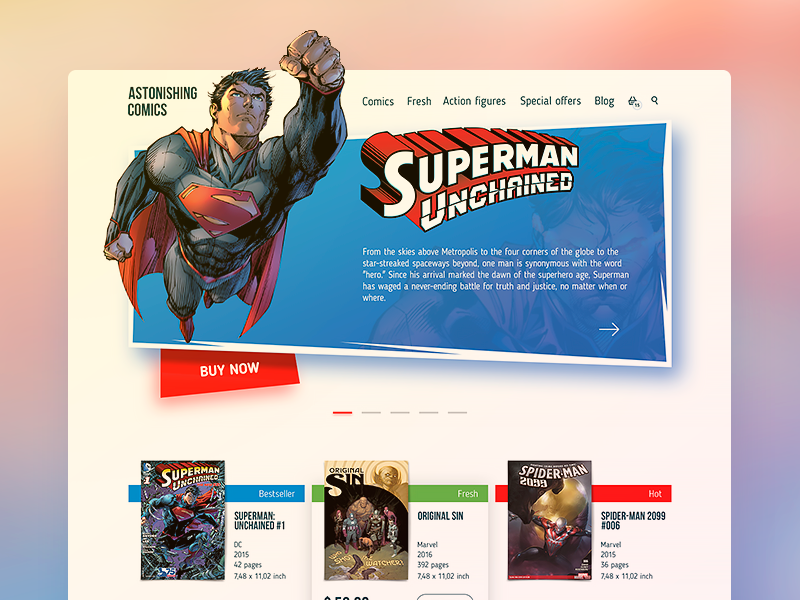
Comics Shop Home Page
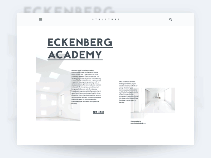
Structure – Architecture Blog
Recommended reading
Here are some more articles we could recommend for those who would like to get deeper into the topic of user experience design.
Visual Dividers in User Interfaces: Types and Design Tips
Directional Cues in User Interfaces
How to Make User Interface Readable
Basic Types of Buttons in User Interfaces
3C of Interface Design: Color, Contrast, Content