For the last decade or two, smartphones have become much more for us than just phones. According to Statista, now about 35% of people all over the world use smartphones, and DMR shares the stats that users have on average 80 apps installed on their mobile devices. No wonder, they are used for multiple purposes and often become our everyday assistants in basic operations. Today, we have collected a set of user interfaces designed here in Tubik for various daily needs, from waking up on time and scheduling tasks to watering plants and cooking.
Watering Tracker App
![]()
Here’s the interface concept of a mobile app Watering Tracker solving one of the frequent problems when being busy, people forget to water their plants. The app reminds users of watering when it’s needed as well as keep the data about watering. What’s more, it also provides detailed data on how to take care of different kinds of plants. Adding items to the app, a user gets his/her own directory of the plants which need to be watered now and then. The collection of items added by the user is shown as a set of tabs. The title above the tab gives the name of the plant while on the tab users can instantly see the notification when the next watering is expected for this position.
![]()
The icon of drops in the top right corner of the tab helps to set the visual association with water and informs a user that the plant on this tab will need watering soon. In contrast, the lowest tab on the presented screen shows the icon of a tick which means that this item has been recently watered.
![]()
Adding a plant takes just short seconds. When a user has taken a photo with a smartphone camera, the application recognizes it and offers the data from the app catalog of plants: it includes the name, the background picture, and the data of care conditions like temperature, humidity, and light rates comfortable for this type.
Slumber App for Better Sleep
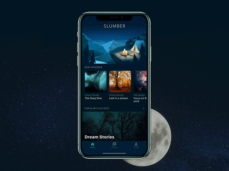
Slumber App presents a collection of stories and meditations for people that suffer from sleep or relax problems. The user interface is designed in accordance with app functionality: it is based on the dark color palette to transfer the atmosphere of the night and subdued lighting and features corresponding graphics. Pull-to-refresh is solved via extended illustration and unobtrusive animation. The choice of fonts is based on high readability and clear typographic hierarchy so that users could scan the screen in short seconds.
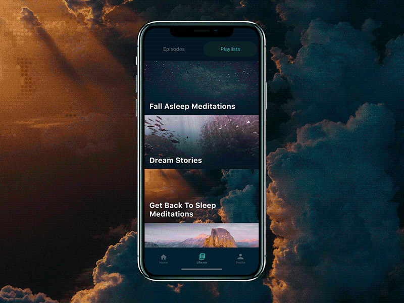
The simple and clear system of filters allows a user to choose the most comforting settings and sound combinations to perfect the experience of meditation or sleep. Tuning background effects, users create personalized sounding.
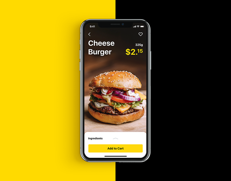
Tasty Burger App
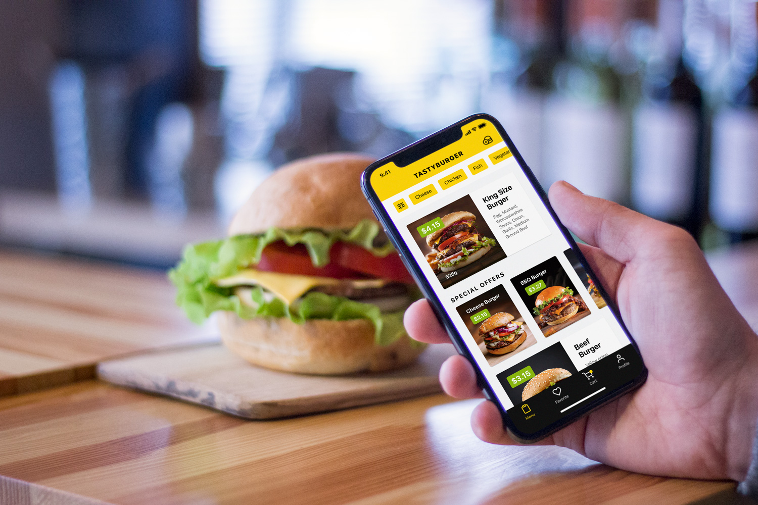
This one is the user interface for ordering and delivering food, namely burgers. Its extended functionality allows users to order a traditional burger from the menu or customize any option for themselves adding or removing the ingredients. As for the color palette in the app, the designer played with the contrast of backgrounds: interactions zones aimed at reading copy, observing and manipulating positions in the lists are presented on the light background to provide a high level of readability. Still, photo content and tab bar apply a dark background that supports the visual performance, makes the graphics look stylish and elegant.
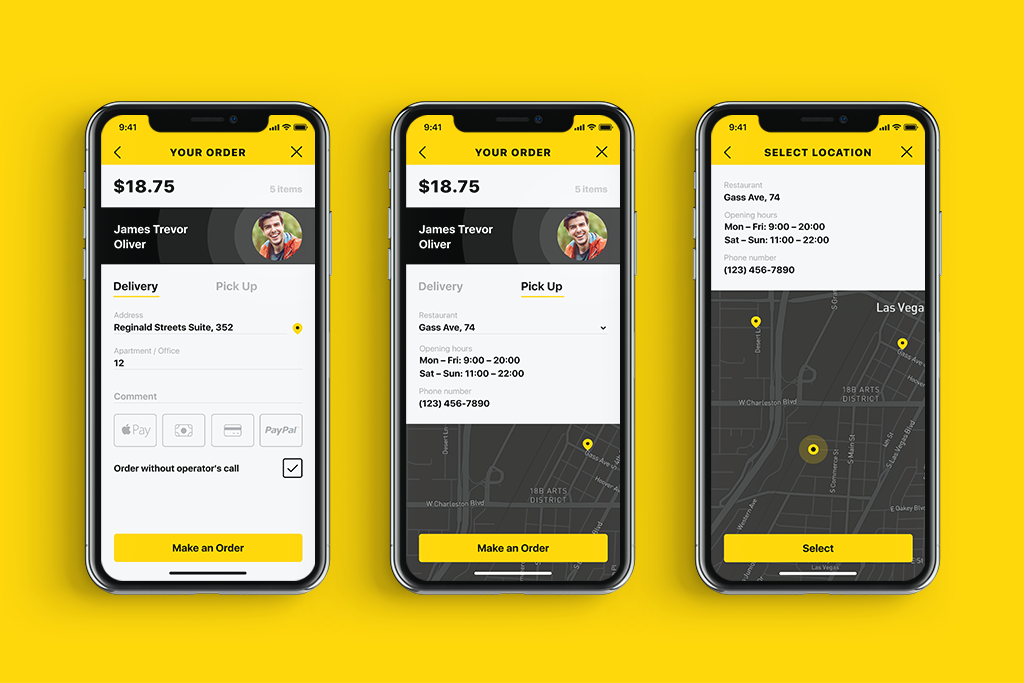
Having decided on the order, a user is offered two ways to get is: delivered at the particular address or picked it up from the restaurant. Also, a variety of payment methods is presented.
Slight and unobtrusive animation applied to transitions and microinteractions made the food ordering app design lively and delicious.
Upper To-Do App
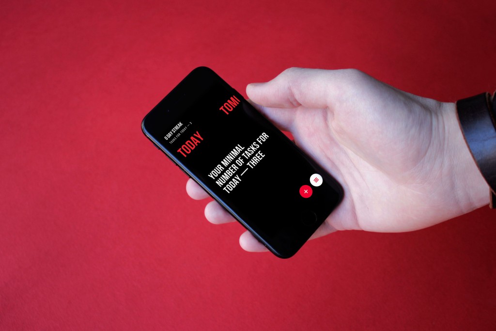
Upper App is a simple and elegant to-do list application increasing users’ productivity. In the UX perspective, the to-do list design is focused on extremely simple interactions and intuitive navigation, while in the UI aspect, the core concerns are high readability level and visual hierarchy that would allow users to use the app easily in any environment and on the go. In addition, Upper analyzes task completion progress and shows stats to keep users updated and motivated.
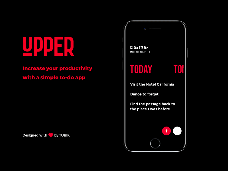
Basic functional buttons are placed at the bottom of the screen, which supports usability for users with big devices. Different swipe gestures allow a user to mark the task complete or delete it from the list.
Perfect Recipes App
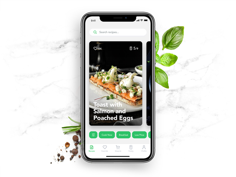
Perfect Recipes is a mobile application for cooking, finding recipes, and effective organization of food shopping. It includes the recipe database which is constantly updated. Also, the application has a supplies manager. To make UX more extended, it allowed users to find the recipes by the supplies they currently had at home or create a shopping list to buy ingredients that were missing.
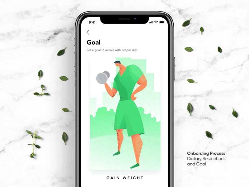
At the start of the interaction, users set the goals they want to achieve such as losing or gaining weight, keeping a healthy diet and the like. Also, users may mark the ingredients they don’t like so that the app didn’t show the recipes containing them.
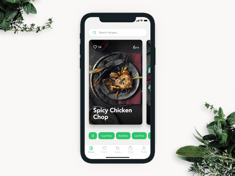
The filter panel allows for adjusting the list of recipes. The user can apply pre-sets such as cooking time, type of meal, kind of cuisine, and preferable timeframe for cooking. Also, the filters can be manually customized. The panel is placed in the bottom part of the screen to add more convenience to the operations with the app by one hand.
Vegan Recipe App
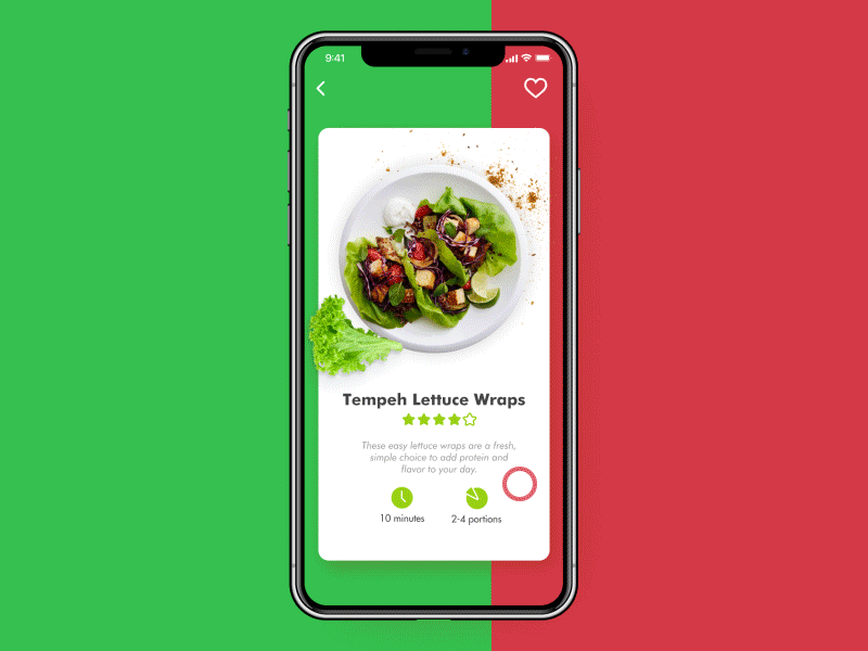
Here’s the set of interactions for one more food UI – Vegan Recipe app. It enables users to choose the dishes based on vegetarian principles and even add the necessary ingredients to the shopping list. Again, the designer applies the idea of a light card on bright background: this way the interface looks fresh and stylish but all the information is scanned easily. Content is clearly prioritized to make interactions quick. Interface animation adds harmony to transitions.
Toonie Alarm
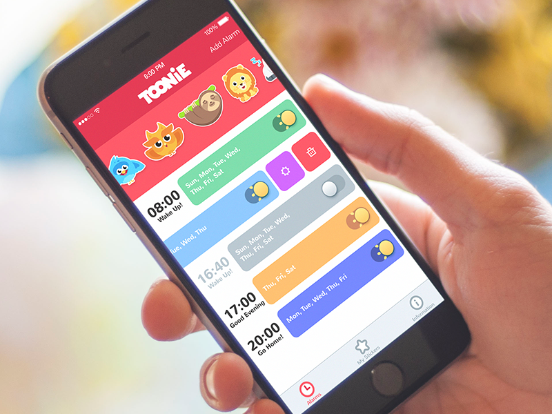
Toonie Alarm is a mobile alarm effectively applying gamification in UI for everyday use: waking up with the app, users get funny stickers and may upgrade them being consistent. The home screen shows the alarms which user already set for a particular time and days and the tab with funny stickers already collected for waking up. Left swipe opens active options for the particular alarm.
Active alarm toggles feature the animated sun making the interaction fun and lively.
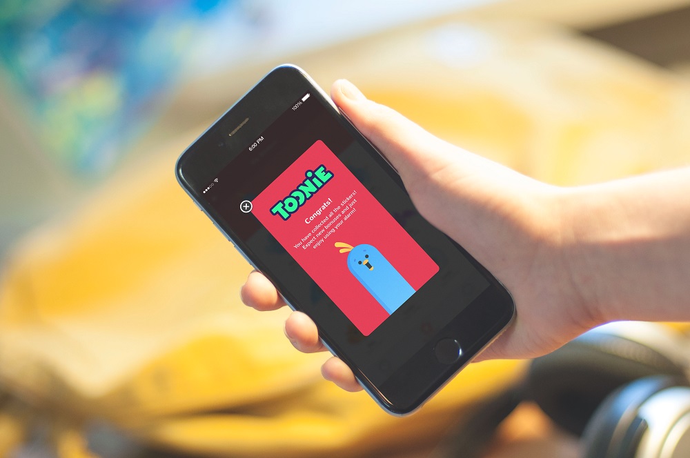
Funny and cute mascot increases usability informing users about news, rewards, errors and just adds some fun and color to everyday life.
Homey App
Homey App is an interface with “smart home” functionality. The featured screens show that users can choose the room and see the basic data about them like temperature, humidity, and energy consumption, can tune the settings and see the expenses as well as turn saving mode and security of different levels.
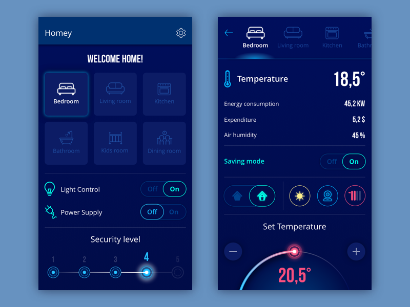
The concept applies dark background which makes the interface look elegant and creates a nice contrast with visual layout elements and color accents.
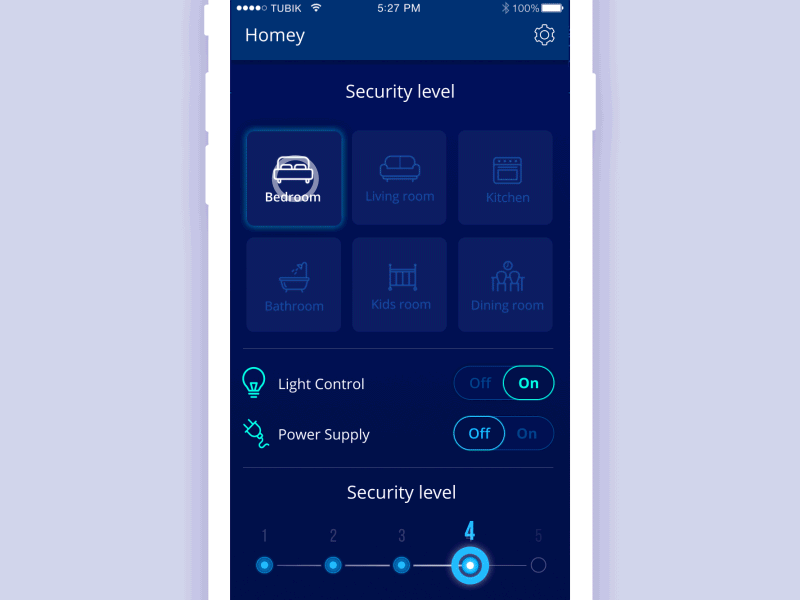
Interface animation adds life to the interface, in particular in icons imitating interaction with physical objects. Animated transitions use the effect of slight delay instead of simple moves of the objects, this way adding style and elegance to the general concept.
Home Budget App
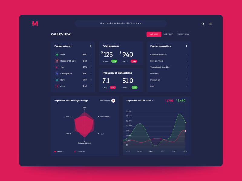
Home Budget is an application for tracking personal finances. It was realized in two versions – web and mobile. The web dashboard was aimed at presenting extended stats for a particular period. The choice of generally dark interface enabled the designer to create an attractive layout with prominently visible colored details drawing users’ attention to the interactive zones of key importance.
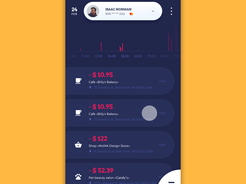
The mobile interface has the other core focus of functionality: first of all, it is concentrated on having the user informed about the operation of the current day and enables to add new data in different environments and on the go.
Business Card App
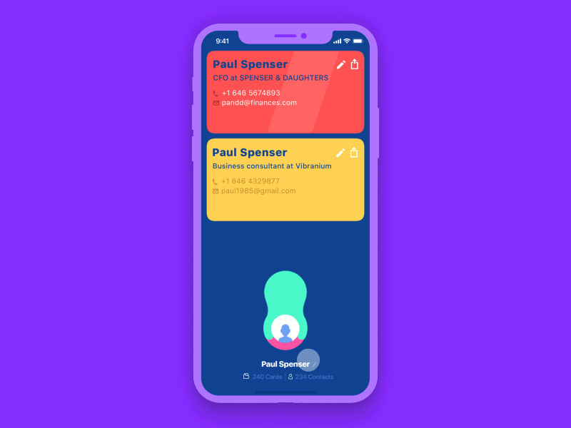
This bright concept is aimed at a quite serious task: it creates, keeps and sends contact data in the form of virtual business cards. For users working at multiple positions, it may save a set of cards as you can see in the animation. Animation adds life to the process imitating the funny effect of pulling out the card from a profile avatar.
Balance App
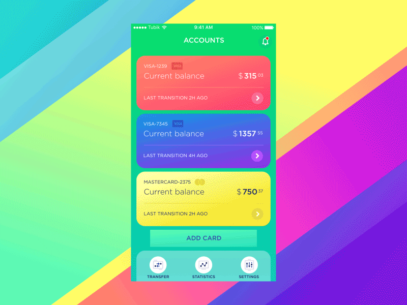
Balance App is another UI concept for a mobile application for tracking finances. It helps users to check the balance of all their bank cards easily, check the expenses along with particular categories and keep updated how much money left to the limits set by the user. The designer has chosen the green color as the basic as it is often associated with safety, confidence, and growth.
Finance App

One more app devoted to finance tracking differs in its functionality: the application enabling people to track their expenses and income individually or in a group. Here you can see a group mode, which may be helpful for family use, joint budgets and even small business needs. Fonts are chosen to provide high readability as the screen is full of various data. Animation creates a stylish transition from the pie chart to the list applying color marking.
Manuva Gym Fitness App
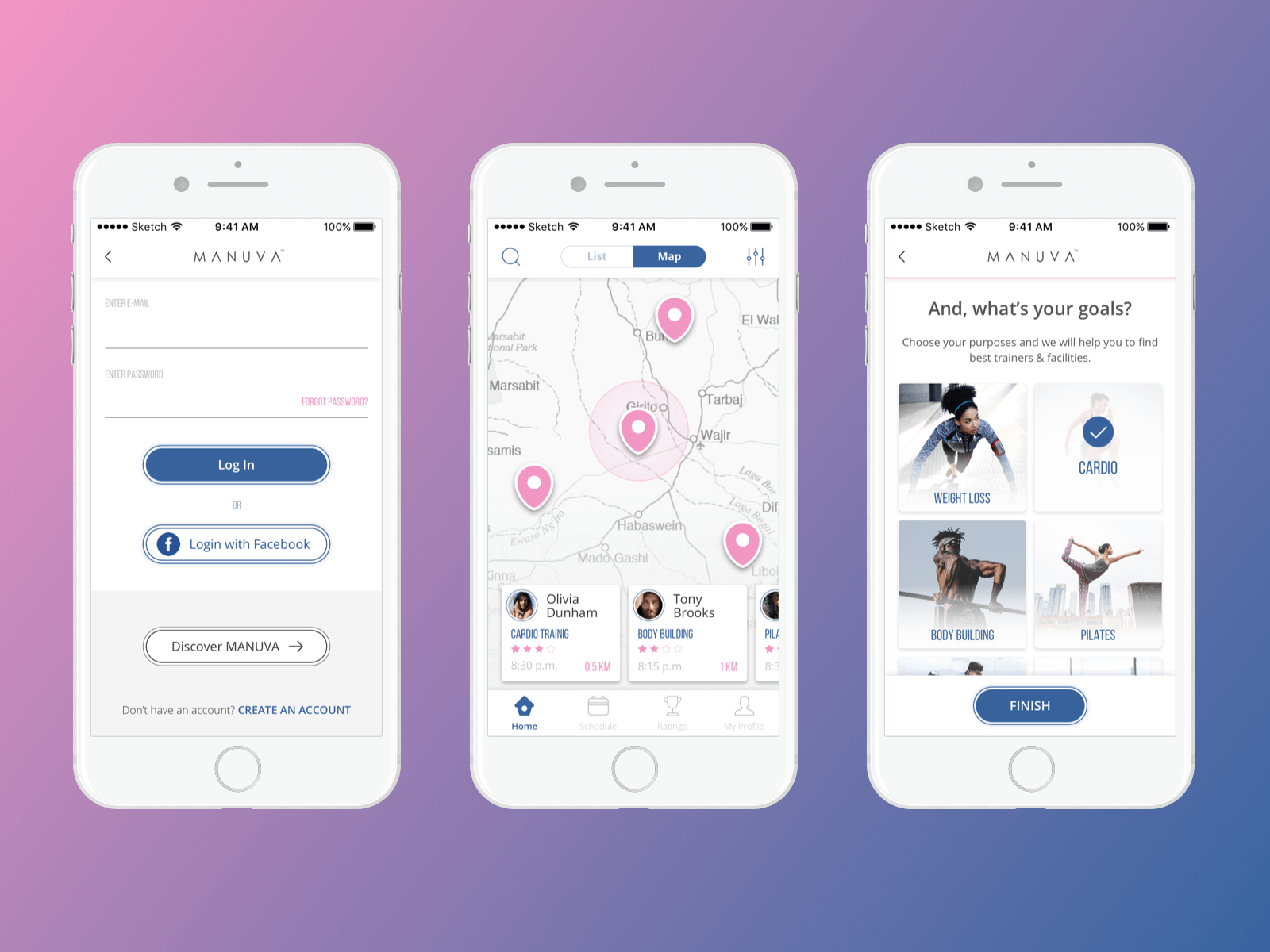
Here’s a concept of an app for sport, health, and fitness. Manuva app helps people find personal trainers in various gyms and book a session without being a member of a particular gym. Users can browse for nearest available trainers, gyms, or group classes via a map or a list sorted by distance and closest start time. UI design is based on a white background and two contrasting colors – blue and pink – for layout details and accents. The designer also created a custom set of vector icons. Simple and aesthetic, they help users get quickly oriented in the navigation system of the app.
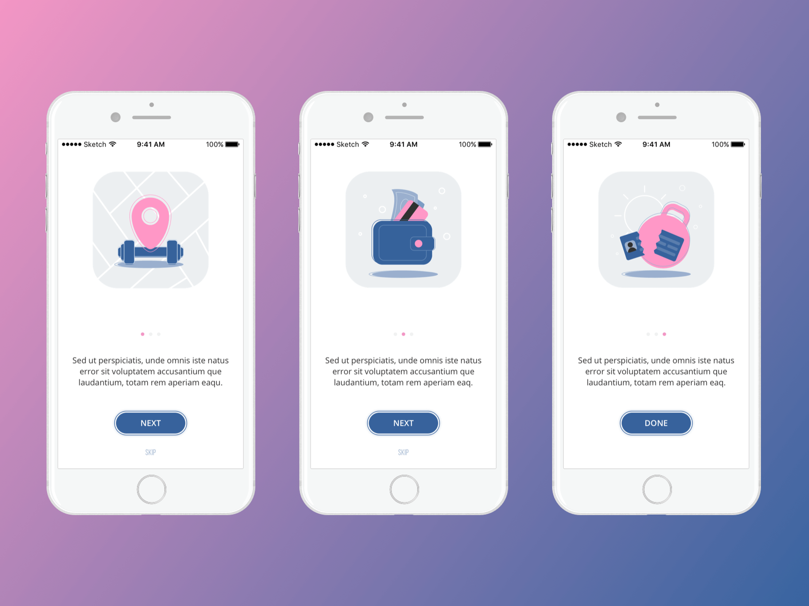
Also, the special set of custom interface illustrations was created for the onboarding tutorial to make the process engaging and clear.
Bright Vibe Calendar App
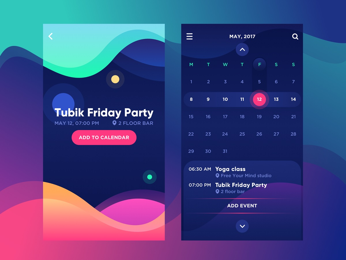
Here’s the UI concept of a calendar app that presents functionality typical for this kind of product but supported with bright design elements and typography creating a strong visual hierarchy and positive mood. The interface presents a good example of applying the Gestalt principle of similarity in the user interface. The letters marking the days of the week on the calendar screen are visually grouped with one color which is different from the colors used for the numbers in the calendar grid. Therefore, the quick glance is enough to separate these types of symbols — color simplifies the process of the first scanning. The next level of color similarity takes place in the field of numbers: the dates on the week which the user has chosen look brighter while the other dates of the month look more faded. The key interactive zones are colored brightly and present the visual accent which is instantly noticeable and cannot be missed. So, color enables the designer to take the easy path of navigation for a user with an effective visual hierarchy via the principle of grouping.
Car Stats App
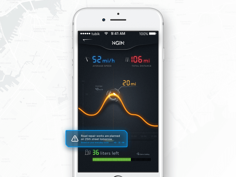
Here’s the conceptual application for the smart car control. The app automates the process of regular data collection informing the driver as well as maintenance engineers about the technical state of the vehicle and conditions in which it’s used. Here you see one of the screens of the mobile app, giving the user basic current stats like average speed, distance, fuel consumption, and useful notifications.
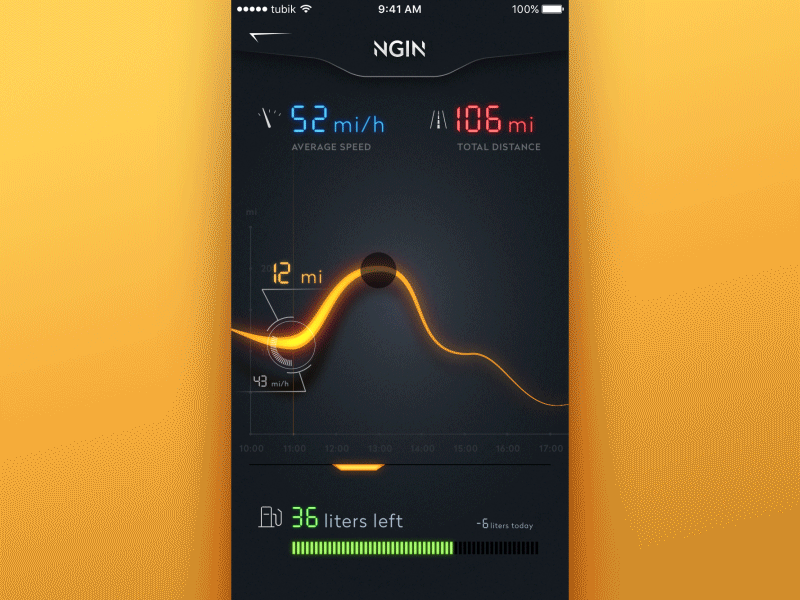
The animated version shows the interactions with the graph curve of the speed for the chosen period and the notification which features a glitch effect to add a bit of fun and support the general stylistic concept.
So, it’s easy to see how many everyday issues may be solved much easier with properly thought-out apps. Moreover, with the help of design, we may do it in style.
Useful Articles and Design Collections
Here’s a set of posts for more design inspiration on web and mobile user experience:
Web Design: 26 Examples of Creative Landing Pages
Steal the Show: Creative Web Design for Diverse Events
UI in Volume: 3D Graphics in Creative UI Design Concepts
3C of Interface Design: Color. Contrast. Content