Benjamin Franklin once said: “Beware of little expenses; a small leak will sink a great ship.” Management of finance and accounts has been an actual issue for a long time; still, for the recent decades, it has got a new perspective with the advent of modern technologies and the internet which is becoming more and more accessible. It presents a new challenge for designers and developers in terms of digital products which will help people to track and manage their money flows both professionally or just for themselves.
This theme built up the foundations for a new UI design concept created in terms of Tubik UI Fridays: one of the creative sessions was devoted to Home Budget, the application for finance management. The creative team of UI/UX designers Ernest Asanov and Dima Panchenko and motion designers Kirill Erokhin and Andrey Drobovich worked under art direction by Sergey Valiukh. Let’s review what design solutions were presented for the task.
Task
UI/UX design for the web and mobile versions of a personal budget manager
Process
Describing the functionality of the app in general terms, Home Budget allows users to manage their expenses and incomes, creating the extended database for tracking financial flows or changes and getting comprehensive stats. The app was planned to have two variants: the web version presented with an informative dashboard and the mobile version giving simpler information and enabling to add new data quickly and easily.
For both variants of interfaces, the designers agreed about the dark background of the layout and the fonts which would have the high level of legibility for both letters and numbers.
Dashboard
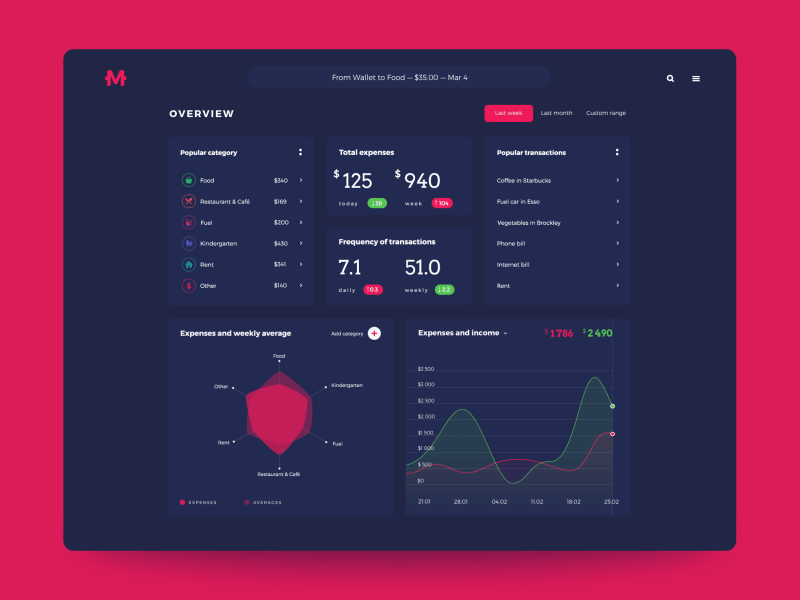
The web dashboard was aimed at presenting extended stats for the particular period. The choice of generally dark interface enabled the designer to create the attractive layout with prominently visible colored details drawing users’ attention to the interactive zones of key importance.
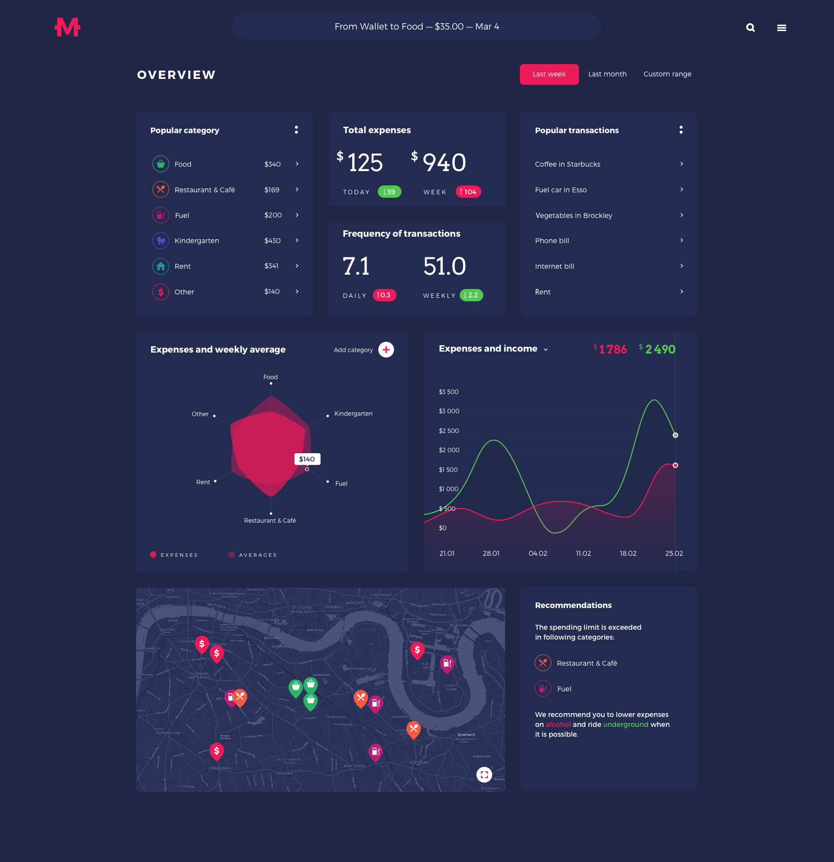
With the dashboard, the users can get the data about their expenses and incomes processed and shown as a variety of statistics for a particular period. As we can see, different blocks of data are organized around cards. The presented page features the overview of the core blocks for the period of the recent week. The horizontal menu in the top part presents the navigation zone enabling the user to set the default periods of overview such as last week or last month as well as choose the custom period they are interested in.
The cards present such information blocks of data:
- the menu with quick access to popular categories of expenses
- information on total expenses and frequency of transactions
- the list of popular transactions
- the cloud of expenses and weekly average rate in comparison to the previous period
- the line graphs of expenses and income for the chosen period graded by day on the horizontal axis and sums on the vertical axis
- the map with the pins marking the most frequent locations of spending money
- the block of recommendations based on financial operations of the period.
Another visual detail that could be mentioned is that for the graphs and markers presenting actual financial changes, the designer applied green and red colors which are widely recognized as signs of positive and negative financial balance. Also, the list of popular categories supports the presentation of each particular category with both name and icon to enhance navigation and make interactions intuitive.
Here’s a piece of animated interactions with the dashboard. The slight unobtrusive motion of the layout elements supports natural microinteractions. When the graphs expand, the other blocks shrink naturally leaving the names of theme blocks visible and readable so that users could continue transitions easily.
Mobile UI
The other direction of the creative process was focused on the UI for a mobile app. While the dashboard is aimed at not only adding information but also presenting the results of its analysis, the mobile interface has the other core focus of functionality: first of all it is concentrated on having the user informed about the operation of the current day and enables to add new data in different environments and on the go.
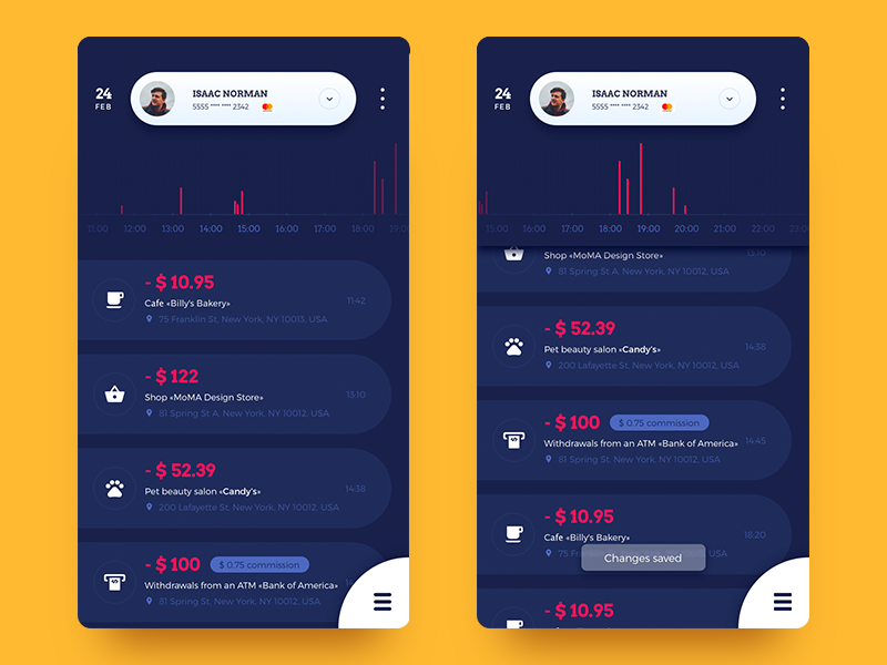
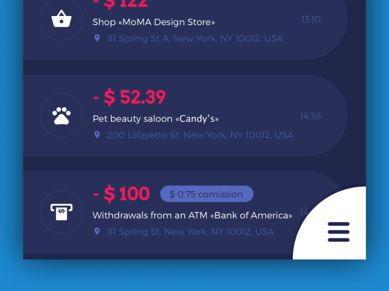
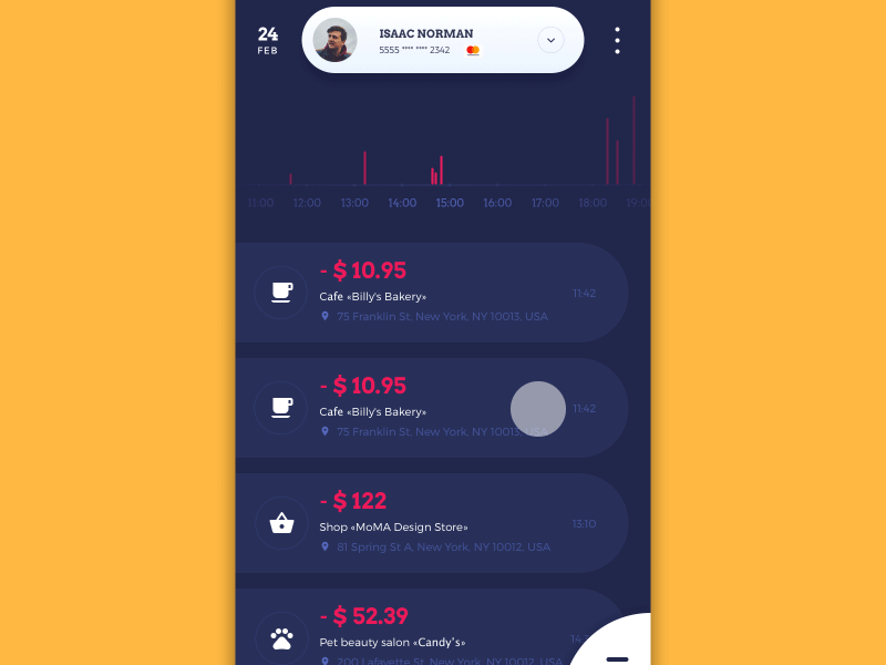
Here is the feed of the latest financial operations, marked by categories shown via icons. The top part of the screen shows the tab of the users’ basic data and marks the credit card used currently. Also, you can see the graph reflecting the flow of finances during the day showed with vertical bars. To interact with it, users can apply horizontal scrolling. When the tab is active, the bottom shadow gives a prompt on that imitating interaction with physical objects.
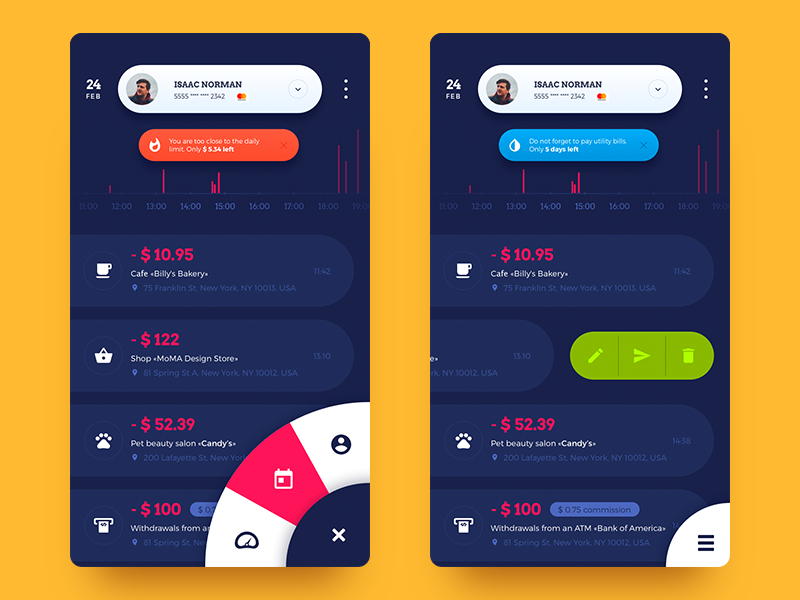
To get the access to the core zones of interaction, the users can press the hamburger button located in the bottom left corner which supports usability for those, who use devices with big screens. The application also shows the important notifications or recommendations to the user: they are shown in the top part of the screen, under the profile tab and over the bar chart zone. The notifications are presented in different colors that mark the nature of the message, for instance, applying orange for warnings and blue for reminders.
Also, the user can interact with each particular position in the list. Left swipe opens the menu of options marked with icons: the entry can be quickly edited, shared or deleted.
The mobile interface was also supported with animations. The one above shows the interaction with the hamburger menu divided into three sections.
Another piece of animation shows interaction with the feed of financial operations for the current day. The warning notification adds more dynamic experience, attracting user’s attention with pulsing movement, and can be removed with a left swipe.
This project has started the deeper immersion into the world of digital products for financial management for the Tubik team and that was definitely the inspiring experience to be continued in further creative sessions. Follow the updates for new concepts and welcome to check the previous cases from Tubik UI Friday: landing page for Big City Guide and mobile interface for Night in Berlin app.
Useful Case Studies
If you are interested to see more practical case studies with creative flows for UI and UX design, here is the set of them from Tubik.
Slumber. Mobile UI Design for Healthy Sleeping
Letter Bounce. UI Design for Mobile Game
Bitex. UX Design for Stock Analysis App
Real Racing. UX and UI Design for Mobile Game
Real Racing. Graphic Design for Mobile Game
Manuva. UI/UX Design for Gym Fitness App
Cuteen. UI/UX Design for Mobile Photo Editor
Tasty Burger. UI Design for Food Ordering App
Watering Tracker. UI Design for Home Needs