The skill of applying colors effectively is a must-have for everyone who works with visual compositions including illustrators and UI designers. Color theory knowledge became even more prominent with the growing popularity of flat and material design directions.
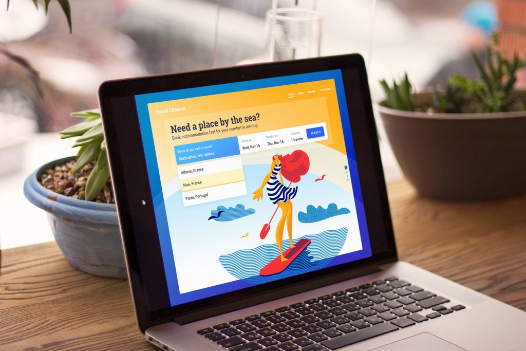
Vibrant colors and gradients are now seen in user interfaces of different digital products: from the playful and entertaining ones to business apps and websites. However, there are still lots of discussions about the impact bright colors have on user experience. The article provides an insight into the strengths and weaknesses of colorful UI.

How can bright colors enhance UI?
Increased readability and legibility
In one of our previous articles, we described factors influencing the choice of color scheme. Readability and legibility are basic factors which designers consider applying colors. Just to remind, readability stands for how easily people read copy content and legibility defines how quickly users distinguish the letters in a particular typeface.
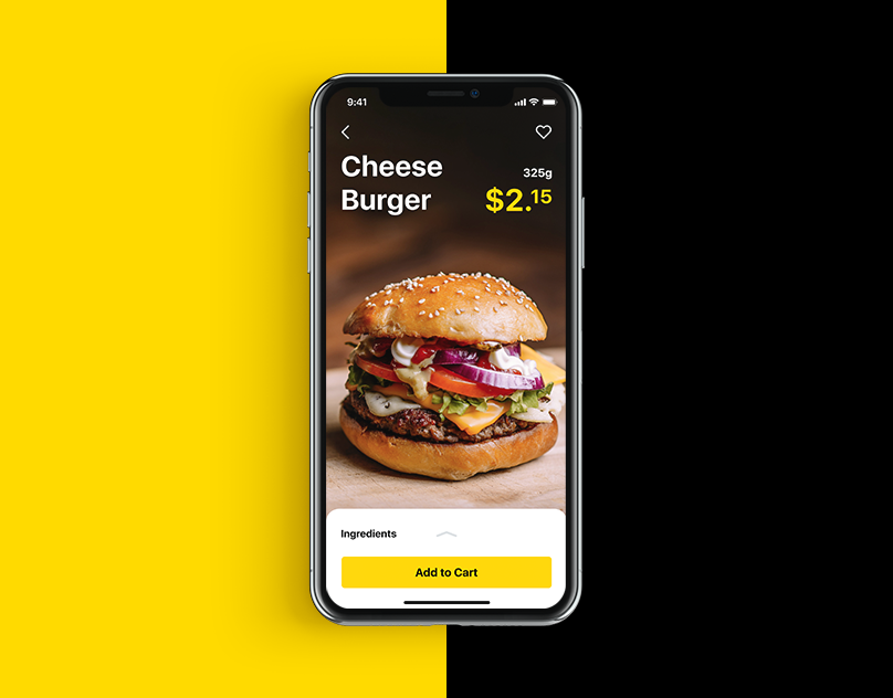
Vibrant colors enable enough contrast helping to increase readability and legibility. Due to contrast layout elements become distinguishable and noticeable. However, a high level of color contrast may not always work well. If copy content and the background colors contrast too much, it will be difficult to read or scan the text. That’s why designers are recommended to create a mild level of contrast and apply high contrasting colors only for highlighting elements.

Sharpening navigation and enhancing intuitive interaction
Visual hierarchy is a core element for clear navigation and intuitive interaction system of any digital product. UI components are organized that way so the brain could distinguish the objects by their physical differences including color.
Colors have their own hierarchy which is defined by the power of impact on users’ minds. There are bold colors such as red and orange as well as the weak ones like white and cream. Bright colors are easy to notice so designers often use them as the means of highlighting or setting contrast. Moreover, applying one color to several elements you can show that they are somehow connected. For example, you can choose a red color for purchase buttons so that people could intuitively find them when they need it.
Recognizability
The human brain reacts intensively to bold colors the reason why bright color combinations can be easily noticed and memorized. Colorful UI design has great chances to stand out from the crowd among many products with weak colors. The choice needs to be based both on the preferences of the target audience and market research.
Moreover, if a company has bright corporate colors applied to the logo and branded items, it can be a good idea to use the colors on its website or mobile app. This way the design creates consistency of visual solutions connecting all the company’s communication channels as well as increases brand awareness.
Setting mood and atmosphere
To convey the right tone, message, and call users to make the expected action, designers need to know that colors can influence our mood and behavior. Our mind reacts to colors while we usually do not notice it. The study called color psychology states that the moment our eyes perceive color, the brain gives signals to the endocrine system releasing hormones responsible for the shifts of emotions.
The properly selected colors help put users in the frame of mind that compels them to take action as well as set the right atmosphere transferring the right message to users. For example, if a designer creates a UI of a product connected with nature or gardening, there are high chances you will see it in the green and blue color palette. This way the design would be associated with a type of product or service from the first sight. You can find the description of color meanings in our article Color in Design: Influence on Users’ Actions.
Trendy look and style
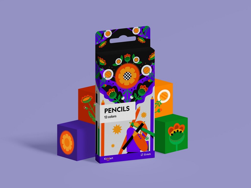
Bright colors and gradients hold their position of top trends in UI design. Now they can be found in different types of digital products and the limitations of strict business style seem to step aside.
Bright gradient colors in user interfaces can bring the feeling of modernized technology and fresh ideas. A mobile app or website designed according to the latest trends often looks catchy and can draw users’ attention despite high competition.
Pitfalls of using bright colors in UI
Bright colors can be tough to match
Those who think that colors can be mixed relying only on intuition and taste of beauty make a big mistake. The basic knowledge of how colors work and how do they collaborate is essential if you want to create harmonical visual compositions.
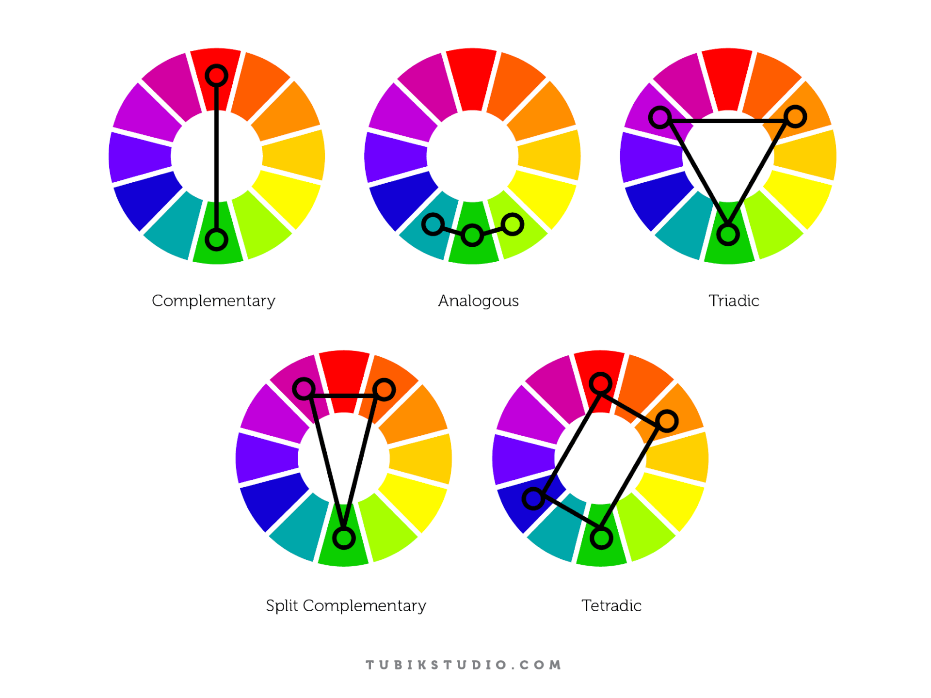
The more vibrant colors you apply in UI, the more difficult it becomes to match them. To make users feel pleased and comfortable, designers try to bring balance and harmony into user interface design. The color harmony is about the arrangement of the colors in design most attractively and effectively for users’ perception. Harmonic color combinations contribute to a nice first impression from the website or application. The color theory defines several basic color schemes that were proven to work efficiently. Let’s see what they are.
- Monochromatic. Color harmony is based on one color with various tones and shades of it.
- Analogous. The scheme applies colors located right next to each other on the color wheel.
- Complementary. It is the mix of colors placed in front of each other on the color wheel and it aims to produce high contrast.
- Split-Complementary. This scheme works similarly to the previous one but it employs more colors. For instance, if you choose the blue color, you need to take two others which are adjacent to its opposite color meaning yellow and red.
- Triadic. It is based on three separate colors that are equidistant on the color wheel. Professionals recommend to use one color as a dominant, the others as accents.
- Tetradic/Double-Complementary. The tetradic color scheme employs four colors from the wheel which are complementary pairs. If you connect the points on the chosen colors they form the rectangle.
Losing accents
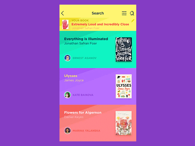
The bold colors can be the tool for making accents in UI still they can be the reason why the accents disappear. Many vibrant colors in a single visual composition bring a risk of losing highlighted elements because they become a part of a colorful mess.
That’s why designers are recommended to apply the proportion of 60%–30%–10%. The biggest part should go to the dominant hue, the third of the composition takes secondary color and 10% percent goes to the color which helps to make the accents. Such a proportion is thought to be pleasant for human eyes since it allows for perceiving all the visual elements gradually.
Bright colors don’t suit all users’ groups
One of the core stages of digital product creation is user research. Defining and analyzing the target audience designers learn what they expect from a website or app. Age, gender, and culture can influence the preferences of a potential user. For example, children like yellow color pretty much, but as we become adults it usually seems less attractive. Men and women generally prefer cool colors such as blue, green, and their tints. Unlike women, men usually prefer achromatic colors including white, black, and gray.
The same goes for bright colors. Even if you create a design for an entertaining app, you need to consider the specifics of the target audience. Middle-aged people usually prefer light UI and they may not like bold colors across the screen finding them a distraction.
Vibrant colors may look too contrasting on mobile screens
As we said above, bright colors can produce much contrast helping to highlight vital UI elements as well as contribute a desirable level of legibility and readability. However, too much of a contrast may play a bad joke, especially with mobile interfaces because they are limited of space and can be used under diverse circumstances.
Small screens, ambient light, and bright fonts make a contrast image look unpleasant for users’ eyes. That’s why applying bright colors in mobile UI designers need to pay attention to the level of contrast between colors so that people would feel comfortable while reading text on a mobile screen.
Color is a great tool in a master’s hands and like any other tool, it has its strengths and weaknesses. To use it effectively you need to consider all its sides so you’ll be able to find the solutions appropriate to the design tasks and goals.
Useful Articles
Design Glossary: Color. Terms and Definitions
Color Theory: Brief Guide For Designers
Light or Dark UI? Tips to Choose a Proper Color Scheme
Color in Design: Influence on Users’ Actions
Color Matters. 6 Tips on Choosing UI Colors