The quality of mobile design can be measured simply. When the process of usage is so smooth and effortless that people don’t even think about it, it is the sign of the professional design work. On the other hand, if there are some problems in the interaction system, users will definitely notice them and won’t be pleased about it.
Mobile apps are expected to be clear and easy to operate so that they could be effectively used anytime and anyplace. Designers’ task is to create an intuitive interface which will guide users within the app helping them operate its functionality without problems. In this article, we describe the essential aspects of the effective mobile interaction system along with the tips helping designers to create intuitive design.
Increase learnability
Every designer strives at creating a unique product with original interactions and navigation systems. Such an approach allows standing out a crowd and being noticeable on the market. However, creating absolutely new environment designers have to think how users will adjust to it.
If the interaction system of a mobile application has no logic and sequence or it doesn’t respond to the needs of the target audience, it may be frustrating and annoying. That condition is critical for UX, so people will simply give up on trying to decipher an app and quit it.
To avoid this kind of outcome, designers need to care about the learnability of the interactive elements. Learnability stands for how easy tasks can be attained during the first usage and how quickly users learn from the previous experience. To increase learnability, designers need to keep it simple and clear helping quickly adjust to it. Also, the system should be consistent and logical so that users could identify the repeating patterns and use a mobile app intuitively.
Consider multiple holds
We all are different in many ways, even how we hold smartphones. The way of holding smartphones depends on various factors including the situation and conditions in which the app is used as well as the task we need to accomplish.
There are three common types of holding a mobile. The first is when we take it with one hand and navigate it with a thumb. Another way is to hold a smartphone in one hand and interact with it with the forefinger of the other hand. Also, the type which is common for chatting people is holding a phone in two hands using both thumbs for actions. Of course, there are other types of holds but these three are thought to be the most common.
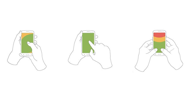
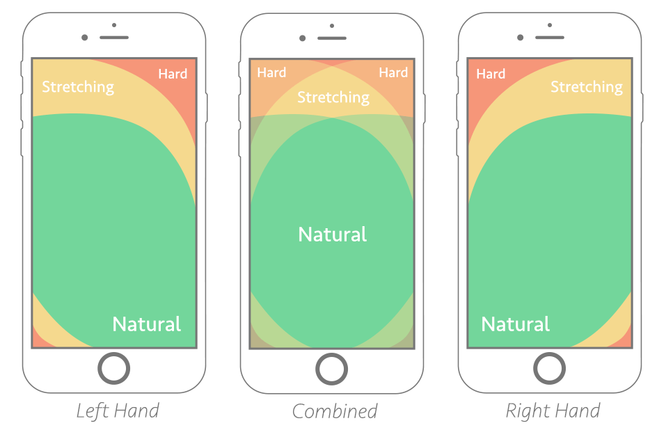
Considering this fact, designers have to figure out if the layout elements placed effectively for different holds. One-handed hold requires special attention since it has the most limited space of reach. To make the interaction process within a mobile app effortless it may be a good idea to put the key components at the bottom of the screen so that users would be able to reach tap areas easily. In addition, the interactive elements should be big enough so there would be no chance for a mistap.
Apply recognition patterns
When a new app can be used intuitively it means that the designer did a good job. To provide intuitive interactions, UI design has to contain recognition patterns. They are the elements which users are already familiar with and those which give slight hints on how an app works. The thing is that using an application we are expecting to see certain things associated with the definite kind of product. For example, working with e-commerce apps we are used to seeing cart icons along with CTA buttons “Buy”. Familiar elements in a new app make people feel more confident in their actions.
Users become accustomed to things quickly and their absence makes them feel uncomfortable. That’s why, if you plan to use custom interactive elements, don’t forget to add some standard components. This way a new application won’t overwhelm with an absolutely unfamiliar environment and will help to learn quickly.

Make a clean UI
A big pitfall of mobile UI design is small screens of the devices. Designers have to figure out how to include all content in a short space without turning user interface into clutter. Clean UI design helps effectively interact with a product since all the core elements can be easily reached.
To create a neat mobile UI, it is recommended to use icons as interactive components. Copy elements often can be too big for the small screen, so icons are a sufficient alternative. They can explain a function visualizing it with simple shapes and it helps to save the space on the screen. However, during usability testing, it should be thoroughly checked if the icons are perceived appropriately and transfer the right message.
Decrease the number of actions
Probably, many of us have the experience of using an annoying mobile app which made us take a long way before we could finally accomplish the task. It may often be caused by ineffective interaction system which employs too many actions and the unnecessary functionality.
Mobile apps usually serve as problem-solving assistants, so it’s vital for them to be designed ergonomically. It means that designers have to apply only core functional elements which will get the users right to the point they needed. Minimum of actions won’t make your product look primitive. It will help a mobile app be effective and pleasing in usage. Remember that people mostly rate the quality of an application not by extraordinary features but how helpful it is.
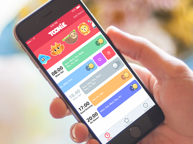
Add game mechanics
Based on the facts described above, we can say that an effective mobile interaction system should be simple and clear to use so that it could be operated without problems.
However, simplifying the interface it’s vital not make it boring. Apps which seem ordinary have fewer chances to gain users’ attention. That’s why it’s important to bring some emotional aspects into applications that look standard at the first glance.
To make the process interesting and catchy, it may be a good idea to use gamification. It is the technique of exerting game mechanics into the non-game environment like mobile applications. Various challenges and leaderboards along with the awards and stickers motivate users to interact with a product more and come back to it constantly.
What’s more, implementing a game mechanic called a user journey is an effective way to create a clear layout and transitions. A journey is the user’s progression stages at the time of usage. Designers create UX that way so that people could go step-by-step through the various features which gradually change depending on the needs of the target audience. An approach helps to avoid problems with incomprehensible interactions and functions.
Last but not least, gamification adds the element of fun. Users enjoy entertainment, challenges, and competitive spirit similar to video games, so they are encouraged to go back. People always need some kind of recreational activity so that they could escape from everyday routine for a bit. By adding the fun element into a casual application, you help to reduce some stress and relax for a moment.
Don’t forget about testing
Mobile interaction design aims at creating a user-friendly product which will be pleasant to use under different circumstances. But how can a designer define if an app is usable enough and distinguish possible problems in UX? This is when usability testing comes into play.
Usability testing is an essential stage in creating mobile apps helping to evaluate it by testing on the potential audience. It is usually conducted at the UX building stage before a project goes to the development team so that inefficient solutions could be changed easier and faster.
Various usability testing methods allow identifying problems and bugs and quickly eliminate them. This way designers can improve all the aspects of UX ensuring user satisfaction.
So, before you deliver a project to the development team remember to handle testing. Test it by yourself, on your colleagues, on the potential users and then you’ll get the desired outcome.

A simple mobile interaction system is not that easy to create. It requires hard work, concentration and lots of practice before you receive sufficient results. Stay tuned!
Recommended reading
Take It Easy: Tips for Effort-Saving User Interfaces
Gamification in UX. Increasing User Engagement
Color Matters. 6 Tips on Choosing UI Colors
Mobile Typography: 8 Steps Toward Powerful UI
Small Elements, Big Impact: Types and Functions of UI Icons
Tests Go First. Usability Testing in Design
Gamification Mechanics in UX: Smart User Journey
Mobile UI Design: 15 Basic Types of Screens
Mobile App Design: Big Guide into Types of Mobile Applications